A 3-second undo beats a 12-second intro on first sessions
A small reversible action on first sessions can build trust faster than any polished introduction, and here is why that matters
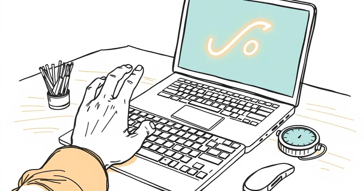
You've got three seconds before a first-time visitor decides whether your site is worth their attention. And here's the uncomfortable part: most Australian businesses spend those three seconds talking about themselves. The question worth sitting with is why a small, reversible action — an undo, a dismiss, a quick win — so reliably outperforms a polished introduction when someone meets your product for the very first time.
The first session is a trust negotiation, not a tour
When someone lands on your site for the first time, they're not evaluating your feature list. They're running a fast, mostly unconscious risk assessment. Is this going to waste my time? Will I look foolish if I click the wrong thing? Can I get out?
Behavioural economists have mapped this territory well. Kahneman and Tversky's work on loss aversion showed that losses loom roughly twice as large as equivalent gains in people's minds. On a first session, that asymmetry is doing a lot of quiet work. A user isn't weighing "this might be useful" against "this might be useless" — they're weighing "this might be useful" against "this might cost me something I can't get back." Time, dignity, the small friction of having to figure out a mess I created.
That's why the 12-second intro video, the modal asking me to subscribe before I've read a word, or the four-step onboarding wizard all fail in the same way. They ask for commitment before trust exists. And they ask for it in the exact window where the visitor is still deciding whether to stay at all.
A 3-second undo does the opposite. It says: try the thing. If you don't like it, no harm. That's a much easier offer to accept.
Why reversible actions lower the cost of engagement
There's a well-documented pattern in interface research and product analytics: people engage more freely when the consequences of a wrong move are clearly recoverable. This isn't just a nicety — it's a structural shift in how the decision feels.
Think about what an undo actually does to the decision. Without it, clicking "delete" or "apply" or "send" is a commitment. You have to be reasonably sure before you act. With it, the action becomes exploratory. You can click, see what happens, and reverse course. The cost of being wrong drops to nearly zero.
The classic demonstration of this is the variable-ratio reinforcement schedule that B.F. Skinner described in the 1950s — the finding that unpredictable rewards produce the most persistent behaviour. But the flip side, less often cited, is that unpredictable penalties produce the fastest avoidance. If a first-time user can't predict whether clicking something will cost them, they simply won't click. Reversibility removes the unpredictability from the negative side, which is where it does the most damage.
A concrete example: when Google first tested a "Did you mean?" correction on search results, users didn't just accept the correction — they started typing more aggressively, because the cost of a typo had collapsed. The correction wasn't a feature they asked for. It was a safety net that changed how they behaved. An undo button is the same move applied to your own product's first session.
The intro is a promise; the undo is proof
There's a reason intros feel safe to the people building them. An intro is scripted, controlled, and flattering. It lets you tell the visitor exactly what you want them to believe. But first-time users have learned, through a thousand disappointing experiences, that intros are marketing and behaviour is truth.
When your site opens with a 12-second animation explaining your value proposition, the visitor is being asked to take your word for it. When your site opens with a small, immediate action they can take and reverse, they're being shown. That's a different category of information.
This is why the "try it before you sign up" pattern works so well across product categories — from online banking demos to design tools to government service portals. The visitor gets to experience the thing, not hear about it. And crucially, they get to experience it without consequences.
For Australian businesses in particular, there's a cultural dimension worth naming. Australian users tend to be sceptical of over-promising and allergic to being talked at. A site that says "here's the thing, have a go, you can change your mind" lands better than one that says "welcome to our journey of excellence." The undo button is, in a small way, a respect signal. It says: I trust you to figure this out, and I've got your back if you don't.
What this looks like in practice
Moving from the principle to the implementation isn't complicated, but it does require resisting a few instincts.
Replace the intro modal with a first action. If your current first-session flow opens with a welcome message, test removing it entirely and letting the user land directly on the primary interaction. Track whether completion rates go up or down. In most cases, they go up — because you've removed a decision point rather than added one.
Make the first action reversible, visibly. Don't bury the undo in a settings menu. Put it where the action was. "Deleted. Undo." That's the whole message. The visibility is doing as much work as the functionality.
Shorten the gap between landing and doing. The 3-second undo isn't just a feature — it's a design principle about how fast a user can get their hands on something. If your site requires reading three paragraphs before the first click, you've already lost the people who would have engaged.
Measure first-session behaviour, not just conversion. The metrics that matter here are things like time-to-first-action, first-action completion rate, and return rate within 24 hours. A 12-second intro might not hurt your sign-up numbers directly, but it almost certainly hurts the percentage of visitors who ever take a meaningful step.
Consider the asymmetry of your own risk. Adding an undo button is cheap. Removing a 12-second intro is cheap. Both are testable in a week. The downside of trying is small and reversible — which is, fittingly, the same logic you're applying to your users.
Where this is heading
The next few years of web development are going to be shaped by AI-driven personalisation and increasingly complex user flows, and the temptation will be to add more — more explanation, more onboarding, more hand-holding. But the behavioural evidence points the other way. The sites that win first sessions are the ones that make the first move feel safe, small, and undoable.
Start by auditing your own first session. Open your site in a fresh browser, with no cookies, and count the seconds between landing and the first thing you can actually do. Then ask: if I got it wrong, how easily could I take it back? If the answer to the first is more than a few seconds, or the answer to the second is "not easily," you've found your next experiment.
The three-second undo isn't a trick. It's a recognition that trust on the web is built the same way it's built anywhere else — by letting someone test you without paying for the privilege.