A 4s splash screen costs 20% of returning users
Four seconds of splash screen is enough to lose one in five returning users, revealing why the brain treats waiting as a small, repeated insult
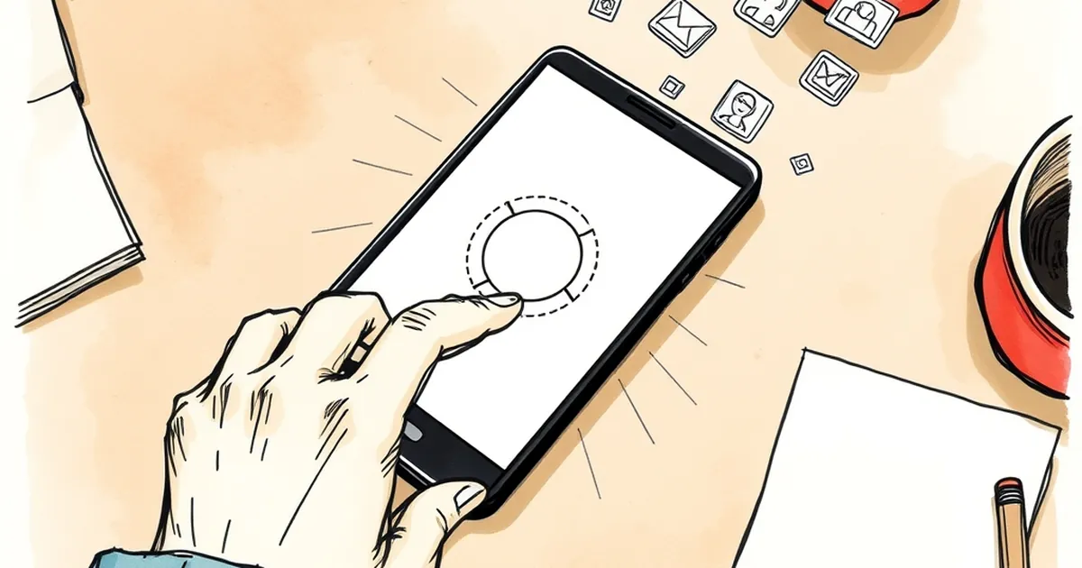
Four seconds. That's roughly the time it takes to boil a kettle to lukewarm, or to read a text message from your mum. It's also, according to a growing pile of mobile analytics, long enough to convince one in five returning users that they'd rather be doing something else. So what exactly is happening in those four seconds — and why does the brain treat a splash screen less like a loading indicator and more like a small, repeated insult?
The four-second number isn't magic — it's a threshold
The "20% of returning users" figure gets thrown around a lot, and it's worth being honest about where it comes from. It's not a single peer-reviewed study so much as a pattern that shows up repeatedly in app and web analytics: retention curves tend to steepen noticeably once time-to-interactive crosses the three-to-five second band. Google's own research on mobile page loads famously found that bounce probability increases sharply as load time climbs from one second to five, with the jump between three and five seconds being particularly brutal. Different datasets give different percentages, but the shape of the curve is remarkably consistent.
What's interesting from a behavioural standpoint isn't the exact number. It's why the curve bends where it does. Four seconds isn't an arbitrary engineering benchmark — it's roughly the outer edge of what psychologists call the "unit of perceived waiting." Below that, waiting feels like a pause. Above it, it starts to feel like a decision you didn't agree to make.
For returning users specifically, the maths gets worse. A first-time visitor is still curious. A returning visitor has already done the cost-benefit analysis once and decided you were worth another go. Making them wait again isn't just friction — it's a small betrayal of an implicit contract.
Loss aversion does the heavy lifting
Here's where Daniel Kahneman and Amos Tversky earn their keep. Their work on loss aversion showed that losses feel roughly twice as painful as equivalent gains feel good. A four-second delay doesn't register as "I gained four seconds of nothing." It registers as "I lost four seconds I had already allocated to something else."
This matters because returning users arrive with a mental script. They know what they came to do — check an order, top up a balance, rebook a slot. The splash screen interrupts the script before it starts. In behavioural terms, you've introduced an aversive event at the exact moment the user was primed for a rewarding one.
Compare it to a physical shop. You walk back into a café you liked last week, and the barista makes you stand silently at the door for four seconds before acknowledging you. Nothing terrible happens. But you notice. And next time you're choosing between two cafés, that four seconds is sitting quietly in the background of your decision.
Variable-ratio reinforcement and the cost of a broken loop
There's a reason well-designed apps feel slightly compulsive: they lean on variable-ratio reinforcement, the same principle B.F. Skinner identified in the 1950s when he found that pigeons pecked more persistently when rewards arrived unpredictably. It's the engine behind notification badges, streak counters, and the small dopamine hit of seeing a "new message" indicator.
A splash screen is the opposite of that. It's a fixed, predictable, unrewarded delay. It doesn't build anticipation — it builds resentment, because it teaches the user that opening your app is a cost, not a reward. Over repeated visits, that association compounds. Behavioural economists call this habituation to friction: users don't consciously decide to leave, they just gradually stop initiating the behaviour.
The cruel irony is that splash screens are often added for reasons that feel defensive — branding, asset loading, legal disclaimers. Each of those is a legitimate need. None of them require four seconds of dead air.
The concrete case: what "20%" looks like in practice
Take a mid-sized Australian e-commerce app — say, a retailer with around 80,000 monthly active users, roughly 30% of whom are returning. That's 24,000 returning sessions a month. If a four-second splash screen costs you 20% of those, you're losing around 4,800 returning sessions monthly. At a conservative 3% conversion rate and a $90 average order, that's about $12,960 in monthly revenue — before you count the quieter cost of users who don't leave but start opening the app less often.
This isn't hypothetical. When Google engineers analysed page abandonment data for mobile sites, they found that as load time went from one to three seconds, bounce rates rose by 32%; from one to five seconds, they rose by 90%. The four-second mark sits right in the middle of that cliff. The specific "20% of returning users" framing is a useful shorthand, but the underlying dynamic — friction compounds with familiarity — is well documented.
What actually helps (and what just moves the problem)
The instinctive fix is "make the splash screen faster." That's necessary but not sufficient. The better question is: what is the splash screen for?
If it's for branding, a 400ms logo animation does the same job as a four-second one. If it's for loading assets, progressive rendering — showing the shell of the interface immediately while data loads — beats a full-screen blocker almost every time. If it's for a legal disclaimer, put it in a place where the user is already engaged, not before they've even seen what you do.
The forward-looking move is to treat the first four seconds as a negotiation rather than a gate. Show the user something useful immediately — a skeleton of the interface, their last-viewed item, a cached summary — and let the rest stream in behind it. This is where behavioural psychology and front-end engineering genuinely converge: both are asking how to reduce the perceived cost of the first interaction.
The next time you sit in a product meeting and someone suggests a splash screen "for polish," ask what it's costing. Four seconds is a long time in a brain that's already decided to come back. The users who notice are rarely the ones who complain — they're the ones who quietly stop opening the app.