A 7-second undo window stops more rage-quits than a survey
A 7-second undo window can catch small interface regrets before they become rage-quits, offering more value than a polite survey ever could
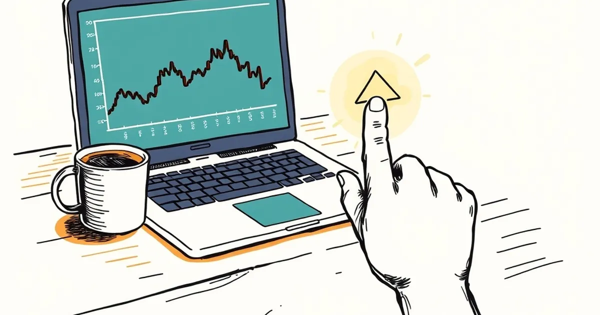
There's a specific moment in interface design that rarely gets studied with the seriousness it deserves: the second or two after someone clicks something they regret. Not the catastrophic stuff — not a payment they can't reverse or a form that wipes their work — but the smaller, more frequent regrets that accumulate into a bad mood. The kind that ends with a closed tab and a quiet decision never to come back. So here's the question worth sitting with: if you could intercept that moment, what would you actually do with it? Most businesses reach for a survey. A short, polite, "How did we do?" that arrives after the damage is done. But there's a growing case that a seven-second undo window does more for retention than any feedback form ever will.
The gap between what people feel and what they report
Behavioural research has known for decades that self-report is a leaky instrument. Daniel Kahneman's work on the remembering self versus the experiencing self makes the point sharply: people reconstruct how an experience felt based on its peak and its ending, not its actual texture. Ask someone why they abandoned a checkout flow and they'll give you a tidy story — "too expensive," "just browsing" — that may have almost nothing to do with the friction they actually hit forty seconds earlier.
That's not dishonesty. It's just how memory works. The irritation of a mis-tapped button, a modal that appeared a beat too late, a quantity field that silently reset — these evaporate from conscious recall within minutes. What survives is a vague feeling of "that site annoyed me," and a vague feeling is very hard to act on from a product roadmap.
This is why exit surveys have such a poor signal-to-noise ratio. They capture the story people tell themselves about leaving, not the mechanism that pushed them out. And the mechanism is usually small, fast, and reversible in principle — if anyone had bothered to make it reversible.
What an undo window actually does
A seven-second undo isn't really about the seven seconds. It's about what the presence of that window does to the decision itself.
Think about loss aversion, the well-documented tendency for losses to loom larger than equivalent gains. In a digital product, the "loss" of a mis-click is rarely financial. It's the loss of a completed action — the sense that you've done something and now you have to do more work to undo it. That asymmetry, the extra effort required to fix a mistake, is where frustration compounds.
An undo window flips that. It says: the action isn't final yet, and if you want it back, the cost is one click. Suddenly the stakes of any single interaction drop. And when the stakes drop, people explore more, click faster, and — counterintuitively — make fewer rage-quits, because rage-quitting is often a response to feeling trapped rather than to the mistake itself.
There's a useful parallel in variable-ratio reinforcement, the schedule that makes behaviour resistant to extinction. Most product teams accidentally build the opposite: predictable punishment. Every mis-click costs you a support ticket or a manual fix. That predictability teaches caution, and excessive caution is the enemy of engagement. An undo window reintroduces a bit of slack into the system, and slack is where people relax enough to keep going.
A concrete example worth knowing
Gmail's "Undo Send" feature is the canonical case, and it started as a joke. In 2008, Google engineer Yossi Matias built it as an April Fools' experiment, giving users five seconds to recall an email. It wasn't meant to be a real feature. But enough people asked for it that Google shipped it properly in 2015, and eventually let users extend the window to 30 seconds. The interesting part isn't that it works — it's why. Most users never actually use it. The value is almost entirely psychological. The knowledge that you could undo changes how you feel about hitting send. The safety net does its job by existing.
That's the insight most survey-driven teams miss. The undo window isn't a correction tool. It's a confidence tool. And confidence is what keeps people in a flow instead of bouncing out of it.
Why seven seconds, and why not longer
Seven seconds is an interesting number because it sits right at the edge of conscious deliberation. Long enough that a person who's just realised they made a mistake has time to react. Short enough that it doesn't interrupt the rhythm of whatever they're doing.
Push it to sixty seconds and you start creating a different problem: users begin to treat the action as provisional, and provisional actions don't feel like progress. The undo window becomes a source of anxiety rather than relief — "did I confirm that or not?" You've traded one kind of friction for another.
This is where decision-making under uncertainty gets genuinely interesting. The ideal undo window isn't a universal constant. It depends on the cost of the action, the reversibility of the underlying operation, and how much cognitive load the user is already carrying. A seven-second window on "delete this draft" is generous. A seven-second window on "send this invoice to a client" is barely enough.
The practical move is to treat the window as a design variable, not a setting. Test it. Watch what happens to completion rates, repeat visits, and support tickets. The signal you're looking for isn't "did people use the undo?" It's "did people stop abandoning the flow midway?"
The competitive angle nobody talks about
Here's where this connects to something more strategic. Most Australian businesses competing online are fighting over the same thin margins of attention. The differentiator isn't usually features or price — it's how the product feels in the messy, distracted, half-attentive moments when real people use it.
Risk-taking behaviour in competitive environments is heavily shaped by perceived recoverability. When people believe a mistake is recoverable, they take more productive risks: they try the advanced filter, they customise the dashboard, they explore the pricing tiers. When mistakes feel permanent, they retreat to the safest possible path — which for most users means leaving.
An undo window is, in this light, a competitive asset. It doesn't just prevent rage-quits. It changes the entire posture of the user from defensive to exploratory. And exploratory users are the ones who find the features that make your product sticky.
The survey, by contrast, is a rear-view mirror. It tells you what someone thought after they'd already made up their mind. Useful, occasionally. But it arrives too late to change the outcome it's measuring.
Where this goes next
The next few years of web development are going to be shaped less by what we can build and more by what we choose to make forgiving. Reversibility is becoming a design principle in its own right, not an afterthought bolted on when support tickets pile up.
The teams that internalise this early will build products that feel calmer to use — not because they've removed complexity, but because they've removed the fear of getting it wrong. That's a harder thing to measure than a Net Promoter Score. It's also a harder thing to fake.
Start with one flow. Pick the action your users most often regret. Give them seven seconds to take it back. Then watch what they do with the confidence you've just handed them. The survey can wait.