Checkout completes in 4 taps—the cart remembers 11
Four taps to pay hides eleven quiet decisions. Explore how behavioural psychology shapes Australian checkouts that convert instead of abandoning
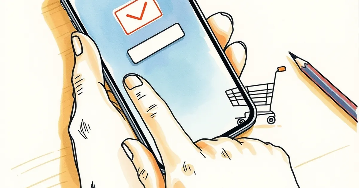
Four taps to pay. Eleven decisions the site quietly made on your behalf before you even saw the button. That gap—between what a checkout feels like and what it is—is where behavioural psychology and website development quietly shake hands. And for Australian businesses, it's the difference between a cart that converts and one that gets abandoned at the postage line.
The invisible ledger your checkout is keeping
When someone says a checkout is "frictionless", they usually mean it's fast. But speed is the visible symptom. The actual work is memory: the site remembering where you left off, what you bought last time, which suburb you're in, whether you're on a phone with a cracked screen at a tram stop in Melbourne or a desktop in a home office in Brisbane.
Every one of those remembered details removes a decision from the customer's plate. And decisions, as any developer who's watched session recordings knows, are expensive.
Behavioural economists call this cognitive load. The more items competing for working memory, the worse humans perform at almost everything—including something as mundane as typing a postcode correctly. So when a checkout "remembers 11 things," it isn't showing off. It's pre-paying a cognitive tax on the customer's behalf.
Here's the uncomfortable part: most of those 11 things were decided by someone. A developer chose to pre-fill the state field. A designer chose to hide the "create account" prompt behind a link. A product manager chose to store the last-used payment method. None of those choices are neutral. Each one is a small bet about what the customer will want next.
Loss aversion at the postage line
Kahneman and Tversky's work on loss aversion is usually trotted out for pricing psychology, but it shows up most brutally at shipping.
A customer has mentally committed to a $79 purchase. They've entered their address. They're four taps from done. Then the postage calculation appears: $14.95. The total jumps to $93.95. Something shifts. The purchase that felt like a good deal now feels like a worse one, and the customer starts doing maths they weren't doing thirty seconds ago.
This isn't rational in the strict sense. The $79 was always going to need postage. But the sequence matters, because losses are felt roughly twice as strongly as equivalent gains. A surprise cost at the end of a checkout registers as a loss. The same cost disclosed at the start registers as information.
Australian retailers have gotten better at this, partly because ACCC guidance on pricing transparency pushed them there. But "better" isn't "solved." Plenty of checkouts still bury delivery costs behind a "calculate" button that only reveals the number after the customer has invested effort. That's not a UX flaw. That's a decision architecture that trades short-term conversion for long-term trust.
The practical fix isn't clever. Show the postage cost before the customer commits to anything. If it varies by region, ask for the postcode early and show the number immediately. The cart should remember the postcode and use it, not hoard it.
Variable rewards and the dashboard trap
There's a concept from behavioural psychology called variable-ratio reinforcement—the idea that unpredictable rewards produce more persistent behaviour than predictable ones. It's the mechanism behind a lot of things that aren't great for us, and it's worth understanding precisely because it's so easy to accidentally build into a website.
Consider the humble order confirmation page. Some businesses show a tracking number. Some show a delivery estimate. Some show a "you might also like" carousel. And some show a spinning wheel or a "check back for updates" prompt that refreshes unpredictably.
Only one of those is a variable reward, and it's the last one. It works—people do check back. It also trains customers to distrust the confirmation, because the confirmation didn't actually confirm anything.
The healthier pattern is the opposite: make the reward predictable and the timing visible. "Your order ships Tuesday, tracking arrives Wednesday morning." That's not exciting. It's also not anxiety-inducing, and anxiety is the enemy of repeat purchase.
For developers, this translates into a design principle: don't use unpredictability as a retention tool. Use it as a diagnostic. If your analytics show people refreshing the order page twelve times, that's not engagement. That's a missing notification.
Risk, competition, and the two-second decision
There's a moment in every checkout where the customer decides whether to trust the site with their card details. It happens fast—often in under two seconds—and it's largely subconscious.
Research on trust and interface design consistently finds that people judge credibility on visual cues before they process any text. Clean layout, consistent typography, visible security indicators, and no jarring pop-ups. These aren't aesthetic preferences. They're risk signals.
This is where the competitive angle gets interesting. Australian e-commerce is not a monopoly. If a customer is comparing two sites and one of them feels slightly riskier, they don't need to articulate why. They just leave. The cart that remembers 11 things is competing against a cart that remembers 11 things and looks like it was built by people who care.
The practical takeaway for anyone building or commissioning a website: audit your checkout for the small stuff. Does the card field format correctly? Does the error message tell the customer what to fix, or just that something's wrong? Does the back button work without losing data? These are not glamorous features. They're the difference between a customer who completes and one who closes the tab and buys from someone else.
What to build next
The forward-looking move isn't to add more features. It's to remove the ones that create decisions.
Start by mapping every decision your checkout asks the customer to make. Not every field—every decision. "Which delivery option?" is a decision. "Do I want an account?" is a decision. "Is this the right card?" is a decision. Count them. The number will probably be higher than you think.
Then ask, for each one: could the site remember this instead? Could it default intelligently? Could it ask earlier, when the customer isn't already committed?
The checkout that completes in four taps isn't a design trick. It's the result of a team that treated memory as a feature and decisions as a cost. Build that, and the eleven things your cart remembers will stop being invisible infrastructure and start being the reason people come back.
The next frontier isn't fewer taps. It's fewer moments of doubt—and that's a problem website developers can actually solve.