Churn doubles at the 9th onboarding screen—cut it there
Why users churn at onboarding screen nine—and how to cut that drop-off without redesigning your flow
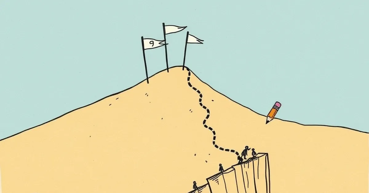
It’s the most predictable moment in any website build. You’ve spent months perfecting the value proposition, the design is crisp, and the analytics look stellar right up until the moment a new user hits screen nine of your onboarding flow. Then the graph just falls off a cliff. We obsess over acquisition and first impressions, but the silent killer is that weird, specific point in the middle of a setup process where cognitive fatigue meets the fear of commitment. Why does churn spike so violently at the ninth step, and what can a developer actually do about it without gutting the entire user journey?
The answer isn’t in better UI copy or a faster server. It’s in understanding that your onboarding flow isn’t just a technical sequence—it’s a psychological gauntlet. When you ask a user to commit to a multi-step process, you’re triggering the same mental machinery that governs risk assessment and loss aversion. Let’s pull apart that ninth screen and look at what’s really happening under the hood.
The Curse of the Mid-Point: It’s Not the End, It’s the Uncertainty
We tend to think of drop-off as a failure of the last screen they saw. But behavioural research tells a different story. The ninth screen isn’t inherently harder than the third or the fourth; it’s just where the perceived cost of continuing starts to outweigh the perceived reward of finishing. This is classic prospect theory, straight out of Kahneman and Tversky’s playbook. Users don’t evaluate the remaining steps in isolation—they evaluate them against the effort they’ve already sunk.
Here’s the kicker: by screen nine, the user has usually provided enough data to see the shape of the solution. They’ve connected a calendar, uploaded a CSV, or selected a template. In their mind, the job is 80% done. But your flow is asking for more—maybe a team member invite, a billing detail, or a preference toggle that feels trivial. That’s where loss aversion kicks in. They’re not thinking, “I’ll gain a fully configured dashboard.” They’re thinking, “I’ve already invested ten minutes; what if the next step asks for something I don’t have?”
The ninth screen is the point of maximum ambiguity. It’s not that the user is lazy; it’s that their brain is doing a rapid cost-benefit analysis on an unknown variable. If the next step is opaque—say, a request for an API key they don’t have yet—the perceived risk spikes. They’d rather bail with a partial win than risk feeling incompetent.
Variable-Ratio Reinforcement Works—Until It Doesn’t
We’ve all read about variable-ratio reinforcement, the behavioural principle where unpredictable rewards create the strongest habits. It’s why slot machines are addictive and why checking your phone for notifications feels so compelling. But here’s the twist: variable-ratio reinforcement is terrible for sequential onboarding. When you’re asking for a linear series of inputs, every screen should feel like a predictable, incremental win. If screen seven is a breeze, screen eight is a breeze, and then screen nine suddenly asks for a “business type” dropdown with 14 options, you’ve broken the rhythm.
The research on this is clear from the world of competitive game design. In games like Fortnite or League of Legends, the tutorial doesn’t throw a mid-boss at you on the ninth step. It introduces a new mechanic, lets you master it, and then escalates the difficulty. If you spike the difficulty or the cognitive load at screen nine, you’re essentially telling the user that the rules have changed. The reward loop is broken.
For a website developer, this means auditing your onboarding for difficulty spikes. Is screen nine where you ask for the first piece of non-obvious information? Is it where you switch from multiple-choice to free-text fields? Is it where you suddenly need a credit card for a free trial? If so, you’re not dealing with a UX problem—you’re dealing with a reward-loop mismatch. The user expected a smooth, predictable climb, and you gave them a cliff.
The "Loss" of Switching Costs and the Sunk Cost Fallacy
Let’s talk about switching costs from a purely technical perspective. In web development, we often optimise for reducing friction—fewer clicks, faster load times, autofill. But behavioural psychology suggests that a little friction is actually good for retention, provided it’s placed correctly. The sunk cost fallacy is real: if a user has invested 20 minutes and 9 screens, they’re less likely to abandon if they feel they’ve already “bought in.”
But here’s the problem: the ninth screen is often where we remove the sunk cost. Many modern onboarding flows have a “Skip for now” button that appears around step eight or nine. That’s a huge mistake. By offering an explicit escape hatch at the exact moment of maximum uncertainty, you’re giving the user permission to rationalise the loss. They think, “Well, I’ll just skip this and come back later.” But they never come back.
Instead, the ninth screen should be where you cement the sunk cost. This is where you show a progress bar that says “90% complete—just one more step.” But more importantly, it’s where you should display a preview of the outcome. If they’ve set up their project, show them what the dashboard will look like when they hit “Finish.” That visualisation converts their past effort into a tangible future asset. It’s not about removing friction; it’s about making the loss of quitting feel more painful than the cost of continuing.
Concrete Example: The Trello Onboarding Shift
Let’s look at a real case. Trello, back in its early growth phase, had a notoriously long onboarding that asked you to create boards, invite members, and set up power-ups. Their analytics showed a brutal drop-off around the seventh or eighth interaction—right where they asked you to invite a teammate. The fix wasn’t to cut the invite step. Instead, they changed the order.
They moved the invite step to the beginning, right after creating an account. Why? Because inviting a teammate is a high-commitment, high-loss-aversion action. If you ask for it early, the user hasn’t sunk much time, so they’re more willing to do it—or they leave quickly without wasting their time. By the time they hit the later screens, the remaining steps were low-stakes configuration toggles. The result was a smoother psychological curve: high-commitment early, low-commitment later.
Apply that to your own flow. Look at screen nine. Is it asking for something that requires a social commitment (inviting a colleague) or a financial one (entering a card)? If so, move it to step two or three. Conversely, if screen nine is asking for something trivial but looks complex (a lengthy permissions matrix), reframe it as a simple toggle with sensible defaults pre-selected.
The Forward-Looking Fix: Design for the "Decision Point" Not the "Finish Line"
So, what do we do with that ninth screen? Stop treating it as a hurdle to be minimised and start treating it as a decision point to be clarified. The user isn’t leaving because they’re tired; they’re leaving because they can’t predict the outcome of the next click.
Here’s the practical, forward-looking approach for your next build:
Audit for the "Unknown Variable" — Go through your onboarding and flag every screen where a user must provide data they might not have on hand (e.g., an API key, a tax ID, a manager’s email). These are your churn spikes. Move them to the end of the flow after the user has seen a successful “setup complete” state, and make them optional.
Implement a "Preview" State at 80% — At the screen where you’d normally hit 80% completion, don’t ask for more input. Instead, show a mock preview of the finished product. Let them see the dashboard, the report, or the integration working with their dummy data. This converts abstract effort into a concrete reward and kills the uncertainty.
Use "Loss Aversion" as a Retention Tool — On your final screens, don’t say “Skip for now.” Say “Finish setup to activate your [feature].” Frame the next step as a threshold that unlocks value, not as a burden. If they’ve entered their business name and URL, tell them that hitting “Continue” will turn on their live site. The cost of stopping becomes the loss of a live site, not just an incomplete form.
Test the "Mid-Point Inversion" — Take your screen nine and literally move it to screen two. Run an A/B test for two weeks. Watch not just the completion rate, but the quality of users who complete. You might find that the users who are willing to do the high-commitment step early are exactly the ones who become your power users.
The ninth screen isn’t your enemy. It’s a mirror reflecting the moment your user’s internal risk calculator overrides their curiosity. Stop trying to make it prettier. Instead, change the calculus—show them the win, hide the optional complexity, and move the scary asks to the front door where the excitement is still high. That’s not just better UX; it’s better behavioural engineering.