Confetti at checkout fires once—repeat purchase needs 3 visits
Checkout confetti celebrates a first purchase once, leaving Australian ecommerce brands to find what genuinely brings customers back for visit two and three
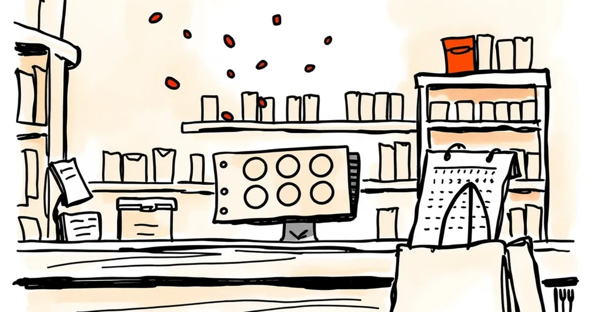
Everyone remembers their first confetti moment. The order lands, the screen erupts, the little dopamine hit arrives right on cue. But ask any Australian ecommerce operator what happens on visit two or three and the story gets quieter. The question worth sitting with is this: if the reward is designed for the first purchase, what's actually pulling the customer back for the second and third?
The first-purchase high is a one-shot design
Most checkout celebrations are built like a finish line. They mark the end of a transaction, and they're genuinely good at it. The problem is that behavioural design has quietly trained customers to expect that peak, then left nothing on the table for the return journey.
This is where behavioural psychology gets interesting for anyone building websites for businesses. The confetti isn't the reward. It's a signal that a reward happened. Strip it of novelty and you're left with the underlying question: what does the customer get for coming back?
B.F. Skinner's work on reinforcement schedules is the classic reference here, and it holds up. Continuous reinforcement—reward every single time—produces fast learning but rapid extinction. The moment the reward stops, the behaviour stops. Variable-ratio schedules, where rewards arrive unpredictably after a number of actions, produce far more persistent behaviour. That's the uncomfortable lesson for checkout design: a guaranteed celebration on purchase one is the least durable pattern available.
The smarter play is to treat the first purchase as onboarding, not the climax. Confetti fires once. What fires on visit two needs to feel different, and what fires on visit three needs to feel earned.
Loss aversion is doing more work than delight
Kahneman and Tversky's prospect theory gave us the now-familiar finding that losses loom roughly twice as large as equivalent gains. Most retention design ignores this entirely and keeps stacking more delight on top of delight.
Consider the difference between these two emails:
- "Here's 10% off your next order."
- "Your $15 credit expires in 6 days."
Same value. Wildly different response rates. The second one reframes the offer as something the customer already owns and is about to lose. That's not manipulation—it's just accurate framing of a real deadline.
There's a concrete example worth knowing. In a well-cited field experiment on gym attendance, researchers found that framing a commitment as a loss if unmet (money forfeited for missed sessions) drove significantly higher attendance than framing it as a reward for showing up. The mechanism was loss aversion, plain and simple. The same logic applies to a second visit: give the customer something to protect, not just something to chase.
For Australian businesses, this translates to loyalty credits with visible expiry, "your cart is waiting" nudges that reference a specific saved item, and member pricing that lapses. The design question shifts from how do we delight them to what do they already hold that's worth returning for.
Three visits is a habit, not a campaign
The three-visit threshold isn't arbitrary. It maps roughly onto what habit researchers call the "three-peat" pattern—the point at which a behaviour starts shifting from deliberate decision to automatic response. Before that, every visit is a conscious choice competing with a dozen alternatives. After it, the site starts living in the customer's mental shortlist.
What does the second visit actually need to do? It needs to make the third one easier. That means:
- Reducing friction, not adding novelty. The second visit should be measurably faster than the first. Saved details, remembered preferences, a "welcome back" that acknowledges what they bought.
- Creating a reason that isn't a discount. Discounts train customers to wait. A reason to return could be a restock alert on a sold-out size, a how-to guide tied to their purchase, or a community feature. Anything that rewards attention rather than patience.
- Signalling progress. A simple "2 of 3 visits to unlock free shipping" progress bar is crude but effective. It converts an abstract relationship into a visible countdown.
The confetti on visit one is a sugar hit. The visit-three reward should feel like a relationship milestone—something the customer did rather than something that happened to them.
Decision-making under uncertainty is where retention gets hard
Here's the part most retention playbooks skip: customers don't know if coming back is worth it. They're operating under uncertainty, and the brain handles that with heuristics that often work against the business.
The availability heuristic means a customer judges your reliability by the most recent experience, not the average. One slow delivery wipes out five good ones. The peak-end rule means they remember the best moment and the last moment, not the middle. So if visit one was a confetti explosion and visit two was a quiet, unremarkable return, the end of that story is "nothing happened." The peak-end rule will weight that quiet ending heavily.
This is why the second visit deserves disproportionate design attention. It's the moment where the customer's mental model of your site gets rewritten. If visit two feels like a downgrade from visit one, the story ends there. If visit two feels like a different kind of good—faster, more personal, more useful—the customer starts building a more durable model of the relationship.
There's a real risk in over-indexing on the first-purchase celebration. It sets an expectation that the rest of the experience then has to match, and most businesses don't have the budget to fire confetti every time. The smarter architecture is a deliberate de-escalation of spectacle paired with an escalation of utility.
What to build instead
If you're designing for repeat purchase, here's the forward-looking version of the brief:
- Visit one: celebrate the decision. Confetti is fine. But immediately set expectations for what comes next—"your member perks activate on your next order."
- Visit two: prioritise speed and recognition. The site should feel like it remembers them. No confetti, but a clear, specific reason to be there.
- Visit three: deliver the promised reward. This is the moment to make good on the loss-aversion play—the credit that was expiring, the progress bar that just completed, the tier that just unlocked.
The underlying principle is that you're designing a sequence, not a series of moments. Each visit should make the next one feel more inevitable. And the visit-three reward should feel like the natural conclusion of a story the customer has been participating in, not a random gift.
The businesses that get this right tend to be the ones that stop thinking of their website as a storefront and start thinking of it as a behavioural system. That's a shift worth making, and it starts with the question of what happens after the confetti settles.