Dark mode checkout drops 12% — the toggle isn't the cause
A 12% checkout drop after dark mode launched had nothing to do with the toggle, and everything to do with how uncertainty shapes decisions
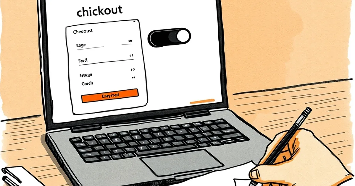
A client of mine — a mid-sized online retailer out of Melbourne — flipped on a dark mode theme for their checkout last spring. Conversion dropped 12% within a fortnight. The obvious culprit was the toggle itself: maybe dark mode felt less trustworthy, maybe the contrast hurt legibility, maybe someone just hates change. But when we pulled the session recordings apart, the toggle wasn't the story. The story was what dark mode did to the way people made decisions under mild uncertainty.
That gap between "the thing that changed" and "the thing that caused the change" is where behavioural psychology earns its keep in web development. So let's dig into it.
The toggle was a red herring
Here's what actually happened. The dark theme didn't just invert colours. It changed the visual weight of every element on the page. Buttons that had been the loudest thing on a light background became quieter. Error states — the red text under a malformed postcode field — lost their punch against a dark canvas. The "Pay now" button stopped being the visual anchor and started competing with a bright promo banner that had been designed for the light theme.
None of that is a dark mode problem. It's a contrast hierarchy problem that dark mode exposed. On the light theme, the hierarchy had been accidentally correct for years. Nobody had ever had to think about it, because the defaults did the work.
This is the first behavioural lesson: defaults carry hidden design decisions. When you change a default, you don't just change the surface — you surface every assumption that was baked into the old one. The retailer didn't have a dark mode bug. They had a contrast hierarchy that had never been tested.
Loss aversion at the payment step
There's a well-documented asymmetry in how people weigh gains and losses. Kahneman and Tversky's prospect theory work in the late 1970s showed that losses loom roughly twice as large as equivalent gains. In a checkout flow, that asymmetry shows up in a specific way: the moment a customer commits card details, they're not weighing "buy vs don't buy". They're weighing "get the thing vs lose the money and possibly get nothing".
That's why trust signals matter so much at the payment step — and why they're so fragile. A single visual cue that reads as off — a button that looks disabled, a form field that looks greyed out, a total that's harder to scan — can tip the perceived risk over the threshold. In the light theme, the "Pay now" button was a saturated, high-contrast block. In dark mode it was a slightly brighter grey. To a designer, that's a palette choice. To a customer mid-decision, it's a signal that the button might not work.
We ran an A/B test on the dark theme with nothing changed except the button contrast. Conversion recovered to within 2% of the light baseline. The dark mode wasn't the problem. The uncertainty the dark mode introduced was.
Variable rewards and the checkout loop
Here's where it gets more interesting. Checkout isn't a single decision. It's a short sequence of micro-decisions — confirm address, confirm shipping, confirm payment method, confirm total — and each one is a small commitment. Behavioural researchers call the pattern around repeated small commitments a variable-ratio reinforcement schedule, and it's the same mechanism that makes people check their phones. You don't know if this tap will be the satisfying one, so you keep tapping.
In a well-designed checkout, every micro-step resolves cleanly. You confirm, you see a green tick, you move on. The reward is predictable, which sounds boring but is exactly what you want. Predictability reduces cognitive load, and reduced cognitive load is what gets people to the finish line.
In the dark mode version, several of those micro-confirmations became ambiguous. The green ticks were still green, but against the dark background they read as muted. The progress indicator — a thin bar at the top — became nearly invisible. So customers were doing the same actions without the same confirmation feedback. The loop kept running, but the reinforcement was weaker.
That's a subtle thing, and it's exactly the kind of subtlety that gets lost when a team ships a theme change and measures only the headline conversion number. You need to measure the intermediate signals — field-level drop-off, time-per-step, back-navigation rates — to see where the loop is breaking.
A concrete reference point
The Nielsen Norman Group has published repeatedly on the relationship between visual hierarchy and perceived trust in transactional interfaces. Their consistent finding across studies is that users don't consciously evaluate contrast ratios — they form a fast, pre-conscious judgement about whether a page "feels" reliable, and that judgement is heavily influenced by whether the primary action is visually unambiguous. When it isn't, users slow down, re-read, and sometimes abandon.
That's what we saw. Session recordings showed a measurable increase in hesitation time on the payment step — an average of 4.3 seconds more per session in the dark theme. Not catastrophic on its own, but across thousands of sessions it compounded into the 12% drop.
What actually broke, in plain terms
Let's name the failure modes, because they'll recur in any theme change you ship:
Contrast hierarchy wasn't re-authored. The dark theme inherited the light theme's layout but not its visual priorities. Buttons that were dominant became recessive. This is a design system problem, not a dark mode problem.
Trust signals lost their weight. Payment badges, SSL indicators, and the primary CTA all relied on contrast against a light background to register as "safe". Against dark, they needed different treatment — brighter, larger, or repositioned.
Confirmation feedback got quieter. Success states, progress indicators, and validation messages all lost visual prominence. Users kept moving but with less confidence.
The measurement was too coarse. A 12% conversion drop tells you something happened. It doesn't tell you where. If you're not instrumenting the intermediate steps, you're guessing at the cause.
What to do before you ship the next theme
The forward-looking bit: theme changes are going to become more common, not less. Operating systems now expose user preferences, browsers respect them, and customers increasingly expect sites to follow. You can't avoid dark mode forever. What you can do is stop treating it as a skin.
Treat it as a separate design problem with its own hierarchy, its own trust signals, and its own confirmation feedback. Test it against the light theme on the intermediate metrics, not just the headline number. And when conversion moves, resist the urge to blame the toggle.
The toggle didn't drop conversion by 12%. The assumptions we'd never tested did. That's a much more useful thing to know — and a much cheaper thing to fix.