Decision fatigue hits at choice 4—your nav menu isn't helping
The fourth menu choice is where users stall, and decision fatigue research explains why your navigation may be quietly driving them away
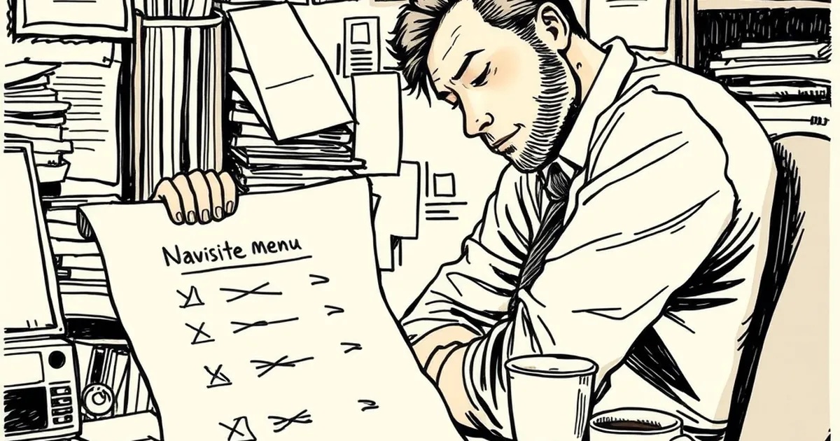
There's a specific moment in user testing that should terrify anyone who builds websites for a living. It's not the rage click. It's not the bounce. It's the pause — that half-second where someone's cursor drifts across your navigation, hovers over one item, then another, then another, and finally just... leaves. The question I keep coming back to is simple: at what point does a menu stop being a map and start being a maze?
The Fourth Choice Is Where Things Get Ugly
Behavioural researchers have been poking at decision fatigue for decades, and the finding that keeps resurfacing is that the number of options matters less than where they sit in the sequence. Sheena Iyengar's famous jam study — 24 varieties versus 6 — is the one everyone quotes, but the detail people skip is that the 24-jam table attracted more browsers and converted far fewer buyers. More options pulled people in, then paralysed them at the point of commitment.
Roughly four items in, something shifts. The first few choices feel like genuine options. By the fourth, you're not comparing anymore — you're rationing. Your brain starts looking for an exit rather than a destination.
This maps almost perfectly onto how people scan a nav menu. The first two or three items get real consideration. By item four, attention is thinning. By item six, most visitors are pattern-matching on shape and length rather than reading. If your primary navigation has nine top-level items, you're not offering nine pathways. You're offering two or three real ones and a wall of noise that looks like choice.
Loss aversion does the rest
Kahneman and Tversky's work on loss aversion tells us people weigh potential losses about twice as heavily as equivalent gains. In navigation terms, that means the fear of clicking the wrong thing — of landing somewhere irrelevant and wasting thirty seconds — is roughly twice as motivating as the promise of finding the right thing. Every additional menu item raises the perceived cost of a misclick. You're not adding options. You're adding risk.
What Your Menu Is Actually Competing With
Here's the part that stings. Your navigation isn't competing with your competitors' navigation. It's competing with the back button.
Think about how people actually move through a site they don't know. They arrive from a search result or a social link with one specific question. They're not browsing. They're hunting. If your menu makes the hunt feel like work, the cheapest move available is to leave and try a different search result — and leaving costs nothing, while clicking the wrong menu item costs a page load, a scroll, and a re-orientation.
This is where the reward loop concept gets interesting, and slightly uncomfortable. Variable-ratio reinforcement — the pattern where a reward arrives unpredictably — is one of the most persistent drivers of repeated behaviour we know of. It's why people keep pulling a lever, refreshing a feed, checking a notification. Website navigation accidentally creates a version of this when menu labels are vague. If "Solutions" sometimes leads to what you want and sometimes doesn't, you'll click it again next time, half-hoping. That's not a good user experience. That's a compulsion loop with a bad hit rate.
Good navigation does the opposite. It makes outcomes predictable. Predictability feels boring to designers and feels like relief to users.
The Evidence From Eye-Tracking
The concrete example worth sitting with comes from a well-replicated pattern in eye-tracking research on menu scanning: participants typically fixate on the first two or three items in a horizontal or vertical list, then their gaze shortens and accelerates across the remainder. Reading time per item drops by roughly half after the third position. They're not reading the rest. They're confirming the rest exists and moving on.
So when you add a seventh item to your nav because someone in a meeting asked for it, you're not adding a seventh option. You're diluting the first three. The items that actually convert get less attention because they're sharing a limited pool of cognitive effort with items nobody clicks.
The mobile version is worse
On a phone, the same menu becomes a hamburger drawer, which means the user has to ask to see the options before they can evaluate them. That extra step raises the cost of even looking. If the drawer then reveals eight items with similar-length labels, you've created a decision problem behind a door the user had to open deliberately. The frustration is compounded, not distributed.
Designing For The Third Choice, Not The Ninth
If decision fatigue bites at item four, the practical target is to make your first three items carry almost all the weight. That usually means a few uncomfortable conversations.
Name things by what people want, not what you call them internally. "Services" is a filing cabinet label. "Get a quote" is a destination. Your org chart is not your navigation.
Kill the catch-all. "Other," "Resources," and "More" are where clarity goes to die. If something doesn't fit your top three, it probably belongs in the footer, in a contextual link, or in search.
Give the top three visual weight. Slightly more spacing, slightly bolder type, maybe a subtle divider. You're signalling priority, and users read that signal fast.
Test the pause. Watch five people try to complete one task on your site. Count the seconds before their first click. If it's more than about three, your menu is asking them to think, and thinking is the thing you're trying to spare them.
Reconsider the hamburger on desktop. On wide screens, showing three clear options beats hiding eight behind an icon. The drawer made sense when screens were small. Most screens aren't.
Where This Goes Next
The interesting frontier isn't fewer menu items — it's menus that adapt to intent. Search-driven navigation, contextual entry points, and interfaces that infer where someone is trying to go from how they arrived are all quietly eating the traditional nav bar's lunch. Google's been doing this for years with query-matched landing pages, and it's why so much organic traffic now skips your homepage entirely.
The forward-looking move for anyone building business sites in Australia right now is to stop treating the nav as a permanent structural feature and start treating it as one of several entry points — and a fairly blunt one at that. If your analytics show most visitors land deep and never touch the top menu, you've already got your answer about how much weight it deserves.
The menu isn't dead. But it stopped being the front door a while ago, and the sites that still act like it is are the ones where the cursor hovers, drifts, and leaves.