Exit-intent popups fire at 2s — the discount lands at 40
Exit-intent popups fire too early to catch real buying intent, and the timing gap between trigger and discount may be costing conversions
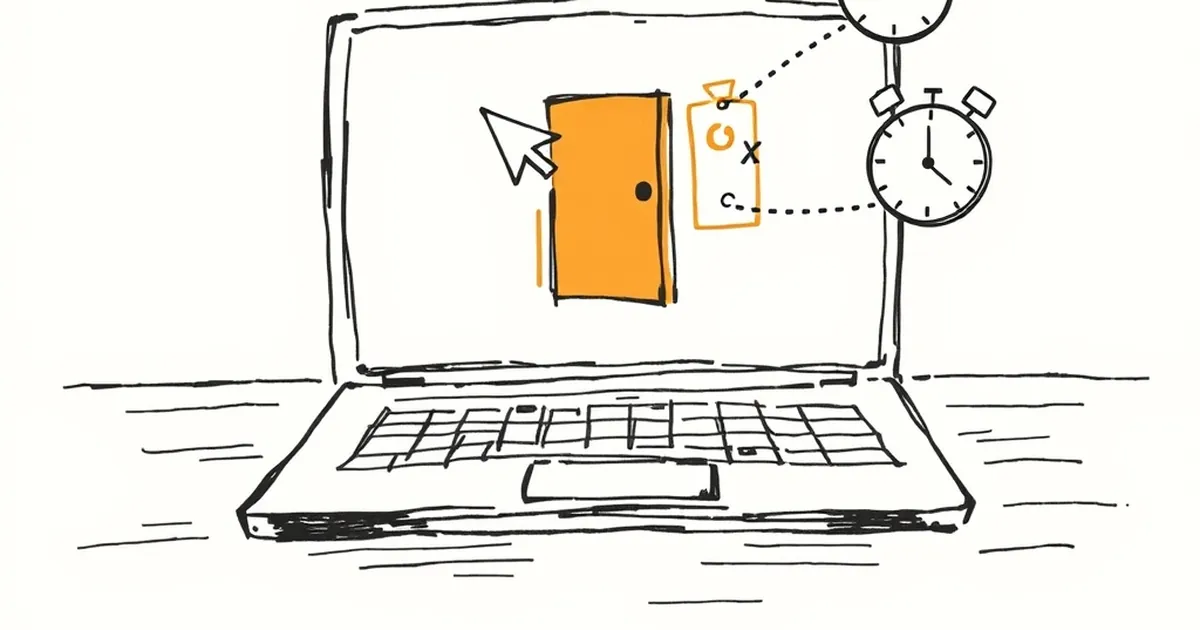
There's a moment in every behavioural experiment where the timing of the intervention matters more than the intervention itself. In web development we've spent a decade obsessing over what to show users — the offer, the copy, the colour of the button. We've spent comparatively little time on when. And yet when is often the whole game.
Consider the exit-intent popup. It fires when the cursor drifts toward the tab bar or the back button — usually somewhere between 1.5 and 3 seconds after the page settles. On a typical Australian retail site, that's before the visitor has read a single product description. It's a panic move dressed up as personalisation. Meanwhile, the discount code it's offering often doesn't land in the customer's inbox or on their screen until 40 seconds in — sometimes not until the second visit, sometimes never. We've built a system that interrupts people before they've decided anything, then rewards them long after they've stopped caring.
The question worth sitting with: what would happen if we treated timing as a design material rather than an afterthought?
The 2-second problem
Two seconds is roughly the time it takes a person to form a first impression of a webpage. Research on visual complexity and trust judgements suggests we're evaluating credibility in the 50-millisecond range, and general "is this worth my attention" assessments settle within a few seconds. So by the time your exit-intent trigger fires, you're not interrupting a decision — you're interrupting the pre-decision phase, where the visitor is still asking whether the page is even relevant to them.
That's a strange place to deploy a discount. Discounts work on people who already want something. They convert intent into action. They don't manufacture intent out of indifference. When you offer 15% off to someone who hasn't yet worked out what you sell, you're not sweetening a deal — you're signalling that the deal needed sweetening, which is its own kind of information. Kahneman's framing here is useful: people are loss-averse, and a discount presented too early can read as a loss of perceived value rather than a gain. If it's on sale before I've looked at it, what's wrong with it?
There's also a subtler cost. Exit-intent popups at 2 seconds train your audience. They learn that leaving triggers a reward. That's a variable-ratio reinforcement schedule — the same one that makes people pull levers — except you're the lever, and the behaviour you're reinforcing is abandonment. You are literally teaching repeat visitors to bail early to see what falls out.
What the 40-second window actually represents
Forty seconds is roughly the point at which a motivated visitor has done something meaningful: scrolled past the hero, opened a product page, read a review, compared two options. It's not a universal number — it varies by page type and intent — but it's a useful stand-in for "past the point of mere curiosity." The discount arriving here does a different job. It removes friction from a decision the visitor was already leaning toward.
The mismatch is the real story. We have a trigger tuned to disengagement (cursor toward the tab bar) and a reward tuned to engagement (a code that requires reading, copying, applying). The two are running on different clocks, and the customer is caught in the gap.
A concrete example worth knowing: Booking.com's famous "only 2 rooms left at this price" nudges are calibrated to appear after you've shown interest in a specific property — after you've clicked in, checked dates, maybe read reviews. The scarcity message doesn't fire on arrival. It fires when you're already committed enough that losing the room would feel like a loss. That's not an accident of engineering; it's a deliberate sequencing decision. The urgency is real to the user because it lands at the moment urgency can be felt.
Designing for the right moment, not the fastest one
If timing is a design material, then the practical question becomes: what signals tell us the visitor has crossed from browsing to considering? A few that hold up in Australian e-commerce contexts:
- Scroll depth combined with time. 60% scroll plus 30 seconds is a much better "considering" signal than either alone.
- Return visits to the same product. Someone who's looked at the same item twice is doing comparison work, not window shopping.
- Cart activity without checkout. Adding to cart is a strong intent signal; abandoning checkout is a strong friction signal. Different problems, different interventions.
- Exit velocity. If someone's mouse moves toward the tab bar slowly, they're hesitating. If it rockets there, they've decided. Only the first is worth interrupting.
The exit-intent trigger itself isn't wrong — it's just under-specified. A slow exit after 45 seconds on a product page is a completely different event from a fast exit after 2 seconds on a landing page. Same trigger, opposite meanings.
The reward loop you're actually building
Here's the part that rarely makes it into conversion rate optimisation decks. Every popup is a training event. Your visitors are learning, over repeated exposures, what your site does when they behave in certain ways. If leaving early yields a discount, you're building a population of visitors who leave early. If waiting yields nothing and leaving yields something, you've inverted the incentive.
Behavioural economists call this the principal-agent problem dressed in UX clothing: your short-term metric (popup conversion rate) and your long-term interest (customer lifetime value) are pulling in different directions. The popup that converts at 4% by firing at 2 seconds might be suppressing the customer who would have converted at full price at 90 seconds. You'll never see that person in the analytics, because they never triggered the popup — they just bought, unhelped and unrecorded.
Where this goes next
The interesting frontier isn't better popups. It's timing models that treat the page as a sequence of states — arrival, orientation, evaluation, decision, exit — and only intervene where the state matches the intervention. That means building the instrumentation to know which state a visitor is in, which is a web development problem before it's a marketing one.
Forward-looking teams are already moving this way: server-side event streams that timestamp micro-behaviours, session models that distinguish hesitation from decision, and offer engines that hold fire until the moment an offer would actually change someone's mind. The 2-second popup isn't going to disappear overnight, but it's becoming harder to defend. The data's been telling us for years that the discount lands best when the customer is ready to receive it — we've just been too impatient to wait the 38 extra seconds.