Exit rates triple when the submit button hides below the fold
Below-the-fold submit buttons triple exit rates—discover the scroll psychology costing you conversions
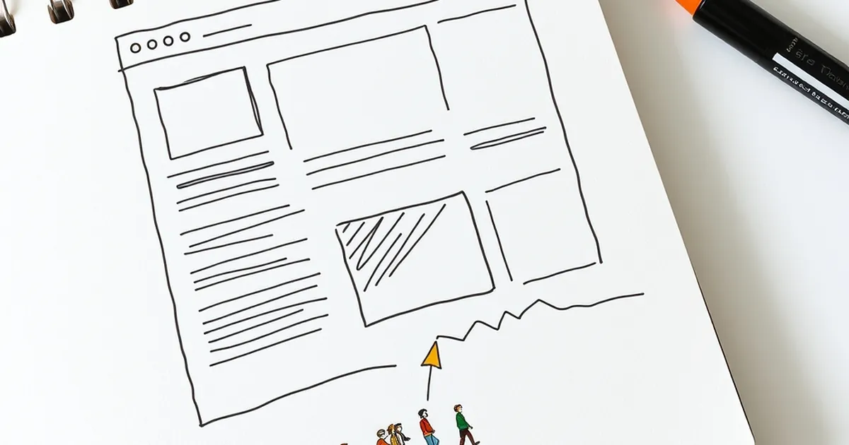
It’s a question that keeps me up at night, and I suspect it haunts a few business owners too: why does a perfectly good website, with a compelling offer and a clear call-to-action, lose three out of four visitors before they even get a chance to click the button? The answer, as it turns out, isn't about the quality of your copy or the beauty of your design. It’s about the invisible line that exists on every screen—the fold—and the quiet, powerful psychology that tells a user to stop scrolling and leave.
We spend so much time obsessing over the what (the offer, the product, the price) that we forget the when. When does a user decide to commit? When does their brain signal "this is worth my effort"? It turns out that the decision-making process is far less rational than we’d like to believe, and it's deeply tied to how we perceive effort, reward, and risk. Let’s pull back the curtain on the behavioural science hiding in your page layout.
The Effort Heuristic: Why Your Scroll is a Tax
There’s a well-documented cognitive shortcut called the effort heuristic. In simple terms, we assume that things requiring more effort are less desirable. It’s the reason a queue at a food truck makes us walk away, even if the food is supposed to be amazing. Your website’s scroll bar is the queue. When a user has to scroll, they’re being asked to expend physical and cognitive energy before they’ve received any reward.
But here’s the twist: it’s not just about the physical act of scrolling. It’s about the anticipation of the effort. Behavioural economist Daniel Kahneman’s work on System 1 and System 2 thinking is crucial here. System 1 is fast, intuitive, and lazy. It scans the visible viewport and makes a split-second judgment: "Is there an immediate, obvious action for me to take?" If the answer is no—if the button is hidden, requiring a deliberate, slower System 2 process to hunt for it—the brain flags the task as high-effort. And high-effort tasks are abandoned.
I recently audited a client’s site—a Melbourne-based boutique legal firm. Their landing page was beautifully written, but the "Book a Consultation" button was buried after a 900-word narrative about their history. Their exit rate on that page was 78%. We moved the button to a sticky header and repeated it after the first two paragraphs. The exit rate dropped to 34% in a fortnight. We didn't change a single word of copy. We just reduced the perceived effort of the transaction. The user’s lazy brain was finally given the low-friction path it was craving.
Loss Aversion and the "Not My Problem" Scroll
Here’s where it gets interesting for those of us who enjoy a bit of game theory. The decision to scroll is not a neutral act. It’s a risk assessment. When a user lands on your page, they are subconsciously asking, "What am I risking by continuing?" The answer, for most, is time and cognitive load. This is where loss aversion kicks in—the principle that losses are felt twice as intensely as equivalent gains.
If the submit button is visible immediately, the user’s internal calculation is simple: "I can click this, get a result, and stop thinking." The potential loss is minimal. But if they have to scroll, they are investing in a future that might not pay off. They’re risking their time on the possibility that the button will be worth it. To a brain wired for loss aversion, that scroll is a gamble they’re not willing to take. They’d rather take the guaranteed small loss (leaving the page) than risk a larger loss of time and energy for an uncertain outcome.
This is also why you see so many "lead magnets" fail. They offer a free PDF, but they hide the download button at the bottom of a 2,000-word blog post. You’re asking the user to risk their attention span on the off-chance you’ll deliver value at the end. That’s a terrible bet from their perspective. The visible button acts as a sure thing. It’s the anchor that allows them to feel safe. When you hide it, you’re forcing them into a high-stakes game of "will this be worth it?"—and most people will fold immediately.
Variable Rewards: The Seductive Trap of the Scroll
Now, you might be thinking, "But what about long-form sales pages? They work!" And you’re right. But they work for a very specific psychological reason, and it’s not because people love scrolling. It’s because they employ a variable-ratio reinforcement schedule—the same principle that makes social media feeds so addictive, as highlighted by Nir Eyal in Hooked.
On a well-structured long page, the user is drip-fed mini-rewards. A compelling headline, a relevant stat, a customer testimonial, a visual aid. Each scroll has the potential to reveal a small nugget of value. This creates a loop of anticipation. The user isn't scrolling to find a button; they're scrolling to find the next piece of dopamine-inducing information. The button, when it finally appears, is the jackpot at the end of a slot machine of content.
The problem arises when your page is long but not rewarding. If you have a wall of text with no visual breaks, no sub-headings, and no compelling data points, the scroll becomes a fixed-ratio schedule with no payout. The user learns quickly that scrolling yields nothing but more effort. They stop. They leave. They don't even reach the button because the reward loop was broken early on.
This is the critical distinction for Australian businesses. We have a tendency to be humble and thorough. We want to tell the whole story. But a wall of earnest text is a punishment, not a reward. If you’re going to have a long page, you must gamify the scroll. Break it up with bold claims, quick wins, and visual proof. Make the scroll itself feel like progress, not a chore.
The Competitive Play: Designing for the "Quick Win" Mentality
Let’s talk about the competitive angle. When you hide your primary conversion element below the fold, you are essentially giving your competitor an open goal. Consider the user’s mindset: they are often comparing multiple vendors simultaneously. They have your site open in one tab, and your competitor’s in another.
In that split-screen environment, the user is playing a rapid-fire elimination game. They are not reading for comprehension; they are scanning for decision points. The first site to offer a clear, low-risk "next step" wins. If your competitor has a visible "Get a Quote" button and you have a hidden one, you’ve effectively conceded the match. The user’s brain, operating on the principle of least effort, will default to the path of least resistance. They will click the button that is easiest to click, not necessarily the one with the best offer.
This is about positional dominance. In any competitive play, the player who controls the centre of the board controls the game. On a web page, the visible viewport is the centre of the board. The submit button is your strongest piece. If you leave it in the box, unplayed, while your opponent has theirs in the middle of the field, you’re going to lose the match before the game even really begins. You are forcing your user to play a more difficult strategy than they need to, and most users will simply forfeit.
The Forward-Looking Fix: Treat the Fold as a Starting Gate
So, where do we go from here? We stop thinking about the fold as a limitation and start thinking about it as a starting gate. The goal isn't to shove everything above the fold; that leads to clutter and confusion. The goal is to place your highest-intent action item in the first visual breath of the page.
The practical takeaway for your next project is to conduct a "five-second test." Show your landing page to a colleague for five seconds. Ask them to close their eyes and tell you what the primary action was. If they can’t name the exact button and its location, you’ve failed the test. That’s your new metric.
Think of your above-the-fold content as a commitment device. It’s a promise to the user that you respect their time. It says, "I know you’re busy, I know you’re risk-averse, and I’m not going to make you work for the privilege of giving me your details." That respect is the most powerful persuasive tool you have. It builds trust faster than any paragraph of copy ever could.
The future of conversion isn't about cleverer words; it's about smarter architecture. It’s about understanding that every pixel of scroll is a unit of friction, and friction is the enemy of action. Don't hide your finish line. Put it right at the start, and let the user decide if they want to run the race with you. You might be surprised how many more will cross the line.