Flow state peaks at 11 reps — the XP bar stops at 3
Why digital reward systems cap out just as human motivation warms up, and what that ten-second moment reveals about product psychology
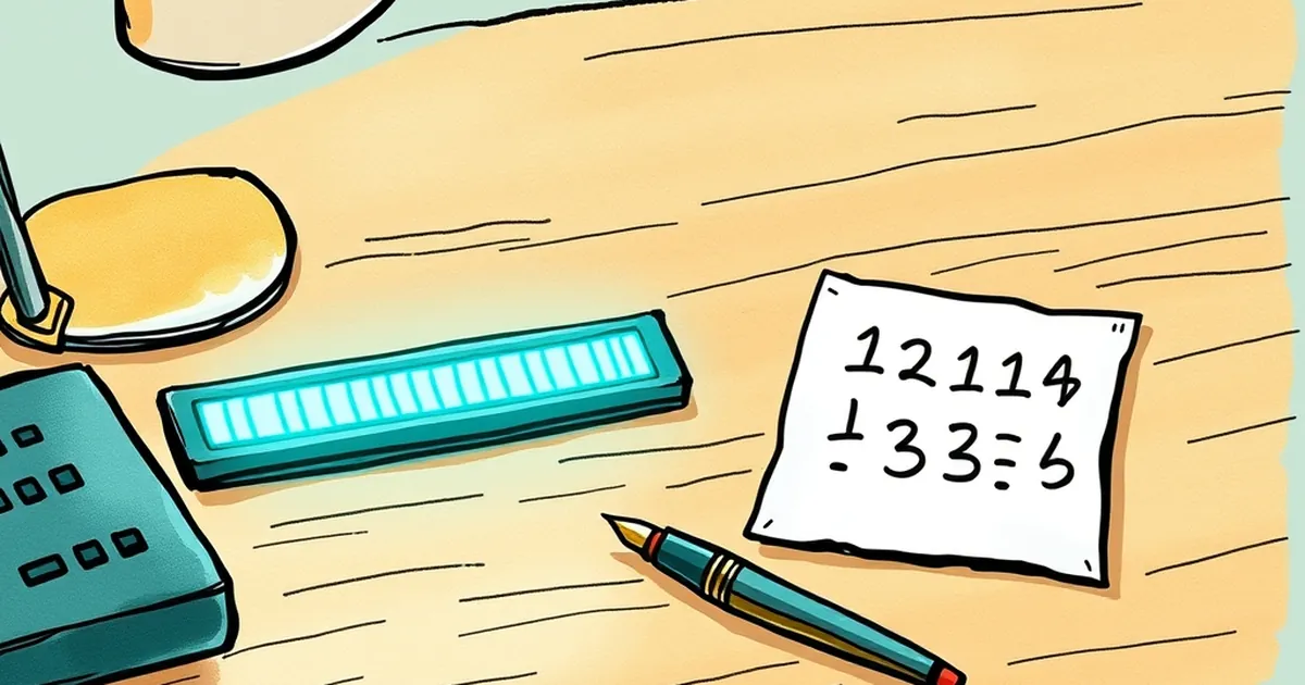
Picture a user on your site. They've just completed a task — filled in a form, added an item to a cart, cleared a level in your onboarding flow. Somewhere in the interface, a small progress indicator ticks over. And then it stops, or worse, it resets. What happens in the next ten seconds tells you more about your product's psychology than any heatmap ever will. The question worth sitting with is this: why do so many digital reward systems cap out exactly where human motivation is just getting warm?
The XP bar problem is a design habit, not a law
Most business websites inherit their reward mechanics from a very narrow lineage. Points, badges, progress bars — these came out of loyalty programs and early gamification toolkits, and they were built around a simple assumption: give people a finite goal, let them hit it, then hand them a voucher or a discount. The bar fills to 100%, confetti fires, everyone goes home.
The trouble is that this design pattern treats motivation as a transaction. The research doesn't quite agree. Work on variable-ratio reinforcement — the intermittent reward schedule that B.F. Skinner documented in the 1950s — showed that unpredictable, partial rewards produce far more persistent behaviour than predictable, complete ones. Skinner's pigeons pecked more when rewards came irregularly. Humans, it turns out, are not dramatically different, though we like to think we are.
A progress bar that fills to 100% and stops is the opposite of variable-ratio. It's fixed, finite, and fully predictable. It's a loyalty card with ten stamps. Useful for a coffee shop. Less useful for anything you want people to keep doing.
What flow state actually requires from an interface
Mihaly Csikszentmihalyi's flow model has three conditions: clear goals, immediate feedback, and a balance between challenge and skill that sits just above the person's current ability. That last one is the interesting bit for web design. Too easy and you get boredom. Too hard and you get anxiety. The sweet spot moves as the person's skill grows — which means the interface has to move with them.
Here's where the "11 reps" idea comes in. In strength training, coaches talk about leaving reps "in the tank" — stopping a set before failure so the nervous system keeps adapting. The productive zone isn't the last rep before collapse; it's somewhere in the middle, where effort is real but sustainable. Flow works the same way. The peak isn't at the moment of completion. It's at the moment of almost — when the next step is visible, achievable, and not yet done.
An XP bar that caps at three tasks is essentially forcing the user to hit failure on purpose. You've built a system that says: here is your ceiling. Reach it, and we have nothing more to say to you.
A concrete example: Duolingo's streak versus its lesson bar
Duolingo is a well-worn example, but it's instructive. The daily lesson bar fills and resets — finite, predictable. The streak, by contrast, has no ceiling. It grows indefinitely, and the perceived cost of breaking it grows with it. That's loss aversion doing the work, in the sense Daniel Kahneman and Amos Tversky described: people weigh losses roughly twice as heavily as equivalent gains. The streak isn't a reward loop so much as a risk-management loop, and it's the streak that keeps people coming back.
For a business website, the lesson is not "copy Duolingo." It's that the ceiling is a choice. You can design a bar that ends, or a metric that accumulates. The first is a transaction. The second is a relationship.
Decision-making under uncertainty is the feature, not the bug
There's a quieter overlap here that doesn't get enough attention. When someone uses your website, they're making a series of small decisions under uncertainty. Will this form take long? Is this pricing page trustworthy? What happens if I click "request a demo"?
Behavioural economics has spent decades mapping how people handle that uncertainty, and one finding keeps showing up: ambiguity aversion. People dislike unknown probabilities more than known bad ones. A 20% chance of something going wrong feels worse than a certain 15% chance, even though the maths says otherwise (Ellsberg's paradox, 1961).
Good interface design reduces ambiguity without eliminating it. A progress bar that says "step 2 of 4" is a known probability. A bar that says "you're 60% through" with no total is an unknown one. Neither is inherently better — but the first builds trust quickly, and the second builds engagement. The trick is knowing which your audience needs at which moment.
For a business site, that usually means: be explicit about cost and commitment, be less explicit about discovery. Let people feel their way through the exploration, but never let them feel ambushed by a hidden step.
Risk-taking, competitive play, and the social layer
Humans are competitive in specific, well-documented ways. Social comparison — the tendency to evaluate ourselves against others — is one of the strongest drivers of sustained effort. Leaderboards work not because people love points, but because points are visible to other people.
But leaderboards also have a well-known failure mode: they demotivate everyone who isn't near the top. The research on this is fairly consistent. If you're going to introduce competitive play into a business website — a referral ladder, a usage ranking, a community challenge — the design question is whether the comparison is upward (aspirational) or downward (threatening). Upward comparison motivates when the gap looks closeable. Downward comparison just makes people feel bad.
The practical move is to compete people against their own past performance rather than against strangers. "You've completed 7 of your last 10 tasks" is a competitive frame that doesn't require a podium.
Designing for the next rep, not the last one
So what does this look like in practice, for a business site that isn't a game?
Start by auditing every place your interface says "done." Every completion state, every 100% bar, every "congratulations, you've finished." Then ask: what's the next rep? Not the next purchase — the next action. If the answer is "nothing," you've built a ceiling.
Second, make at least one metric unbounded. A counter that only goes up. A streak that has no maximum. Something the user can keep adding to without the interface ever telling them they've maxed out.
Third, keep the feedback immediate and the challenge slightly ahead of the skill. That's the Csikszentmihalyi condition, and it's the one most business sites ignore entirely. A user who has just mastered your onboarding flow should be immediately presented with something marginally harder — not a thank-you page.
None of this requires a game. It requires treating motivation as a system that has a shape, and building the shape deliberately. The XP bar that stops at three isn't a design failure so much as a design assumption — one that says the user's job is to finish. The better assumption is that the user's job is to continue. Build for the eleventh rep, and the first three will take care of themselves.