Losses sting 2x harder—the win banner still shows first
Why loss aversion makes error states feel twice as painful as success states, and what that asymmetry costs the businesses you build for
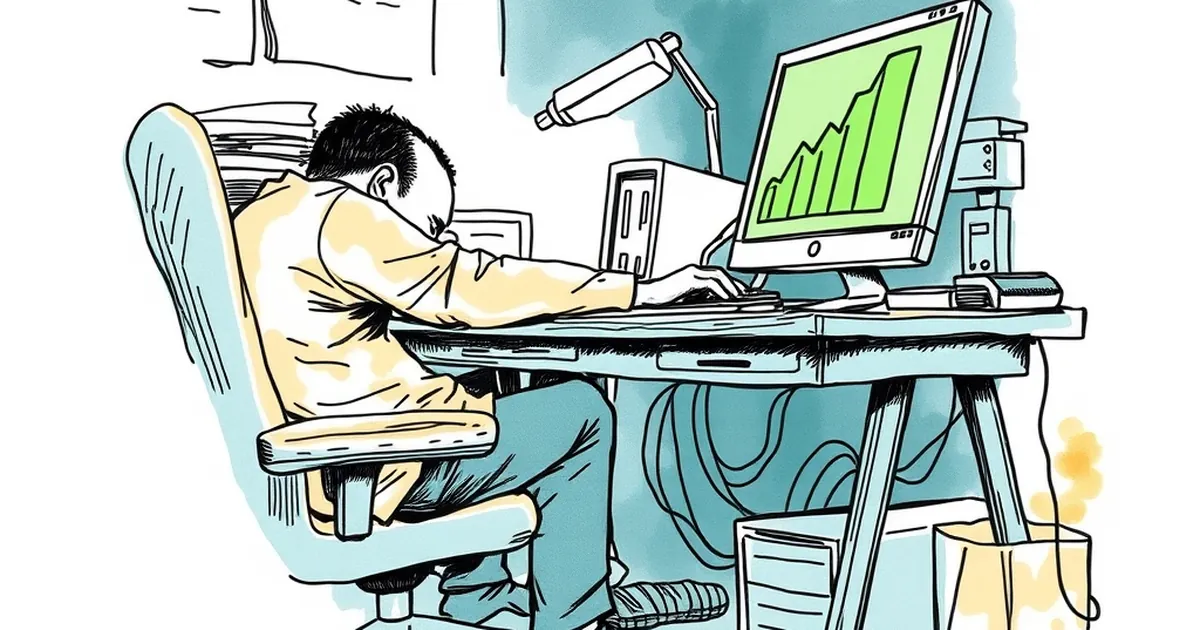
You've probably seen it on a client site: the "Payment successful" banner gets a green tick and a bounce animation, while the "Card declined" message is a thin red line of text buried near the form. The question worth sitting with is why we keep designing it that way — and what it's actually costing the businesses we build for.
Kahneman and Tversky's work on loss aversion gives us the headline number: losses feel roughly twice as painful as equivalent gains feel good. That ratio gets quoted constantly in product meetings, usually as a reason to add more reassurance copy. But the more interesting thing for anyone building websites is what happens when you put that asymmetry next to the way we typically handle feedback states in a UI. The win gets the celebration. The loss gets a line of text. And somehow we've convinced ourselves this is neutral design.
The feedback loop is doing more work than the copy
B.F. Skinner's work on variable-ratio reinforcement is usually dragged out to explain why people keep pulling levers or refreshing feeds. The mechanism is simple: when a reward arrives unpredictably, the behaviour that preceded it gets stickier. What gets less attention is that the same logic applies to negative feedback — except the stickiness attaches to avoidance rather than repetition.
Think about what a user actually experiences on a checkout page. They hit "Pay." There's a pause. Then either a green tick or a red message. If the red message is vague — "Something went wrong" — the user has no idea whether to retry, change card, contact the bank, or abandon. The uncertainty itself is the punishment. They're not just losing the transaction; they're losing the ability to predict what happens next.
A concrete example from the research side: a 2019 study on form abandonment (published through the Baymard Institute's ongoing e-commerce UX research) found that unclear error messaging was one of the top three reasons users abandoned checkout, alongside forced account creation and unexpected costs. The error message wasn't the cause of the failure — the card genuinely declined — but the way it was presented turned a recoverable moment into an exit.
That's the gap. The transaction failed for a reason the user can usually fix. The interface decided, implicitly, that the failure was theirs to solve alone.
Why the win banner gets the animation budget
There's a design economy at work here that nobody explicitly agreed to. Success states are easy to design because they're terminal — the user is done, the job is complete, you can throw a confetti animation at it and move on. Error states are hard because they're branching. A good error state has to answer three questions in under two seconds: what happened, whose fault is it (or isn't it), and what do I do now.
Most teams don't have the bandwidth to design that properly, so the error state gets the default treatment. Red text. Maybe an icon. Ship it.
The problem is that this default treatment is optimised for the developer's convenience, not the user's emotional state. And the user's emotional state, at the moment of a declined payment, is already primed for loss aversion. They've mentally committed to the purchase. The item is in the cart. The money was going to leave their account. In their head, they've already spent it. The decline doesn't feel like "no transaction occurred" — it feels like they lost something they had.
This is the part that's genuinely underappreciated in web development. We tend to model the user's state as binary: pre-purchase and post-purchase. But there's a third state — the anticipated purchase — and that's where loss aversion does its heaviest lifting. The user is already in possession, psychologically. The decline takes it away.
What good error states actually look like
The fix isn't to make error messages cheerful. That reads as dismissive. The fix is to make them specific and actionable, which is a much less glamorous design brief but does more work.
Three things consistently show up in error states that recover well:
Name the failure precisely. "Your card was declined by your bank" is better than "Payment failed." The first tells the user the problem isn't with your site. The second leaves them wondering if they should try a different browser.
Give one clear next step. Not three. Not a link to a help centre article. One action: "Try a different card" or "Contact your bank and try again." Choice paralysis in a failure state is worse than in a success state because the user is already stressed.
Preserve the cart. This sounds obvious but it's astonishing how often a failed payment wipes the session. From a loss aversion standpoint, losing the cart on top of losing the transaction is a double hit. The user was already feeling the loss of the purchase; now they've lost the work of assembling it.
There's a fourth thing that's less about design and more about architecture: log the failure reason. If you're seeing a spike in declines at a particular step, that's a signal — maybe your payment provider is timing out, maybe a specific card type is failing, maybe there's a bug in how you're passing the amount. The error state isn't just a user-facing screen; it's telemetry.
The asymmetry cuts both ways, and that's the opportunity
Here's the part that makes this genuinely interesting rather than just a UX gripe. Loss aversion isn't a bug in human cognition — it's a feature that evolved because losses are often more consequential than equivalent gains. Missing a meal is worse than the pleasure of an extra one. Getting it wrong twice as hard as getting it right is a reasonable survival heuristic.
In a website context, that means users are already paying disproportionate attention to what goes wrong. They're not skimming the error message. They're reading it. That's a gift. It means the error state is one of the highest-attention moments in the entire user journey — higher than most of your marketing copy, higher than your homepage hero.
Most businesses treat that attention as a problem to be minimised. The better move is to treat it as a moment to be used. A clear, specific, calm error message at the moment of failure does more for trust than a dozen testimonials on the homepage. It says: we know this is frustrating, here's exactly what happened, here's what to do. That's a brand voice moment, and it's free.
Where this goes next
The forward-looking version of this is that error states stop being an afterthought and start being a designed surface with the same care as the success path. That means component libraries that ship with proper error variants, not just the happy path. It means QA that tests failure modes as thoroughly as success modes. It means analytics that treat decline reasons as first-class data, not noise.
It also means accepting that the win banner will always be easier to design. It's terminal, it's celebratory, it's the thing everyone wants to screenshot. The error state is where the actual craft lives — because it's the moment the user is most attentive, most vulnerable, and most likely to remember whether you handled it well.
The businesses that get this right won't do it by adding more animation to the failure message. They'll do it by treating the failure as a real moment in the user's day, with real stakes, and responding accordingly. That's not a design trend. It's just paying attention to where the attention already is.