Progress bar stalls at 68%—what your users see next
A stalled progress bar at 68% shapes user trust—discover what your visitors feel and how to fix it
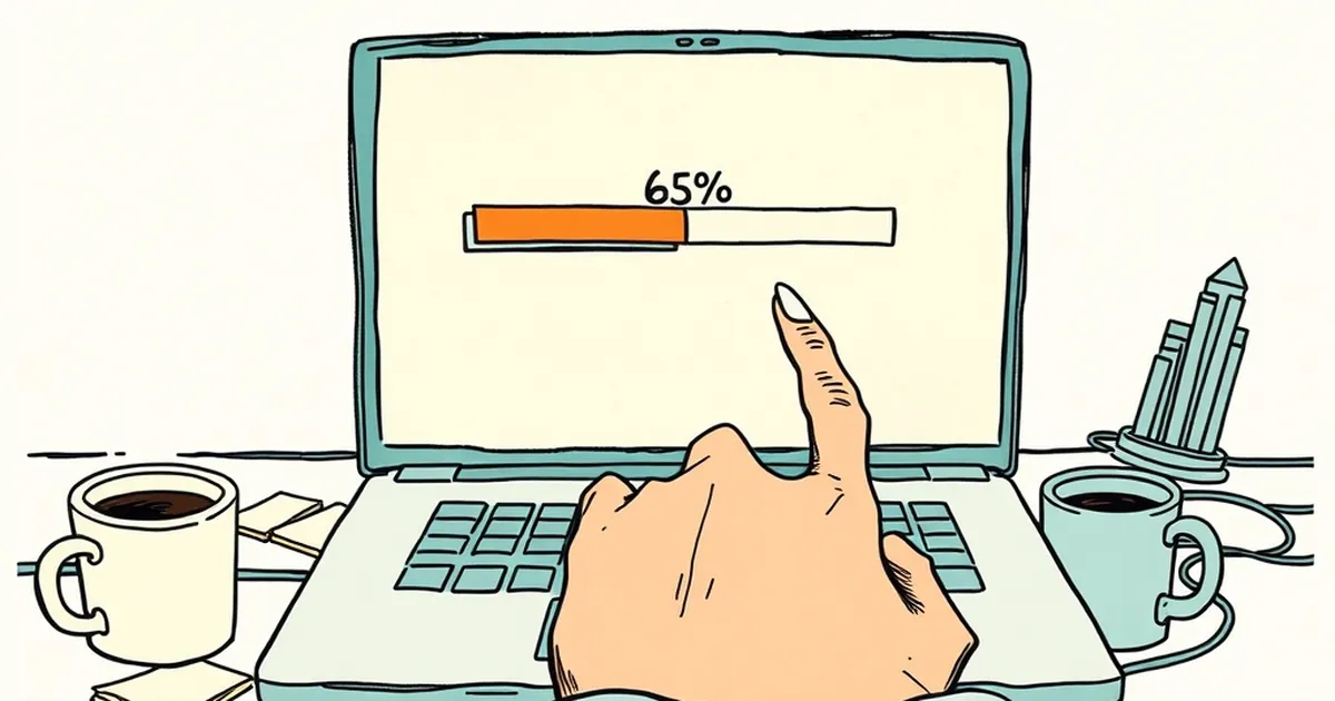
We’ve all been there. You’re waiting for a file to upload, a form to process, or a checkout to finalise, and the little green bar creeps to 68%... and then it just sits there. The spinning wheel mocks you. The seconds stretch into what feels like minutes. As a business owner or website developer, you’ve probably built these moments without thinking twice—but the truth is, that stalled progress bar is one of the most psychologically loaded pieces of UI you can control.
The question isn’t about server speed or code optimisation (though that helps). The real question is: what does the user feel when that bar stops moving, and how does that feeling dictate whether they stay or abandon your site?
Let’s pull apart the behavioural mechanics at play, because understanding the brain behind the click is just as important as the JavaScript behind the button.
The Uncertainty Gap: Why 68% Feels Worse Than 10%
Kahneman and Tversky’s work on loss aversion gives us a starting point. We’re not wired to process neutral waiting—we’re wired to process potential loss. When a progress bar is at 10%, the user hasn’t invested much. They can bail without emotional cost. But at 68%? They’ve already committed time, entered details, or uploaded a file. Abandoning now feels like losing that sunk cost.
Here’s the kicker: a stalled bar at 68% creates what psychologists call the uncertainty gap. The user doesn’t know if the system is working, broken, or just slow. That ambiguity is worse than a clear failure message. In a 2016 study from the University of Michigan, researchers found that when users were shown a progress bar that paused mid-way, their perceived wait time was up to 18% longer than when the bar moved at a steady, predictable pace—even if the actual duration was identical.
So what do your users see next? They see a reason to leave. They see a potential failure. They see the risk of losing their work. And in that moment, the back button becomes a lifeline.
Variable-Ratio Reinforcement: The Sneaky Power of the Jump
Now, let’s flip the script. Not all progress bars are created equal. Have you ever watched a bar jump from 68% to 91% in a single second? That little rush you feel? That’s your dopamine system firing on a variable-ratio reinforcement schedule—the same mechanism that makes slot machines (or even just refreshing your inbox) so compelling.
Behavioural psychologist B.F. Skinner demonstrated that unpredictable rewards are more engaging than predictable ones. When your progress bar stalls and then suddenly leaps forward, you’re creating a mini reward loop. The user learns that patience pays off, but they don’t know exactly when. That uncertainty keeps them glued to the screen.
For a website developer, this is a practical goldmine. If you can’t make the backend faster, you can engineer the perception of speed. Instead of a linear bar that crawls, use a stepped or adaptive bar that moves in bursts. But here’s the catch: if you stall too long without a subsequent jump, you trigger the loss aversion response we talked about earlier. The key is balance—stall, then surge, then stall again. Keep the user in that sweet spot of hopeful uncertainty.
The Illusion of Control: Why Progress Bars Need a “Why”
Let’s talk about another layer: perceived control. Research on decision-making under uncertainty shows that when people feel they have some agency, they tolerate waiting much better. Think about airport luggage carousels—they’re slow, but you watch because you know your bag will come. Now think about a doctor’s waiting room. No progress bar, no updates, just a vague sense of “soon.” That ambiguity is unbearable.
Your progress bar can give users agency by showing what is happening, not just that something is happening. At 68%, instead of a frozen bar, show a micro-copy line: “Compressing your images…”, “Validating your address…”, “Contacting the payment gateway…” Even if the actual task is just a long database query, labelling the steps gives the user a narrative.
A 2019 study in the Journal of Experimental Psychology found that when participants were shown specific task labels during a delay, their perceived wait time dropped by roughly 25% compared to a generic spinner. Why? Because a labelled step feels like progress, not a black box. The user can anticipate the next step, which reduces the uncertainty gap and keeps loss aversion at bay.
Risk-Taking and the “Almost Done” Effect
Here’s where it gets interesting for the competitive side of human nature. There’s a well-documented phenomenon called the “near-completion effect”—people are more likely to take a risk or push through a difficult task when they believe they’re close to the finish line. Think of a marathon runner at the 40km mark versus the 5km mark. The former will push through pain because the end is visible.
Your progress bar is a finish line. But if it stalls at 68%, you’re sending a mixed signal: “You’re close… but not close enough to risk continuing.” Compare that to a bar that hits 95% and then pauses. That’s a completely different psychological state. The user is now invested in completion. They’re more likely to wait, refresh, or even retry if something fails, because the cost of abandoning at 95% feels irrational.
For Australian e-commerce sites especially—where cart abandonment rates hover around 70-80%—this matters. If a checkout process stalls at 68% during payment processing, you’re asking the user to hold onto risk with no reward in sight. But if you can get that bar to 90% before the slow backend call, you’re leveraging the near-completion effect. The user will endure a few extra seconds because they can smell the finish line.
Practical Moves: What to Build Next
Alright, let’s get concrete. You’re not just here for the psychology—you want to build better interfaces. Here are three forward-looking, practical changes you can make starting this week:
1. Decouple the visual from the actual process.
Don’t let your progress bar reflect real-time server status. Instead, use a time-based animation that moves predictably for the first 70%, then slows down. This is a well-known design pattern called “fake progress,” but it works because it aligns with user expectations, not technical reality. The goal is to manage perception, not to lie—just don’t let it stall at a number that feels arbitrary.
2. Add a “stall state” with a human touch.
If your backend genuinely takes 10 seconds, don’t leave users hanging. At the 68% mark, inject a micro-interaction: a subtle pulsing animation, a rotating set of tips, or a progress message that changes every 2 seconds. The key is to signal aliveness. A static bar reads as “broken.” A moving one reads as “working.”
3. Test the 90% rule.
For any multi-step process (checkout, signup, upload), aim to reach 90% of visual progress before your slowest operation. This leverages the near-completion effect and reduces abandonment. You can A/B test this easily—run one version with a linear bar and another with a fast-start/slow-finish curve. Measure the drop-off rate at the stall point. I bet you’ll see a significant lift.
The next time you’re building a progress bar, stop thinking about it as a technical widget. It’s a behavioural tool. It’s a promise to the user that their time is being respected. And when it stalls at 68%, you’re not just showing a loading state—you’re showing them how much you value their patience. Make that moment count.