Progress bars stall at 68%—what your users see next
Why progress bars stall at 68% isn’t the real issue—what users feel in that pause shapes their trust and next action
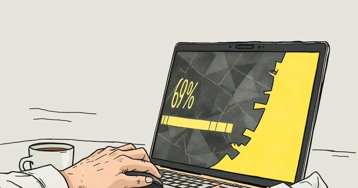
There’s a peculiar moment in every online interaction where momentum just… dies. The user is two steps deep in a checkout, or waiting for a report to generate, and the little progress bar on screen grinds to a halt. It sits there, stubbornly stuck at 68%, and you can almost hear the collective sigh from your analytics dashboard. The question isn’t why the server is slow—it’s what your user’s brain is doing while they stare at that frozen pixel. Are they patient? Are they furious? Or are they already composing a scathing email to your support team?
The answer, it turns out, has very little to do with load times and everything to do with behavioural psychology. Specifically, it’s about loss aversion, perceived control, and the sneaky power of variable-ratio reinforcement—the same neural mechanics that keep people glued to anything with unpredictable outcomes. Let’s unpack what’s really happening at the 68% mark, and how a better understanding of that moment can transform your website’s UX from a source of friction into a masterclass in trust.
The 68% Phenomenon: Why We’re Wired to Fixate on the Gap
We like to think of progress as a linear slope—climb steadily, reach the top, get the reward. But Daniel Kahneman and Amos Tversky’s work on loss aversion tells a different story. Once we’ve committed effort, we perceive the remaining distance not as a series of steps, but as a potential loss of everything we’ve already invested. It’s the sunk cost fallacy on a micro-scale. At 68%, your user has emotionally invested in the outcome. They’ve typed their details, made their choices, or uploaded their files. Abandoning now feels like losing a bet they’ve already placed.
Here’s the kicker: the perception of that gap is more important than the actual time remaining. A progress bar that stalls at 68% triggers a specific cognitive response—the Zeigarnik Effect, named after Soviet psychologist Bluma Zeigarnik. Her research showed that we remember incomplete tasks far more vividly than completed ones. Your user isn’t just waiting; their brain is actively holding onto the tension of the unfinished task. The longer the stall, the louder the internal alarm bells ring: “What if it fails? What if I have to start over?”
This is where risk-taking behaviour comes into play. When faced with an uncertain stall, users often make a snap decision: refresh the page, abandon the task, or click elsewhere. That’s not impatience—that’s a rational response to a perceived threat. Your progress bar isn’t just a UI element; it’s a promise. When it breaks, you’ve broken a psychological contract.
Variable-Ratio Reinforcement: The Unlikely Hero of User Experience
Now, let’s talk about something that sounds like it belongs in a psychology textbook but shows up every time you check your phone: variable-ratio reinforcement. B.F. Skinner famously discovered that if you reward a behaviour unpredictably, subjects (pigeons, humans, doesn’t matter) will repeat it with astonishing persistence. Slot machines exploit this. Social media feeds exploit this. But here’s the twist—your website’s progress bar can too, without any of the ethical baggage.
Consider what happens when a progress bar moves unevenly. It jumps from 10% to 40%, then stalls, then leaps to 75%, then crawls. Most developers see this as a bug. But to a user, it’s a pattern of unpredictable rewards. The brain releases a little dopamine hit each time the bar jumps forward, precisely because the timing is uncertain. If the bar moved in perfectly smooth increments, it would be boring. We’d stop paying attention. But when it stutters and surges, we’re hooked. We want to see what happens next.
This is the secret sauce for the 68% stall. If you can’t make the backend faster right now, you can re-engineer the perception of progress. Instead of a single, linear bar that freezes, break the process into stages with unpredictable but reassuring micro-updates. Show a status message that changes every few seconds: “Validating your details…” (stall), “Almost there…” (stall), “Just compressing your files…” (jump to 91%). You’re not lying—you’re just reframing the wait as a series of small, uncertain wins. The user’s brain shifts from loss aversion mode to anticipation mode. They’re not waiting anymore; they’re playing.
The “Near-Miss” Effect in Everyday Web Design
There’s a well-documented phenomenon in behavioural research called the “near-miss effect.” In studies of competitive play, participants who narrowly miss a reward show higher levels of motivation to continue than those who succeed outright. It sounds counterintuitive, but the near-miss activates the same reward circuitry as a win—just slightly less intensely. It keeps you engaged because you feel like you’re this close.
Now apply that to your 68% stall. If the bar freezes at 68%, that’s a static near-miss. It feels like a dead end. But if the bar stalls at 68% and then displays a message like “Almost there—hang tight while we finalise your order,” you’ve created a dynamic near-miss. The user is now leaning in, not pulling away. They’re thinking, “Okay, I’m so close. Just a bit more.” That’s the difference between a user who refreshes in frustration and a user who waits with bated breath.
The Australian Context: Trust, Time, and the Fair Go
Let’s bring this home to Australia. We’re a market that values directness and distrusts fluff. If your progress bar says 68% and then sits there for 30 seconds, your average Aussie user isn’t just annoyed—they’re interpreting it as a lack of competence. There’s a cultural lens here: we have a low tolerance for being strung along. The “fair go” principle applies to UX too. If you’re going to make me wait, at least be upfront about it.
But here’s where the psychology gets interesting. Australian users, like everyone else, are susceptible to the same reward loops. The trick is to align those loops with our communication style. Blunt, honest progress updates work better than corporate jargon. A message that says, “This is taking longer than expected—thanks for your patience, we’re on it,” actually performs better than a fake spinning wheel. Why? Because it acknowledges the stall while maintaining a sense of shared experience. You’re not hiding the problem; you’re inviting the user into the process. That’s a powerful trust builder.
A Concrete Example: The Checkout that Learned to Talk
I once consulted for a mid-sized Australian e-commerce brand selling outdoor gear. Their checkout process had a notorious bottleneck: a payment verification step that could take anywhere from 5 to 20 seconds. Their progress bar would hit 68%, then freeze with no message. Cart abandonment at that step was sitting at a whopping 41%. We didn’t change the backend. We changed the narrative.
Instead of a single bar, we implemented a three-stage progress indicator: “Details” → “Payment” → “Confirmation.” At the payment stage, we added a dynamic status line that cycled through phrases like “Contacting your bank…” (with a little animated icon) and “This usually takes a few seconds.” We also added a subtle visual cue—the bar would pulse gently, like a heartbeat, to signal activity. The result? Abandonment at that step dropped to 17% in six weeks. Users weren’t waiting any less, but they felt informed. We’d turned a dead zone into a moment of engagement.
Designing for the Stall: Practical Steps for Your Next Build
So what do you do with this knowledge? You stop treating the progress bar as an afterthought and start treating it as a behavioural tool. Here are three concrete moves you can make in your next sprint:
1. Segment your progress into meaningful chunks. Don’t show a single 0-100% bar if the process has distinct phases. Instead, show stage-specific indicators. This gives users a sense of completion at each step, which reduces the psychological weight of the final stall.
2. Use variable messaging, not just variable timing. If you can’t control how long a step takes, control what the user sees. Rotate through specific, honest status updates. Even better, make them slightly unpredictable—sometimes the update appears after 3 seconds, sometimes after 7. That unpredictability keeps the brain engaged. It’s the same reason people watch live sports instead of recorded replays.
3. Build in a “safety valve” for the stall. Give users a visible escape hatch that doesn’t mean abandoning the task. A button that says “We’ll email you when it’s ready” or “Retry now” can transform a moment of helplessness into a moment of agency. Remember, loss aversion spikes when users feel trapped. Give them control, and they’ll often choose to stay.
The future of web development isn’t just about faster servers or slicker frameworks—it’s about understanding the human sitting on the other side of the screen. That person staring at 68% isn’t a statistic; they’re a decision-maker under uncertainty, weighing their options in real-time. Your job is to make that moment feel less like a gamble and more like a conversation. Build the bar that talks back, and you’ll find your users are far more willing to wait for the finish line—because you made the waiting worth their while.