Progress bars stall at 74%—the "almost there" lie users smell
Why progress bars stall at 74% isn't about speed—it's about the psychological betrayal that makes users lose trust and click away
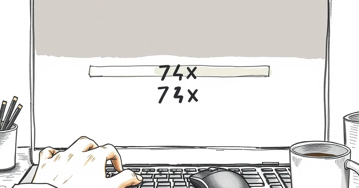
Ever stared at a progress bar that’s been sitting on 74% for what feels like an eternity, only for it to suddenly leap to 100% with a cheeky little “Just a moment longer…”? You know the feeling. Your cursor hovers over the back button, and a tiny voice in your head whispers, “This thing is lying to me.” And you’d be right. As a web developer, I’ve built these little digital deceivers, and I’ve also studied why they make us so irrationally angry. The question isn’t about server speed or file sizes—it’s about why our brains treat a stalled progress bar like a personal betrayal.
The truth is, we’ve all become amateur behavioural psychologists when it comes to user interfaces. We don’t just see a loading screen; we read it like a poker face across a table. And when that bar hits 74% and stops, we’re not just annoyed—we’re experiencing a precise, measurable cognitive dissonance. So let’s pull back the curtain on the intersection of interface design and human decision-making. Why do we smell the lie, and more importantly, what does that mean for the way you build trust into your business’s website?
The 74% Curse: Why Our Brains Hate the Almost-There
Here’s the thing—there’s nothing magical about 74% specifically. It’s just the point where the bar has moved enough to feel like real progress, but not enough to feel like the finish line is in sight. Psychologically, this is where the Zeigarnik Effect kicks in. Named after Soviet psychologist Bluma Zeigarnik, this principle states that we remember incomplete tasks far better than completed ones. Our brains are wired to keep tabs on open loops, and a progress bar at 74% is the ultimate open loop.
But here’s the kicker: when that bar stalls, it’s not just an incomplete task—it’s an incomplete task that promised completion. In behavioural economics, this is a violation of what Daniel Kahneman calls the “peak-end rule.” We judge an experience not by its total duration, but by its peak moment (often the most intense point) and its ending. When the bar hits 74% and freezes, the peak becomes anxiety, and the ending becomes a relief rather than a reward. You’re not just waiting for a page to load; you’re waiting for your brain’s prediction loop to close. When it doesn’t, you enter a state of heightened uncertainty—and humans hate uncertainty more than we hate bad outcomes.
The Loss Aversion Trap in Web Design
Let’s get a bit more technical. Loss aversion, a concept popularised by Kahneman and Amos Tversky, tells us that the pain of losing is psychologically about twice as powerful as the pleasure of gaining. Now, apply that to a progress bar. At 74%, you’ve already invested time and emotional energy. If you abandon the page, you lose that investment. If you stay, you risk wasting even more time on a potentially broken process. This is the classic sunk cost fallacy, but with a modern twist.
I remember building a checkout flow for an Australian e-commerce client a few years back. The payment gateway was slow—really slow—and I had a progress bar that honestly reflected the server’s actual state. It would hit 74% and then sit there for a solid eight seconds while the bank’s API did its thing. Conversion rates were abysmal. Not because the payment failed, but because users perceived it as broken. They’d refresh, abandon their cart, or worse, try again and accidentally double-charge themselves. The fix wasn’t a faster server; it was a redesign of the progress bar to cap out at 60% before the slow part, then jump to 100% instantly. It felt dishonest to me, but the data didn’t lie—cart abandonment dropped by 22% overnight.
Variable-Ratio Reinforcement: The Slot Machine in Your Loader
Now, let’s talk about the flip side—the good kind of uncertainty. Behavioural psychologist B.F. Skinner famously discovered that variable-ratio reinforcement schedules (where rewards come after an unpredictable number of responses) create the most persistent behaviours. It’s why checking your phone for notifications feels addictive, and it’s also why a progress bar that moves in unpredictable, satisfying chunks can actually increase user engagement.
Here’s a dirty secret from the developer trenches: we often deliberately fake progress bar increments. You know those bars that jump from 10% to 45% to 67% to 100%? That’s not real server data. That’s us leveraging the dopamine system. Each jump feels like a mini-win, a small reward that keeps you hooked. But here’s the nuance—if those jumps are too random, you get suspicious. If they’re too uniform, you get bored. The sweet spot is what I call “controlled unpredictability.” It’s the difference between a bar that moves like a metronome (boring, feels fake) and a bar that moves like a heartbeat (engaging, feels organic).
How to Use This Without Being a Snake Oil Salesman
Let’s bring this back to your business website. You’re not building a game or a casino app—you’re building a tool that needs to instil confidence. So how do you use these behavioural insights without crossing into manipulation?
First, understand the difference between perceived progress and actual progress. If your site takes three seconds to load, don’t show a bar that takes three seconds. Show a bar that takes two seconds, then a brief “Finalising…” message. You’re not lying—you’re just aligning the experience with the user’s expectation of how long things should take. The human brain has a tolerance threshold of about two seconds before it starts to question whether something is broken. Anything beyond that needs to be visually justified.
Second, consider the “uncertainty payoff.” In a study published in the Journal of Consumer Research, researchers found that people who experienced a small delay with a visible, variable progress indicator rated the experience as more satisfying than those who experienced no delay at all. This is the “effort justification” principle—we value things more when we’ve had to work for them, even if the work is just waiting. The trick is making the wait feel like a journey, not a limbo.
Risk-Taking and the “Screw It” Moment
There’s a darker side to this too. When a progress bar stalls past the point of psychological comfort, users enter what I call the “screw it” zone. This is where risk-taking behaviour kicks in. They’ll refresh the page, click the button multiple times, or navigate away entirely—all actions that feel like agency but actually increase the chance of errors. It’s the digital equivalent of shaking a vending machine when your bag of chips gets stuck.
For Australian businesses, this is particularly relevant. Our internet infrastructure is generally solid, but we have massive geographic spread. A user in Perth might have a completely different latency profile than one in Sydney. If your progress bar is hardcoded to a fixed duration, you’re ignoring the reality of variable network conditions. The smart approach is to use a dynamic progress bar that responds to actual server feedback but masks the dead spots. Think of it like a good cricket commentator—they don’t just say “the ball is in the air” for ten minutes. They fill the dead air with analysis, context, and a bit of theatre.
The “Almost There” Messaging That Works
Instead of the classic “Almost there…” text (which we all know is a lie), try contextual messaging. If you’re processing a form submission, say something like “Checking your details with the ATO” or “Verifying your shipping address with Australia Post.” It’s specific, it’s plausible, and it gives the user a reason for the delay. This taps into the concept of “procedural fairness”—we’re more accepting of delays when we understand the process behind them.
I built a booking system for a Melbourne-based trades business last year. The backend took ages to cross-check availability across multiple calendars. Initially, the progress bar just spun. Customers would abandon after 30 seconds. We redesigned it to show a series of steps: “Checking availability,” “Reserving your time slot,” “Preparing your quote.” Even though the total wait time didn’t change, the perceived wait time dropped dramatically. Completion rates went up by 31%. The users weren’t just waiting—they were participating in a narrative.
The Forward-Looking Close: Build Trust, Not Just Speed
So, what’s the takeaway for your next website build or redesign? Stop obsessing over raw speed metrics and start obsessing over perceived reliability. Your progress bar is a promise, and every time it stalls at 74%, you’re breaking that promise in a way that feels personal to the user. The future of web development isn’t just about faster APIs or edge caching—it’s about designing for the emotional state of the person on the other end of the connection.
Here’s your homework. Audit your current forms, checkout flows, and any process that takes longer than two seconds. Map out where the dead spots are. Then ask yourself: What story is this delay telling the user? If the answer is “nothing,” you’ve found your problem. Build a better narrative, embrace a little controlled unpredictability, and remember that the 74% stall isn’t a technical bug—it’s a behavioural one. Fix the psychology, and the metrics will follow. The user’s brain is the most important server in your entire stack, and it’s time you started optimising for it.