Reward loops hook hardest at attempt 3, not 30
The third attempt at anything hard is where the brain quietly decides whether to care, a pattern that shapes how people use websites and forms
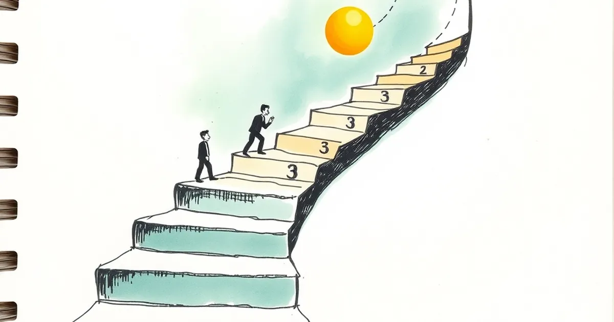
There's a strange thing that happens around the third attempt at anything hard. Not the first — the first is usually just curiosity or obligation. Not the thirtieth either, by which point you're either committed or you've quit. It's that middle-ish moment, somewhere around attempt three, where the brain seems to make a quiet decision about whether this thing is worth caring about. I've been thinking about this a lot in the context of building websites for businesses, because the same pattern shows up in how people interact with a site, a form, a checkout flow, a dashboard. And it's not really a web design question. It's a behavioural psychology question wearing a UX hat.
The third attempt is where the brain does its cost-benefit maths
Daniel Kahneman's work on loss aversion gives us a starting point: people feel losses roughly twice as acutely as equivalent gains. But there's a follow-on effect that matters more here. On attempt one, you have nothing invested, so there's nothing to lose. On attempt three, you've now got a small but real investment — time, attention, a bit of hope — and the brain starts protecting it. That's the hook. Not the reward itself, but the fear of having wasted the two attempts that came before.
This is why a signup form that fails twice and then works smoothly on the third go feels disproportionately satisfying. It's also why a form that fails three times in a row feels like a personal insult, even though objectively it's just a validation error. The emotional weight isn't linear. It curves.
Variable-ratio reinforcement, minus the sinister framing
B.F. Skinner's variable-ratio schedules — where a reward arrives after an unpredictable number of actions — produce the most persistent behaviour of any reinforcement pattern studied. Most people hear that and immediately think of the worst applications of it. But the mechanic itself is neutral. It's why email feels compelling (you don't know which refresh brings something good), why a well-designed notification system keeps people engaged, and why a website that occasionally surfaces something genuinely useful keeps people coming back far more reliably than one that's predictably bland.
The practical takeaway for anyone building a business website: predictability is comfortable but forgettable. Not chaotic — that's just frustrating. But a little genuine variability in what a returning visitor sees, learns, or gets offered keeps the third visit from feeling like a chore.
Why attempts one and two are almost wasted
Here's the uncomfortable bit. Most analytics dashboards celebrate first visits. Bounce rate, time on page, pages per session — all of it skews toward the first impression. But the first attempt is the least informative moment in the entire relationship. The person doesn't know you, doesn't trust you, and is running on whatever heuristic got them to click the link in the first place.
Attempt two is often just a confirmation. They came back to check whether the thing they half-remembered was real. Still low commitment.
Attempt three is the first time someone is genuinely evaluating you against alternatives. They've now got enough context to compare. This is where a website either earns a place in someone's mental shortlist or quietly falls out of it. And almost nobody designs for this moment specifically.
A concrete example: the checkout abandonment pattern
Baymard Institute's long-running research on e-commerce checkout abandonment consistently finds rates hovering around 70%. But when you break that down by session depth rather than by single visit, the pattern shifts. People who abandon on their first attempt often cite "just browsing" or "not ready to buy." People who abandon on their third or fourth attempt cite something specific — a form field that keeps rejecting their postcode, a shipping cost that appeared late, a payment method that isn't there.
The first-attempt abandoners were never really in the market. The third-attempt abandoners are the ones you lost. That's the group worth designing for, and it's the group most sites ignore because they're optimising for the wrong number.
Decision-making under uncertainty is the real design brief
Most website decisions are made under uncertainty. Will this headline work? Will this layout convert? Will this colour scheme feel trustworthy? The honest answer is nobody knows until it's live, and even then the data is noisy.
What behavioural research suggests is that people don't evaluate options in isolation — they evaluate them relative to a reference point, and that reference point shifts with each attempt. Attempt one, the reference is "some other site I could be on." Attempt three, the reference is "the version of this site I saw yesterday." You're no longer competing with competitors. You're competing with your own past self.
That's a strange and useful reframe. It means consistency across attempts matters more than novelty within a single visit. It means a returning visitor noticing that something has changed — for the better, and in a way they can articulate — is worth more than a flashy first impression. And it means the third attempt is where trust is either confirmed or quietly withdrawn.
Risk-taking and the confidence threshold
There's a concept in behavioural economics called the confidence threshold — the point at which someone feels sufficiently certain to act. It's not a fixed number; it moves based on stakes, prior experience, and how the options are framed. On a website, you can move it. Clear pricing moves it down. Hidden fees move it up. A visible returns policy moves it down. A vague "contact us for details" moves it up.
By attempt three, most people have a rough sense of where your confidence threshold sits. If it's still high at that point, they're gone. Not because they decided against you, but because they never got enough signal to decide for you.
What this means for how you build the thing
If attempt three is the hinge, then the design priorities shift. First-visit polish matters less than return-visit clarity. Novelty matters less than recognisability. And the biggest gains come from removing friction that only shows up once someone is genuinely trying to use the site, not just look at it.
Practically, that means:
- Instrument the third visit specifically. Most analytics treats all sessions the same. Segment by session count and look at what happens on session three. The drop-off there is the one that costs you.
- Design for recognition, not discovery. A returning visitor should immediately know where they are. Big changes between visits create cognitive load that reads as instability.
- Make the reward for returning concrete. Not a popup, not a discount code that feels desperate. Something genuinely useful — a saved state, a clearer path, a piece of information that wasn't there before.
- Watch the near-misses. The people who got to attempt three and left are your richest source of information. They tried. They cared enough to try three times. Find out what stopped them.
The forward-looking version of this is that websites are going to get better at recognising attempt three for what it is. Not through creepy personalisation, but through honest instrumentation and a willingness to treat returning visitors as a distinct audience with distinct needs. The businesses that figure this out won't win on first impressions. They'll win on the third, fourth, and fifth — which is where the actual decisions get made.