The progress bar fills at step 9—users quit at step 4
Why an accurate progress bar still loses users at step four, and what behavioural research says about designing progress people actually feel
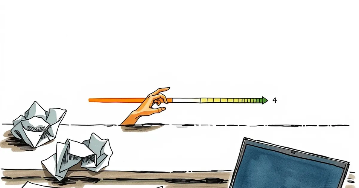
Your onboarding flow has nine steps. Analytics show most users bail at step four. The progress bar says 44 per cent; the user's brain says "I've done enough to know this is going to be a slog, and I have no idea what's waiting at the end." That gap—between the objective progress a website reports and the subjective progress a person feels—is one of the most useful things a developer can learn to design around. So the question worth sitting with: why does a progress bar that is technically accurate fail so completely at keeping people moving, and what does behavioural research suggest we do instead?
The progress bar is a promise, not a measurement
Most progress bars are built as honest reporting devices. Four of nine steps done, 44 per cent, done. But users don't experience a progress bar as a report. They experience it as a forecast. And forecasts are evaluated emotionally, not arithmetically.
This is where Daniel Kahneman's work on loss aversion earns its keep. People weigh losses roughly twice as heavily as equivalent gains. A progress bar showing 44 per cent complete is, from the user's side of the screen, also showing 56 per cent incomplete—and the incomplete portion is the thing that feels like a cost still to be paid. The further into a flow someone gets, the more the remaining distance can loom, because they've now invested effort they don't want to waste. That's the sunk-cost squeeze: quitting at step four feels like throwing away three steps of work, but continuing feels like signing up for five more unknowns.
The obvious fix—make the bar fill faster early, slower later—is a real technique, but it's a cosmetic one. It buys goodwill without answering the underlying question the user is actually asking at step four: what is this costing me, and when does it end?
Step four is usually where the flow stops being about the user
There's a pattern in onboarding analytics worth naming. Early steps tend to be about the person: what they want, who they are, what they're trying to do. Somewhere around the middle, the flow quietly changes character and starts asking for things that serve the business—company size, referral source, billing details, a phone number for a sales call.
Users aren't stupid about this. They can feel the shift. The variable-ratio reinforcement that makes notifications and feeds so sticky doesn't work in reverse: unpredictable costs don't create engagement, they create abandonment. B.F. Skinner's schedules of reinforcement describe why unpredictable rewards keep behaviour going. Unpredictable demands do the opposite.
Step four is often where the flow stops feeling like a conversation and starts feeling like a form. That's not a design failure of the progress bar. It's a design failure upstream of it.
The practical test is simple: read your own onboarding steps out loud and mark each one user-serving or business-serving. If the business-serving block starts before the user has received any value, you've probably found your drop-off point.
Autonomy, competence, and the three things that keep people going
Self-determination theory—Deci and Ryan's long-running body of work on motivation—identifies three psychological needs that sustain effort: autonomy, competence, and relatedness. Progress bars only really address one of them, competence, and they do it clumsily.
- Autonomy: does the user feel like they're choosing their path, or being funnelled? A step that asks "what do you want to do first?" does more for completion rates than a bar that fills smoothly.
- Competence: does each step make the user feel more capable? A step that produces a visible result—a draft, a preview, a working page—does this. A step that just collects a data point doesn't.
- Relatedness: is there a sense of who this is for, or who else is doing it? Even a plain sentence like "most people in your situation start here" taps this.
Notice that none of these are progress-bar problems. They're flow-architecture problems. The bar is downstream of all three.
What the research on goal gradients actually says
There's a well-documented phenomenon in behavioural psychology called the goal gradient effect: effort tends to increase as people perceive themselves to be closer to a goal. It was first described in the 1930s with rats running mazes—they sped up near the end—and it's been replicated with humans in loyalty programs, where people with more stamps on a card buy coffee more frequently.
The interesting nuance, and the one most relevant to web development, is that the effect depends on perceived proximity, not actual proximity. A bar that fills in a straight line is a poor instrument for this, because it gives the user no moments of acceleration. A bar that jumps—25 per cent, then 50 per cent, then 80 per cent—creates the sense of closing in. So does restructuring the flow so the big, satisfying steps sit near the end.
But there's a limit. If the perceived progress outpaces the real work, users notice, and the effect collapses into distrust. The goal gradient works when the acceleration is honest.
A concrete example worth borrowing
Duolingo's onboarding is a well-known case study, and the reason it's relevant here isn't gamification in the shallow sense. It's that the flow front-loads a meaningful commitment—"how much time do you want to spend per day?"—before asking for an account. That single question does three things at once: it gives the user autonomy, it frames the effort as their choice, and it makes the account creation feel like the natural next step rather than a toll gate.
The lesson isn't "copy Duolingo." It's that the question "what is this person willing to invest?" is more useful at step one than "what is this person's job title?" is at step four. The former shapes the rest of the flow. The latter just fills a CRM field.
Where to take this next
If you're looking at your own funnel and seeing a cliff at step four, resist the urge to start with the bar. Start with a different question: what does the user have at the end of step three that they didn't have at the start? If the answer is "nothing tangible," you've found the problem.
Three things worth trying before you touch the visual design:
- Reorder by value, not by data model. Put the step that produces the most visible result as early as you honestly can. If your flow requires certain information before that step, ask whether it really does or whether it's just how the database was built.
- Break the linear assumption. Some of the best onboarding flows let users pick which step to do first. That's autonomy, and it also means the drop-off point becomes a choice rather than a wall.
- Instrument the emotional moments, not just the clicks. Add a single-question micro-survey at step three and step five: "how confident do you feel about finishing this?" You'll learn more about why people leave than any funnel chart will tell you.
The progress bar will keep filling at step nine. Whether anyone is still there to see it is a question about motivation, not measurement—and that's a design problem worth taking seriously.