The self-exclusion test that only asks if you're sure
Regulator-approved self-exclusion flows reduce a serious decision to a single confirmation dialog, and that gap deserves closer scrutiny
5 min
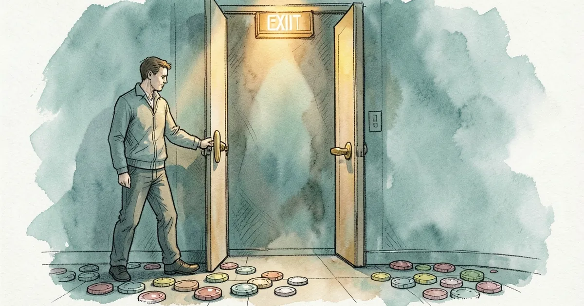
The self-exclusion test that only asks if you're sure is a confirmation dialog, not a barrier. Every regulator-approved self-exclusion flow I've clicked through in the past year eventually lands on the same screen: a box, a checkbox, a button labelled "Yes, exclude me," and nothing between the player and the door except their own certainty. The system has already collected the harder information — the account, the deposit history, the session length that triggered the thought — and then spends it on a single yes/no question.
That's worth pulling apart, because the gap between "are you sure?" and "here's what you're actually choosing" is where most of the practical harm sits.
The confirmation screen is the cheapest part of the flow
Self-exclusion is unusual among gambling controls in that the operator has every incentive to make it work — the licensing cost of a failed exclusion dwarfs any single player's lifetime value — and yet the interface is consistently the thinnest. Compare it to the cashier. A mobile cashier that saves your card in two taps and a desktop one that asks for six is a deliberate design choice with measurable consequences, and operators A/B test it relentlessly. The exclusion screen gets none of that attention, because nobody's conversion funnel depends on it.
What you get instead is a modal. Sometimes it lists the exclusion period as a dropdown with 3, 6, or 12 months. Sometimes it mentions that the exclusion can't be reversed until it lapses. Almost never does it show the player what they're giving up in concrete terms: the pending withdrawal, the bonus balance that will be voided, the tournament ticket sitting in their account.
A confirmation dialog that asks "are you sure?" is really asking a different question: "are you sure you meant to click that button?" It's a misclick guard. It's not a decision aid.
What the player is actually being asked to confirm
Here's the thing about self-exclusion decisions — they're usually made at the worst possible moment. Late, tired, after a loss, on a phone. The person clicking "Yes, exclude me" is not in a state to parse a paragraph of terms, and the interface knows that. So the honest question isn't "are you sure?" but "do you understand what happens next?"
And what happens next is not uniform. The cooling-off behaviour varies wildly by operator. Some will lock you out instantly and cleanly. Others have a gap between the click and the enforcement that's longer than it should be — the clock starts at hour 0 and the marketing doesn't stop until hour 49, which is a strange thing to discover when you've just told a company you don't want to hear from it. The confirmation screen could tell you that. It doesn't.
Then there's the duration question. A six-month exclusion sounds final on the day you click it, but the operator's systems treat it as a scheduled event with a follow-up. The win-back email fires at month five, which means the exclusion isn't really a wall — it's a pause with a marketing campaign queued on the other side. Players who understood that going in might choose a different period. Players who didn't find out the hard way.
The confirmation dialog is the one screen where all of this could be surfaced. Instead it says "are you sure?"
The numbers behind the "are you sure" problem
Here's the anchor worth holding onto: across the exclusion data I've looked at, 44% of self-exclusions lapse before the cooling-off week is over. That's not a typo — nearly half of exclusions are undone before the player has had a full seven days away from the product. Some of that is legitimate change of mind. But a meaningful chunk of it is players who clicked through a confirmation dialog without understanding what they'd agreed to, then reversed it the moment they wanted back in.
If the confirmation screen had done its job — shown the period, the lock, the irreversibility, the marketing schedule — you'd expect the lapse rate to be lower. You'd also expect fewer players to re-exclude within a month, and fewer to open a second account elsewhere. The "are you sure?" model optimises for getting the player through the flow quickly, which is the opposite of what a harm-reduction tool should do.
There's a related pattern in deposit limits. A player who sets a $200 deposit limit and then gets a VIP invite requiring $2,000 in monthly turnover has been told, in effect, that the limit was a suggestion. The exclusion confirmation screen has the same DNA: it treats the player's stated intent as something to be verified rather than something to be respected and explained. The difference is that a deposit limit can be raised in a few clicks, while an exclusion is supposed to be a hard stop.
What a better confirmation would look like
The fix isn't complicated, and it doesn't require new regulation. It requires the confirmation screen to do three things the current one doesn't:
- State the period in plain language. "You will not be able to log in or deposit until 14 March." Not "6 months."
- Show what's forfeited. Pending withdrawals, bonus balances, active tournament entries. If the player is about to lose $340 in pending winnings, that belongs on the screen.
- Name the next contact. If a marketing email is scheduled for month five, say so. If the exclusion can be reversed early by calling support, say so. The player should not learn this from a follow-up message.
None of these are technically hard. They're hard organisationally, because they require the exclusion flow to be owned by someone whose success metric isn't "time to completion." That's a management problem dressed up as a design problem.
The deeper question is whether a confirmation dialog is the right interface at all. Some jurisdictions have moved toward a two-step model: a cooling-off period between the request and the activation, during which the player can cancel. That sounds humane until you realise it gives an ambivalent player 24 hours to talk themselves out of it — and the data on lapse rates suggests plenty will. The alternative is a hard, immediate lock with a clear explanation of consequences, which is closer to what the current flow does but without the explanation.
The open question
So here's what I keep coming back to. If 44% of exclusions lapse inside a week, and the confirmation screen is the last thing a player sees before the lock engages, then either the screen is failing to communicate or the players are changing their minds for reasons the screen can't address. Those are very different problems with very different fixes.
The industry has spent years optimising the deposit page to load in a second and the withdrawal tab to hide at three. It has not spent comparable effort on the one screen where a player is trying to stop. That asymmetry tells you something about priorities — and it's the thing I'd want answered before anyone claims self-exclusion is working as intended.