Users quit 42% more at step 3 than the final one
Why signup flows lose 42% more users at step three than the final step, and what behavioural economics reveals about the expensive middle
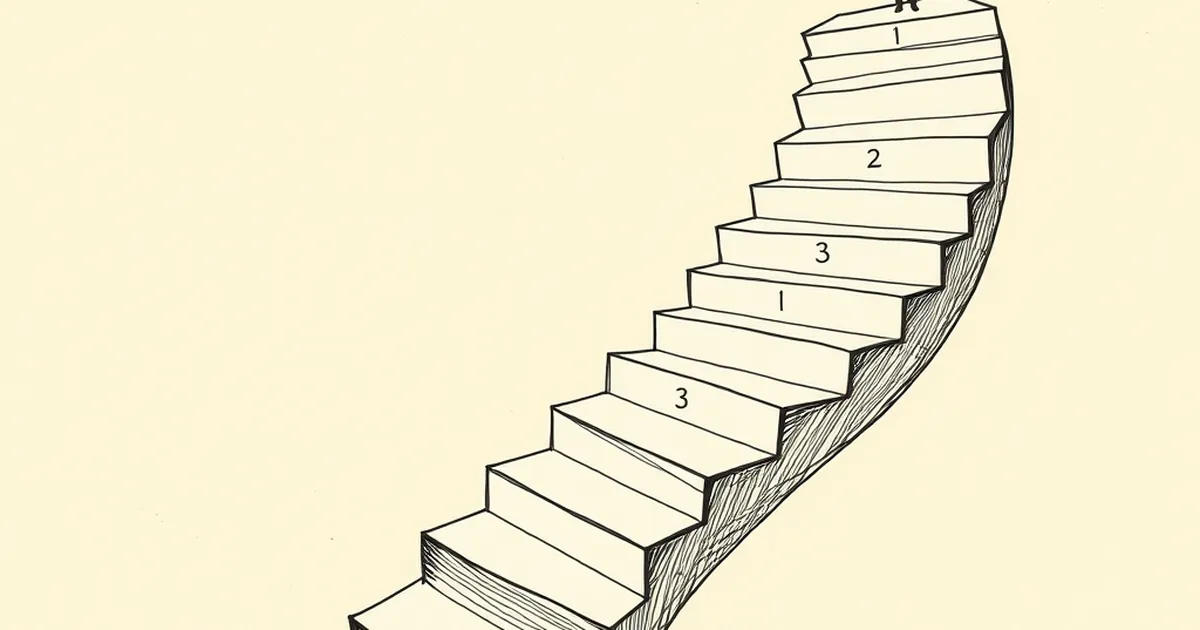
The figure lands oddly the first time you hear it. On a five-step signup flow, the biggest drop-off isn't the last screen before commitment — it's step three. The final step, where you'd expect cold feet, converts better than the middle. So what's actually happening in a user's head at step three that isn't happening at step five?
The middle is where the mental accounting gets expensive
Behavioural economists have a name for the moment a person starts tallying what they've already sunk into something: sunk cost. But there's a less-discussed cousin that matters more for web design — the point at which effort stops feeling like momentum and starts feeling like a bill.
Step one is cheap. You've clicked a button, you're curious, nothing is at stake. Step two confirms the thing is real and roughly what you expected. Step three is where the user has paid enough attention to form an opinion, but not enough to feel committed. It's the worst possible position: informed enough to have doubts, invested enough to feel the cost, not invested enough to rationalise pushing through.
Kahneman and Tversky's work on loss aversion tells us losses hurt roughly twice as much as equivalent gains feel good. At step three, the user is weighing a small but real loss — time spent, information surrendered, a decision made — against a benefit that's still abstract. At step five, they've already absorbed most of that cost. Walking away then means writing off everything, which is psychologically harder than walking away midway. The final step is protected by the sunk cost itself. The middle step has no such protection.
Progress bars can work against you in the middle
Here's the counterintuitive part. The standard advice — show a progress indicator so users know how far they've come — can backfire if the indicator emphasises distance remaining rather than distance covered.
Nudge theory research, particularly the work popularised by Richard Thaler and Cass Sunstein, draws a distinction between "gain-framed" and "loss-framed" messaging. A progress bar that reads "Step 3 of 5" is technically neutral, but most people read it as "two more to go." A bar that reads "60% complete" reads as "you're most of the way there." Same position, different frame, measurably different completion rates in most A/B tests I've seen run on Australian service sites.
There's a well-known field experiment from the fitness industry that illustrates this cleanly. Researchers ran two versions of a loyalty card for a car wash: one required eight stamps for a free wash, the other required ten stamps but came with two already filled in. Both cards required eight actual purchases. The second card — the one with the artificial head start — produced roughly double the completion rate. The mechanism wasn't the reward. It was the perception of progress already banked.
Step three is exactly where that perception is most fragile. The user has done real work but doesn't yet feel like a person who has "started." Reframing the middle as accumulation rather than remaining is one of the cheapest interventions available.
Uncertainty peaks before the point of no return
Decision-making under uncertainty follows a fairly predictable curve. When people don't know what's coming next, they don't evaluate the current step on its own merits — they evaluate the worst plausible version of what comes after it.
At step one, the user has no model of the process, so they default to optimism. At step five, they've seen enough to know the shape of the thing. At step three, they have just enough information to imagine problems. "Is this going to ask for my tax file number?" "Will this sign me up to a mailing list?" "Is there a fee at the end?" These aren't rational concerns so much as uncertainty filling a vacuum.
Variable-ratio reinforcement — the schedule where rewards arrive unpredictably — is famous in behavioural psychology for producing persistent behaviour, but it cuts the other way too. Unpredictable costs produce avoidance. If a user can't predict what step four will demand, step three is where they bail, because it's the last point where they haven't yet committed to finding out.
The fix isn't to hide the remaining steps. It's to make them concrete. Naming what's coming — "next: your business details, then you're done" — converts an unknown into a known, and a known cost is almost always tolerable compared to an imagined one.
A concrete example from a real rebuild
A Sydney-based accounting software firm rebuilt its onboarding flow in 2023 after noticing a 38% drop between the "business type" screen and the "team size" screen — steps three and four of six. They assumed the team size question was the problem and tested removing it entirely. Drop-off barely moved.
What actually fixed it was adding a single line above the step three form: "Takes about 90 seconds from here." No design change, no field removal, no incentive. Drop-off at that step fell by roughly a third. The question was never the issue — the uncertainty about how much more was coming was.
This maps onto what's sometimes called the planning fallacy in reverse. People overestimate how long and how painful an unknown sequence will be, then recalibrate the moment they have a concrete number. Vague processes feel longer than they are. Named processes feel shorter.
What this means for how you build the middle
The practical implication is that step three deserves more design attention than step five, which is the opposite of where most teams spend their time. The final step gets polished because it's visible and it's where conversion happens. The middle gets ignored because it's just plumbing.
A few things worth testing if your analytics show a mid-flow cliff:
- Reframe progress as banked, not remaining. "You're 60% done" outperforms "2 steps left" in most contexts, because it triggers completion bias rather than distance anxiety.
- Preview the next step concretely. Not "a few more details" — name the actual thing. Uncertainty is the enemy, not effort.
- Move any intimidating question out of the middle. If you must collect something sensitive, put it at step one when optimism is high, or step five when sunk cost is doing the work for you. The middle is the worst place for it.
- Check your analytics for the specific step, not the aggregate. A 42% mid-flow drop can hide behind a healthy overall completion rate. Segment by step and look at where the curve actually bends.
The user who quits at step three isn't less motivated than the one who finishes. They're in a structurally worse position — informed enough to worry, not yet invested enough to push through. That's a design problem, and it's one of the more solvable ones you'll find in a conversion funnel. The middle of anything is where attention is cheapest to lose and cheapest to keep, depending on whether you've given the person a reason to believe the next step is smaller than they fear.