Why decision fatigue is killing your website’s conversion flow
Discover why decision fatigue silently sabotages your conversion flow and how psychology reveals the fix
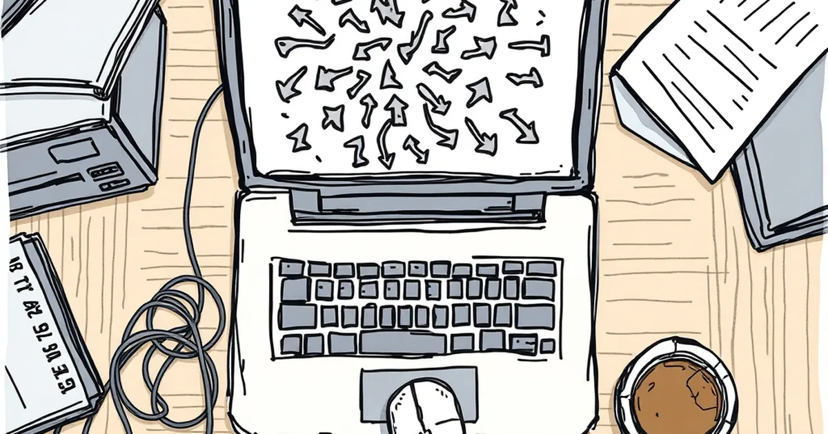
You’ve spent months perfecting your website. The copy is tight, the design clean, the calls-to-action prominent. Yet visitors are bouncing faster than a kangaroo in a thunderstorm. You’ve tried bigger buttons, brighter colours, shorter forms. Still, something feels off.
The problem isn’t your design. It’s the invisible weight you’re placing on every visitor’s shoulders the moment they land. It’s called decision fatigue, and it’s quietly dismantling your conversion flow. But here’s the twist: understanding why it works the way it does draws from a place you might not expect — the psychology of high-stakes, rapid-fire choices. And that’s where things get interesting.
The hidden cost of every click
Let’s get one thing straight: human brains are not built for endless choice. The classic jam study from Columbia University showed that when shoppers faced 24 varieties of jam, only 3% bought. When reduced to six, 30% bought. That’s a 10x lift just by cutting options.
But decision fatigue runs deeper than product lists. Every micro-choice on your website — a font size, a colour swatch, a form field label — consumes a tiny sliver of your visitor’s cognitive budget. By the time they reach your checkout or contact form, they’re running on fumes.
Here’s where it connects to something primal. In competitive environments where split-second decisions matter — think fast-paced scenarios with high stakes — players learn to conserve mental energy for the critical moments. They develop heuristics, mental shortcuts that bypass analysis paralysis. Your website visitors are doing the same thing, except their heuristic is often “hit the back button.”
Variable rewards: the double-edged sword
You’ve probably heard of variable-ratio reinforcement. It’s the principle that keeps people checking notifications, scrolling feeds, and yes, pulling levers in certain contexts. The key insight: unpredictable rewards trigger stronger dopamine responses than predictable ones.
Applied to websites, this explains why “spin to win” pop-ups or mystery discounts can boost engagement. But here’s the catch — and it’s a big one for conversion flow. Variable rewards create a loop that trains users to expect uncertainty. When they hit your landing page, they’re already primed to wonder: Is the real offer hidden? Will clicking this lead to something valuable or just another step in a maze?
This uncertainty amplifies decision fatigue. Every time a visitor must decide “Do I click this or keep looking?” without clear payoff, they drain their cognitive reserves. The research is clear: people under cognitive load are less likely to process complex information and more likely to default to the easiest option — which is often leaving.
The loss aversion twist
Daniel Kahneman and Amos Tversky’s prospect theory showed us that losses hurt about twice as much as equivalent gains feel good. This plays out brutally in conversion flows. Every form field, every step, every unexplained delay is perceived as a potential loss — of time, of privacy, of control.
When a visitor has already made ten micro-decisions just to read your pricing, their loss aversion sensitivity spikes. They start seeing risk everywhere. “What if I enter my email and get spammed?” “What if this button leads to a hidden fee?” The brain’s threat-detection system kicks into overdrive, and suddenly even a simple checkout feels like a high-stakes gamble.
The competitive play pattern that saves conversions
Here’s the practical insight from the overlap. In competitive environments where players face rapid decisions under uncertainty, the best performers don’t try to eliminate risk. They structure it. They create a clear hierarchy: what decisions matter now, what can wait, and what should be automated.
Your website needs the same architecture. Consider an Australian SaaS company that was bleeding trial sign-ups. Their landing page had seven navigation options, two competing CTAs, a live chat bubble, and a pop-up asking for email before showing pricing. The founder described it as “a buffet of confusion.”
They redesigned with one principle: reduce the decision count before the conversion point. Every element that didn’t directly support the primary action was moved to secondary pages. The live chat was replaced with a simple question: “Need help? We’ll call you.” The pricing was upfront, no email required.
Result? Trial starts increased 40%. But the interesting part was the qualitative feedback. Users described the new site as “calm” and “easy” — words you rarely hear about B2B software.
The one concrete study you need to know
A 2019 study published in the Journal of Consumer Psychology tested the impact of sequential decision-making on purchase behaviour. Participants who made a series of unrelated decisions (choosing colours, fonts, layouts) before seeing a product were significantly less likely to buy it — even when the product was identical to the control group’s.
The researchers called it “choice depletion.” And here’s the kicker: the effect was strongest when the initial decisions felt inconsequential. When people thought they were just “browsing,” they burned the same mental energy as if they were actively shopping. Your website’s navigation, your image carousels, your “learn more” links — they’re all draining the same battery.
Practical moves for the Australian market
Australian audiences bring their own flavour to this dynamic. We’re famously pragmatic, slightly sceptical of hype, and value directness. A Sydney-based e-commerce brand found that removing the “sign up for newsletter” pop-up reduced their email list growth by 15% but increased overall revenue by 22%. The reason? Fewer decisions at the top meant more cognitive budget for the actual purchase.
Try this tomorrow:
Audit your decision count. Open your site in an incognito window. Count every choice a visitor must make before reaching your primary conversion point. If it’s more than three, you’re bleeding conversions.
Create decision-free zones. Product pages should not ask visitors to choose between “learn more,” “see specs,” “read reviews,” and “buy now.” Lead with one clear action. The rest is context, not choice.
Use progressive commitment. Instead of asking for everything upfront (name, email, phone, company size, job title), ask one thing. Then another. Each micro-commitment feels easier than the big ask, and the sunk cost keeps them moving forward.
Name the uncertainty. If your pricing has variables, acknowledge it. “Not sure which plan fits? Here’s how to decide in 30 seconds.” This reduces the perceived risk of making the wrong choice.
The forward-looking take
Decision fatigue isn’t a bug in human psychology — it’s a feature of how we conserve energy for what truly matters. Your website can either drain that energy or respect it. The best conversion flows don’t persuade harder; they decide for the visitor wherever possible.
The next frontier isn’t bigger buttons or flashier animations. It’s designing for the tired, distracted, over-stimulated human who lands on your page after a long day. Give them fewer choices, clearer paths, and the sense that the hard work has already been done for them. That’s not manipulation. That’s respect.
And in a world where every website is screaming for attention, respect might just be the most underrated conversion tool of all.