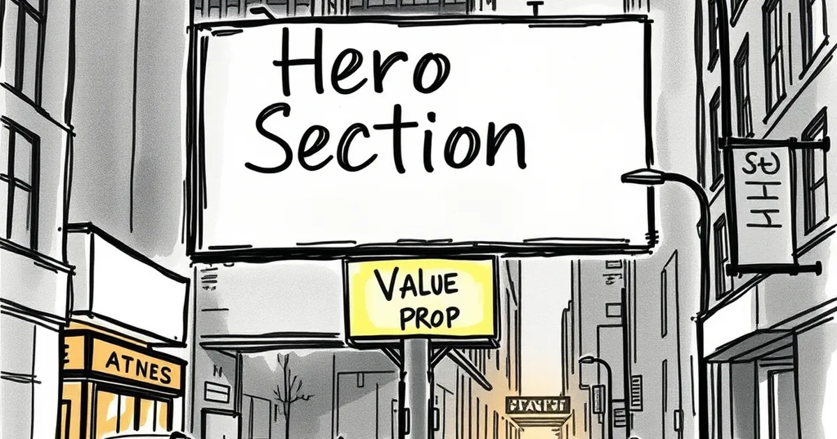
Why your homepage hero section is wasting its best real estate
Stop wasting your homepage hero on vague taglines and stock photos—make that prime real estate convert visitors from the first second
You’ve spent thousands on your website, maybe tens of thousands. The homepage loads, and right there, front and centre, is a giant photo of someone smiling at a laptop, a vague tagline like “We Deliver Results”, and a button that says “Learn More”. And you wonder why nobody converts.
That prime piece of digital real estate — the hero section — is the first thing 80% of your visitors see. If it’s not grabbing them by the collar and telling them exactly what to do, you’re burning money on every single visit.
The hero section is not a billboard
Too many businesses treat their homepage hero like a highway billboard. They think a pretty picture and a brand slogan will do the job. But a website visitor isn’t driving past at 100 km/h. They’ve clicked through because they have a problem, and they’re desperate for a solution.
Your hero section has one job: to answer the question screaming in their head within three seconds. That question is almost never “What does your company do?”. It’s “Can you solve my specific problem right now?”
When you lead with generic fluff, you’re actually telling the visitor “This site isn’t for you”. They bounce. And in Australia, where the average small business website bounce rate sits around 60-70%, that’s a lot of lost opportunities.
The “Laptop Photo” trap
I once worked with a Melbourne-based plumbing business. Their hero section featured a stock photo of a smiling tradie holding a wrench, with the headline “Your Trusted Local Plumber”. Beneath it was a “Contact Us” button.
We changed the hero to a photo of a burst pipe with the headline “Burst pipe? We’ll be there in 30 minutes or it’s free”. The button read “Call Now for Emergency Service”. Their contact form submissions tripled in a month.
The difference? Specificity. The original hero was about them. The new hero was about the customer’s emergency.
What should actually live in your hero section
Your hero section needs to be a high-converting landing page in miniature. It’s not about being clever or artistic. It’s about being brutally clear.
Here’s the formula that works across Australian businesses, from tradies to SaaS startups:
- A headline that states the outcome your customer wants
- A subheading that removes their primary objection
- A single, high-value call to action
- Social proof (e.g., “Join 500+ happy customers”)
Headline: State the outcome, not the feature
Don’t say “We offer cloud-based accounting software”. Say “Stop chasing invoices and get paid in 24 hours”. Your customer doesn’t care about your features. They care about what your features do for them.
Think about it. When was the last time you bought a drill because you wanted a drill? You bought it because you wanted a hole in the wall. Your product or service is the drill. The outcome is the hole.
Subheading: Kill the objection before it forms
Every visitor is silently asking “Is this for someone like me?” and “Can I afford this?” or “Will this actually work?”. Your subheading should directly address the biggest hesitation your specific audience has.
For a Gold Coast landscaper, that might be “No deposit required. Free quote within 24 hours”. For a Sydney financial planner, it could be “No jargon. No hidden fees. Just straight talk about your money.”
Call to action: Be painfully specific
“Learn More” is the most useless button on the internet. “Get Your Free Quote”, “Book a 15-Minute Call”, or “Start Your Free Trial” are infinitely better. Tell them exactly what happens when they click.
And for heaven’s sake, make sure the button is visible without scrolling. On mobile, that means it should be in the top 60% of the screen. On desktop, above the fold. If they have to scroll to find the action, you’ve already lost half of them.
The three-second test your hero is failing
Here’s a brutal exercise. Show your homepage to someone who has never seen it before. Give them three seconds, then cover the screen. Ask them: “What do they do, and what should I do next?”
If they can’t answer both questions, your hero section is failing. I run this test with clients all the time. The look on their face when they realise their “professional” hero section is actually just noise is priceless — and painful.
Common hero section sins (and how to fix them)
Sin #1: The carousel slider. Nobody clicks through your five slides. Studies show the second slide gets less than 1% of clicks. Pick your single best message and lead with it. Everything else goes below the fold.
Sin #2: The “About Us” headline. Your visitor doesn’t care about your story yet. They care about their own problem. Lead with their story, not yours. You can tell them about your 20 years of experience after they’ve decided you can help them.
Sin #3: The busy background video. A full-screen video of your office or team working looks cool for about two seconds. Then it becomes a distraction that slows your page load time. In Australia, where NBN speeds vary wildly, a slow hero section is a conversion killer.
A practical tweak you can make today
If you’re not ready to redesign your entire hero section, try this one small change. Replace your current headline with a question that your customer is already asking Google.
For example, if you’re a Brisbane electrician, instead of “Reliable Electrical Services”, try “Need an emergency electrician on the Gold Coast?”. Then your subheading can be “We answer calls 24/7 and arrive within the hour.”
This works because it mirrors the language your customer uses internally. They’re not searching for “reliable electrical services”. They’re searching for “emergency electrician near me”. Match their search intent in your hero, and you’ll feel the difference in your enquiry rate.
Forward-looking note: The hero section is just the start
Getting your hero section right is non-negotiable. But it’s only the first step. Once you’ve convinced someone to stay, the rest of your homepage needs to carry that momentum through to the conversion point.
Think of your hero section as a handshake. It needs to be firm, confident, and clear. But the rest of the page is the conversation that builds trust and leads to a sale. Fix the hero first, then audit every element below it for clarity and purpose.
Your website’s best real estate deserves better than a generic greeting. Give your visitors a reason to stay, and they’ll reward you with their attention — and their business.