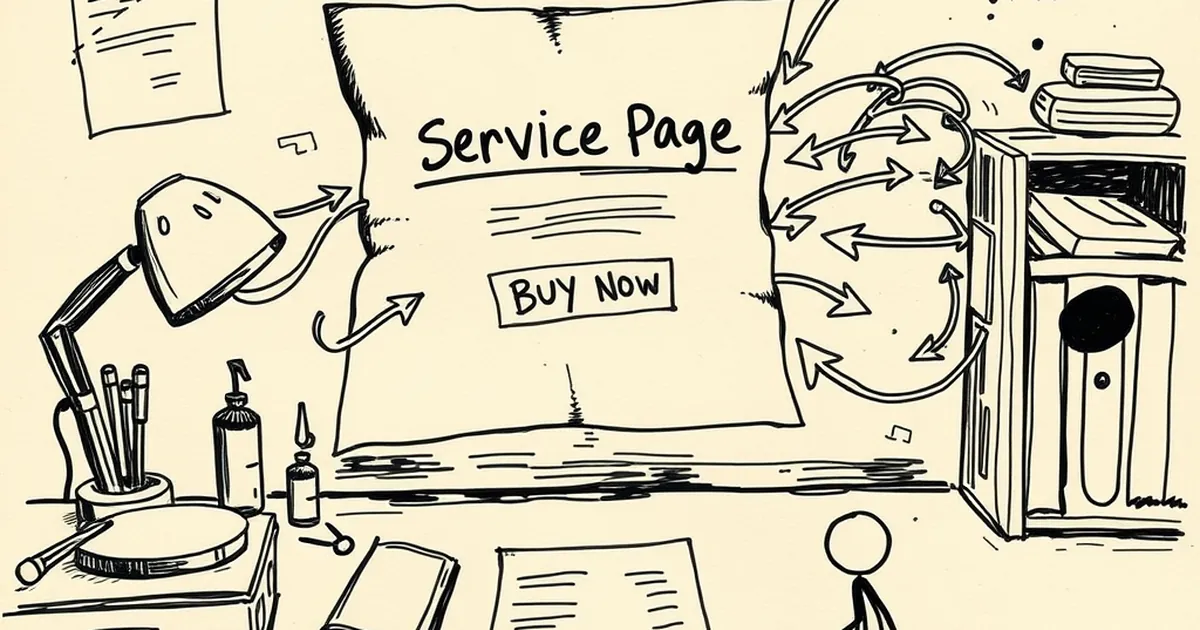
Why your service page is confusing customers who are ready to buy
Find out why your service page may be turning ready-to-buy customers away—and how to fix it
You know that gut feeling when a customer visits your site, fills out a form, mentions they’re “ready to move forward,” and then… nothing. No reply after your follow-up. No booking. Just silence.
It hurts because you know they were keen. But something between their initial interest and your checkout button made them second-guess themselves. More often than not, the culprit isn't your pricing or your portfolio — it’s your service page itself.
Let’s talk about why your service page might be scaring away customers who are literally ready to buy from you today.
They can’t find the price (or anything close to it)
One of the biggest trust-killers for Australian small business owners is the “request a quote” loophole that goes nowhere. You might think you’re being smart by hiding pricing until you can “qualify” the lead. But to a customer who’s already done their research, this feels like a brick wall.
If you run a website development business, you don’t need to list every line of code. But a simple starting point — “Basic business site from $3,500” — gives someone a mental anchor. Without it, they start wondering if you’re going to charge them $15,000 for a three-page brochure site.
I once had a client in Melbourne tell me she visited six different web developer sites in one afternoon. She was ready to spend $5,000. Four of those sites had no pricing at all. She hired the one that showed a clear range. The others lost her forever.
You’re speaking to yourself, not your customer
This is the most common mistake I see on service pages across Australia. The copy is full of industry jargon: “full-stack responsive design,” “SEO-optimised architecture,” “scalable modular framework.” Sounds impressive, but to a tradie, a café owner, or a local accountant? It’s gibberish.
Your customer doesn’t care about your tech stack. They care about whether your service will save them time, make them look professional, or help them get more bookings. Your service page needs to translate your technical skills into real outcomes.
The "so what?" test
Before you publish any sentence on your service page, ask yourself: “So what?” If you say “We use React,” the customer’s brain says “So what?”. But if you say “Your site will load in under two seconds, even on a dodgy 4G connection in the suburbs,” now you’re speaking their language.
Rewrite every feature as a benefit. “Mobile-first design” becomes “Your customers can easily book you from their phone while waiting for their coffee.” “CMS integration” becomes “You can update your own menu or blog without calling me every time.”
The page has too many options
Choice paralysis is real. When a potential customer lands on your service page and sees five different packages, three add-ons, a “custom quote” button, and a contact form for a “free discovery call,” their brain short-circuits. They were ready to buy, but now they have to make too many decisions.
Keep it simple. Offer two or three clear paths. For a web developer, that might be a “Starter Site,” a “Business Site,” and a “Custom Build.” Each option should have a clear price range, a bullet list of what’s included, and a single call-to-action button.
The paradox of choice
I once worked with a plumber in Brisbane who had six service tiers on his website. He was proud of the detail. But when we ran a heat map, customers were clicking on the “contact us” button from the homepage — skipping the service page entirely. They were overwhelmed.
We trimmed it down to three options, each with a clear price tag. His conversion rate doubled in a month. Sometimes less really is more, especially when someone’s ready to hand you their money.
Your call-to-action is weak or confusing
You’ve got them interested. They’ve read the page. They’re ready to take the next step. And then they see a button that says “Learn More” or “Get a Free Quote.” Those words don’t signal commitment. They signal “maybe later.”
If your customer is ready to buy, your CTA should match their intent. Use direct, action-oriented language. “Book a Strategy Call,” “Start Your Project,” “Get My Website Quote.” Avoid vague phrases that let them slip away.
One CTA per page
Don’t give your customer five different things to do. One primary button. One secondary option (like a phone number). That’s it. If your service page has a “contact us” form, a “chat now” popup, a “download our brochure” link, and a “subscribe to our newsletter” box, you’re competing against yourself.
Focus their attention on the one action that moves them forward. If they’re ready to buy, make it as easy as pressing a single button.
You’re missing social proof at the point of decision
Your service page might be beautifully written and perfectly priced, but without proof that other Aussie businesses have trusted you, it’s just words. Customers who are ready to buy want reassurance that they’re making a smart choice.
Include a testimonial or a case study right on the service page — not buried on a separate “testimonials” page. A short quote from a real client in a similar industry can be the final nudge someone needs.
The “just like me” effect
People trust people they can relate to. If you’re a web developer in Perth, include a testimonial from a local café owner. If you’re a plumber in Sydney, show a review from a homeowner in the same suburb. When a customer sees “This business is just like mine, and they were happy,” their hesitation disappears.
A single sentence like “Mel’s Cafe saw a 40% increase in online orders after their new site launched” is worth more than a hundred bullet points about your technical skills.
Your page doesn’t answer the unspoken question
Every customer has a hidden question they rarely ask out loud: “What happens after I click this button?” Your service page should walk them through the next step — not just tell them to contact you.
If your CTA says “Book a Call,” explain what happens on that call. “We’ll chat for 15 minutes about your goals, I’ll show you some examples, and you’ll walk away with a clear idea of what your site will look like and how much it will cost.” That removes the fear of the unknown.
The fear of the follow-up
Australian small business owners are busy. They’re scared that if they contact you, they’ll get a barrage of emails, pushy sales calls, and pressure to sign a contract. Your service page can address that head-on. Add a line like “No obligation, no pressure. If it’s not the right fit, that’s fine.”
When you remove the fear of commitment, you make it easy for them to take the next step.
A practical takeaway for your next update
Here’s the thing: you don’t need to redesign your entire website to fix this. Pick one service page — your most popular one — and spend an hour rewriting it with these principles in mind. Cut the jargon. Add a price range. Simplify the options. Strengthen the CTA. Drop in one relevant testimonial.
Then watch what happens. The customers who were already ready to buy? They’ll finally take that step. And you’ll wonder why you didn’t do it sooner.