Why your site’s contact form is killing your leads
Discover why your contact form is losing leads and how to fix it with smarter design and fewer fields
You’ve spent thousands on SEO, polished your copy, and built a slick design. People are clicking through to your site. Then they hit your contact form and… crickets.
Why would a visitor, already interested enough to reach out, abandon the very tool you’ve given them to do it? The answer isn’t bad luck — it’s usually bad design or bad psychology. And it’s costing you real leads.
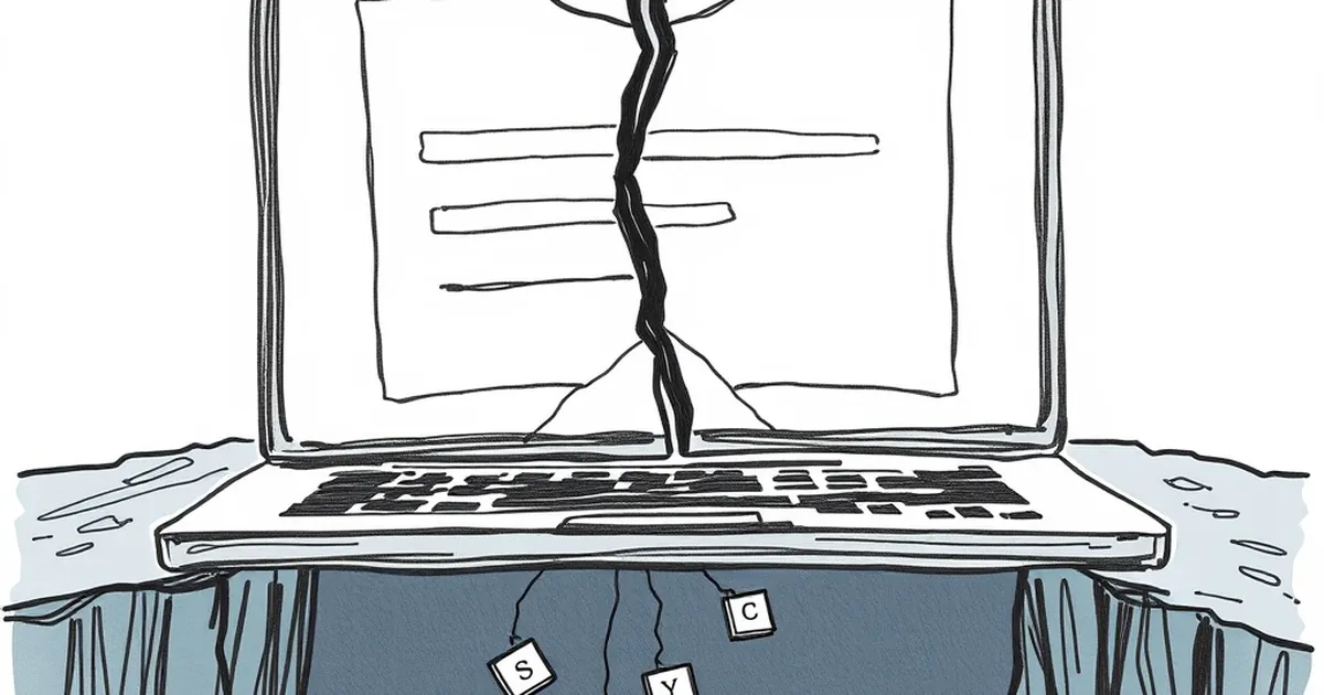
The form field trap: asking for too much, too soon
The single biggest reason contact forms kill leads is simple: they ask for too much information. I see this constantly with Australian service businesses — tradies, accountants, consultants — where the form looks more like a loan application than a friendly invitation to chat.
The “just in case” mentality
Business owners often tell me: “I ask for their phone number, suburb, business name, and a detailed message so I can qualify them before I call back.” That sounds smart in theory. In practice, you’re asking a stranger to hand over personal details before you’ve earned an ounce of trust.
Every extra field is a mental hurdle. A study by HubSpot a few years back found that reducing form fields from four to three increased conversion rates by nearly 50%. That’s not a small bump — that’s a flood of leads you’re currently blocking.
The Australian privacy factor
Australian readers are particularly sensitive about their data. Between the Notifiable Data Breaches scheme and growing awareness around spam, people hesitate to type their mobile number or home address into a random form. If you don’t need their date of birth or their dog’s name, don’t ask for it.
A concrete example: I worked with a Melbourne-based plumber who had a nine-field contact form. Name, email, phone, address, suburb, service type, preferred time, message, and “how did you hear about us”. We cut it down to three fields: name, email, and message. His lead submissions tripled in the first month. He still got enough info to follow up — and he stopped scaring people away.
The design sins that make visitors bounce
Even if your form only has three fields, you can still kill leads with bad layout or confusing cues. Small business websites in Australia are notorious for this, often because the form was an afterthought slapped onto a “Contact” page.
Tiny fields and no visual hierarchy
If your form fields are microscopic, or if they’re crammed into a corner of the page, visitors subconsciously feel like they’re filling out a tax return. Use generous padding, clear labels above the fields (not placeholder text that disappears), and a single-column layout. Multi-column forms confuse the eye and slow people down.
The submit button that screams “meh”
Your submit button should be impossible to miss. I still see grey buttons with low-contrast text that say “Submit” or “Send”. That’s not a call to action — that’s a whisper. Use a button that contrasts with your brand colours and says something specific, like “Get a free quote” or “Send my message”. It’s a small change that signals confidence.
No trust signals nearby
If your form sits alone on a page with no phone number, no physical address, and no privacy note, visitors wonder if you’re real. Add a line like “We’ll never share your details” right above the submit button. If you’re a registered Australian business, mention your ABN nearby. It builds instant credibility.
The broken feedback loop that kills follow-up
Here’s a problem that’s more common than you think: your form works fine, but the follow-up is terrible. A lead submits a message and hears nothing for three days. By then, they’ve called a competitor.
No confirmation or auto-reply
When someone hits submit, they need immediate reassurance. A simple “Thanks, we’ll be in touch within 24 hours” auto-reply does wonders. It also sets an expectation — if you don’t reply in that window, you look unprofessional. Set up an auto-responder in your email system or your CRM. It takes ten minutes.
The “we’re too busy to check” trap
I’ve audited dozens of Australian business sites where the contact form literally goes to an inbox nobody monitors. One client had a form that had been broken for six months — the emails were bouncing into a spam folder. Leads were being sent into a black hole. If you’re not going to check the form daily, turn it off and put your phone number front and centre instead. A dead form is worse than no form at all.
Mobile users: the forgotten majority
Over 60% of web traffic in Australia now comes from mobile devices. If your contact form is a fiddly mess on a phone screen, you’re alienating more than half your potential leads.
Tiny tap targets and keyboard issues
On mobile, form fields need to be large enough to tap with a thumb. If your fields are too small, users will accidentally hit the wrong one, get frustrated, and leave. Also, make sure the keyboard that pops up is appropriate — use type="tel" for phone fields so the number pad appears, and type="email" so the @ symbol is easy to find.
The scroll problem
Some mobile contact forms are so long that users have to scroll endlessly to reach the submit button. If the button sits below the fold and the page doesn’t scroll smoothly, they’ll abandon the attempt. Test your form on an actual phone, not just a browser resize. You’ll be surprised at what you find.
A practical takeaway for Australian business owners
Here’s the forward-looking note I want you to remember: your contact form should feel like the start of a conversation, not an interrogation. Strip it back to the essentials — name, email, message — and test it on a real mobile device. Set up a proper auto-reply and check the inbox daily. Then watch what happens.
The businesses that will thrive in 2025 aren’t the ones with the fanciest forms. They’re the ones that make it effortless for a busy person to say “hello”. That’s the edge you can build this week.