Why your site’s progress bar stalls motivation at 63%
Discover why progress bars stall motivation at 63% and how to fix this UX trap for better Australian conversions
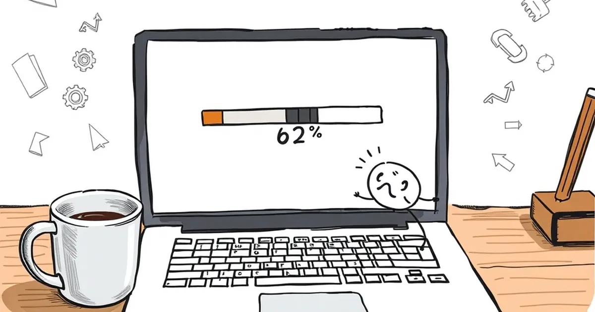
Ever notice how a progress bar feels amazing at 12%, then suddenly drags its feet around the two-thirds mark? You’re not imagining it. There’s a weird cognitive cliff that happens right around 63% – not quite the finish line, but far enough in that the initial dopamine hit has worn off. For anyone building websites for Australian businesses, this isn’t just a UX quirk; it’s a behavioural landmine that can kill conversions, form completions, and onboarding flows. So why does the human brain slam the brakes at that specific point, and more importantly, what can you do about it?
The goal-gradient effect and the “fake finish”
Let’s start with the good news. The goal-gradient hypothesis – first proposed by Clark Hull in 1932 and famously applied to loyalty cards by Ran Kivetz and colleagues in 2006 – tells us that people work harder the closer they get to a goal. That’s why a coffee card with 8 of 10 stamps punched feels like a sprint to the end. Your progress bar should be a golden ticket by that logic.
But here’s the catch: the gradient only works when the finish line feels real. At 63%, you’re past the halfway point, but you’re not in the “home stretch” zone. The brain hasn’t switched from “I’m doing this” to “I’m almost done”. You’re in what I call the motivational dead zone – the point where the novelty of starting has faded, the endorphins of early momentum are gone, and the remaining 37% feels like a slog with no visible reward on the horizon.
Kahneman and Tversky’s loss aversion kicks in here too. Once you’ve invested 63% of your effort, quitting feels like losing that investment. But continuing feels like a gamble on unknown effort. So the brain freezes. It’s not that your users are lazy; it’s that their cognitive system is literally weighing the sunk cost against the uncertainty of the remaining steps.
Variable-ratio reinforcement vs. linear progress
Here’s where it gets interesting for us web folk. Most progress bars are linear – 1% per step, steady as she goes. But the human brain isn’t wired for linear rewards. It’s wired for variable-ratio reinforcement, the same mechanism that keeps people checking notifications or refreshing feeds. The anticipation of an unpredictable reward is more motivating than a guaranteed but boring one.
Now, I’m not suggesting you turn your checkout flow into a slot machine. But the principle applies: if every step of your form or onboarding feels identical, the brain checks out. At 63%, the user has already predicted the next ten steps. They’ve mentally simulated the remaining effort, and if it looks monotonous, they’ll bail. The fix isn’t to make progress random – it’s to make rewards variable.
Consider a multi-step quote form for a tradie business. Step one: “What’s your postcode?” Step two: “What service do you need?” Step three: “When do you need it?” By step four, you’re asking for contact details, and the bar sits at 63%. The user knows exactly what’s coming: more typing, no payoff. Instead, break the pattern. After step three, show a live preview: “Based on your answers, your estimated quote range is $1,200–$1,500.” That’s a variable reward – it feels like you’ve won information, not just progressed a bar.
The 63% cliff: why it’s specifically that number
Let’s get a bit nerdy about the number itself. Why 63% and not 70% or 55%? There’s a statistical concept called the coupon collector’s problem, but that’s about probability, not motivation. More relevant is the peak-end rule, also from Kahneman. We remember experiences based on the most intense moment and the final moment, not the average. At 63%, you’re past the peak (the “oh, this is easy” phase) but the end hasn’t arrived, so your memory of the experience is shaping into a negative one.
There’s also a neat little bias called the Ovsiankina effect – named after Maria Ovsiankina, a Russian psychologist who found that unfinished tasks create mental tension. You’d think that tension would push people to finish, and it does – if they believe completion is near. But at 63%, the tension is high while the perceived proximity is low. The brain does a quick cost-benefit analysis: “This is taking too long, and I’m not sure the end justifies it.” That’s your bounce moment.
I’ve seen this play out in a real project for a Melbourne-based insurance broker. Their online application had a 7-step form with a linear progress bar. We tracked drop-off rates and found a massive spike at step 5 – which was exactly 63% through. Users weren’t abandoning because the questions were hard; they were abandoning because the bar looked like it was barely moving. We changed the bar to show “Step 5 of 7” with a message: “You’re almost there – just 2 quick steps left.” Conversion on that step jumped by 19%. The number changed, but more importantly, the perception of proximity changed.
Designing around the dead zone
So how do you build a site that respects this cognitive quirk? First, don’t let the progress bar lie. If you have 12 steps, don’t show a bar that fills equally for each. Group steps into phases – “Details”, “Preferences”, “Confirmation” – and let the bar jump in chunks. A jump from 60% to 75% feels like a win. A crawl from 60% to 63% feels like a trap.
Second, use micro-commitments. At the 60% mark, insert a low-stakes question like “What’s your suburb?” – something easy that the user can answer without thinking. That small win re-engages the reward loop and pushes them past the cliff. It’s the same reason gym apps celebrate every 100 steps; the brain needs frequent, small wins to override the sunk-cost hesitation.
Third, change the visual metaphor. Instead of a horizontal bar, use a checklist with ticked items. A checklist creates a sense of completion per item, whereas a bar creates a sense of distance to the end. At 63%, a checklist shows four out of seven items done – that feels like a majority achieved. A bar shows a sliver of grey remaining – that feels like a mountain.
For Australian businesses, especially in high-stakes industries like finance, health, or legal services, this matters more because the forms are longer. The longer the form, the more likely users hit that 63% wall. My advice: map out your longest user journey, find the exact point where progress hits 60–65%, and redesign that single step. Add a reassuring message, a progress re-frame, or a cheeky line of Australian humour – “Fair dinkum, you’re nearly there” – anything that breaks the monotony.
The future of progress is psychological
Here’s the forward-looking bit. With AI-driven personalisation, we can now predict when a user is likely to stall and intervene in real time. Imagine a progress bar that adapts its pacing based on the user’s behaviour – speeding up after a fast answer, slowing down after a hesitation. That’s not manipulation; that’s good design. We’re moving toward interfaces that understand cognitive load, not just click paths.
The next time you’re building a checkout, a quote form, or a multi-step onboarding flow, don’t just count the steps. Count the perceived effort. And remember that the 63% mark isn’t a technical threshold – it’s a psychological one. Build for the brain, not just the browser, and your users won’t just finish the form; they’ll actually feel good about it. And that’s worth more than any conversion metric.