Why your site’s skill meter flattens after three perfect scores
Why your site’s skill meter flattens after three perfect scores—and how psychological certainty kills engagement
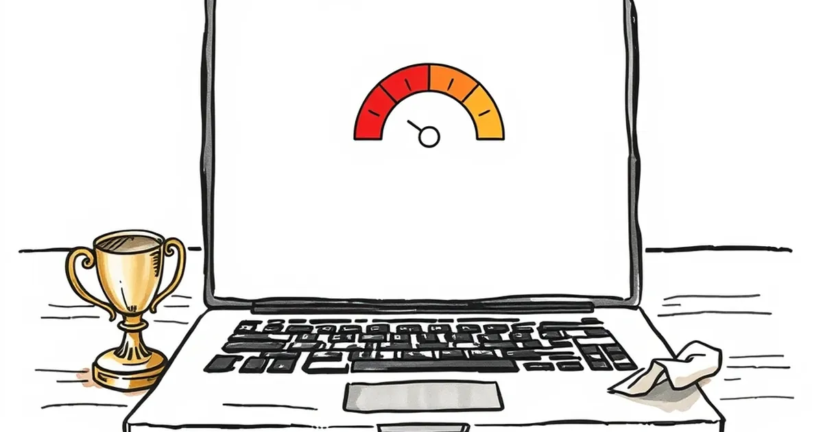
Ever noticed that moment when a user lands on your site, nails the first interaction, gets it right again, and then… just stops caring? You’ve built a killer onboarding flow, the feedback loops are tight, and your analytics show a perfect completion streak. Yet engagement flatlines. It’s not a design flaw. It’s a psychological ceiling — and it’s directly tied to how your brain processes certainty versus surprise.
The problem isn’t that your site is too easy. It’s that you’ve accidentally trained your users to expect a predictable outcome. And once the brain figures out the pattern, the dopamine tap turns off. Let’s unpack why your skill meter stops working after the third perfect score, and what that means for how you build for real humans.
The three-strike rule of mastery (and boredom)
Think about the last time you learned a new piece of software. Day one: every click feels like a tiny victory. Day two: you’re faster, but the novelty’s wearing off. Day three: you can do the thing blindfolded — and that’s precisely when you start looking for the exit.
This isn’t just anecdotal. It maps neatly onto the Yerkes-Dodson law, which describes the inverted-U relationship between arousal and performance. Too little challenge, and you get apathy. Too much, and you get anxiety. The sweet spot — the peak of that curve — is where skill and difficulty just barely outpace each other.
Here’s the kicker: your site’s “skill meter” (progress bars, achievement badges, completion percentages) is a static reward. Once a user hits 100% three times in a row, their brain has logged the pattern. It’s not a challenge anymore; it’s a chore. The reward loop has collapsed because the prediction error — the gap between what you expect and what you get — has dropped to zero.
Why the third perfect score is the danger zone
The first perfect score feels like luck. The second feels like competence. The third feels like routine. And routine is the enemy of engagement. In behavioural psychology, this is called habituation. Your neurons fire less intensely to repeated stimuli, even if the stimulus is positive. That’s why that shiny new dashboard you spent weeks polishing starts feeling like wallpaper by week two.
For Australian businesses, this has a very practical sting: you’re paying for traffic, but you’re not building stickiness. A user who’s habituated to your interface isn’t loyal — they’re just not annoyed enough to leave. Yet.
Variable-ratio reinforcement meets your onboarding flow
This is where things get genuinely interesting. B.F. Skinner’s work on reinforcement schedules isn’t just lab-rat lore — it’s the most underused tool in web design. Specifically, variable-ratio reinforcement (where rewards come after an unpredictable number of responses) is the strongest known driver of repeat behaviour. It’s why checking your phone feels compulsive even when there’s no new notification. The possibility of the reward is the reward.
Now, look at your site’s feedback system. If you’re rewarding every single correct action with a badge, a chime, or a progress fill, you’re using a fixed-ratio schedule. Predictable. Linear. Boring. And crucially, it teaches the user that effort equals reward — which sounds great, but it also means that once the effort stops, the reward stops mattering.
The fix isn’t to remove feedback. It’s to randomise the intensity of it.
A concrete example: Duolingo’s sneaky streak system
Duolingo famously uses streaks to keep users coming back. But the real genius is in their variable rewards — the occasional bonus XP, the sudden “legendary” challenge, the unexpected streak freeze. They don’t give you the same confetti cannon every time. Sometimes it’s a quiet “nice”. Sometimes it’s a full-screen celebration. The unpredictability is what keeps your brain guessing.
For your site, this might look like: after a user completes a task, instead of always showing “Task complete ✓”, occasionally show a “Bonus insight unlocked” — a piece of data or a tip they didn’t expect. Or, after three perfect completions, throw in a harder variant of the task, not an easier one. That’s the opposite of what most dashboards do, and it’s exactly why most dashboards die.
Loss aversion: the quiet killer of skill meters
Here’s another layer. Daniel Kahneman and Amos Tversky’s prospect theory tells us that losses hurt roughly twice as much as equivalent gains feel good. Your skill meter, if it’s purely additive, is playing the wrong game. A progress bar that only goes up gives the user nothing to lose.
But flip it. What if the meter could decay? What if a user who hasn’t logged in for three days sees their “sharpness score” drop by 10% — not as a punishment, but as a visual representation of reality? Skills fade without practice. That’s not a guilt trip; it’s honest feedback. And oddly, it’s more engaging than a static trophy cabinet.
The trick is to frame the decay as information, not as a penalty. Think of it like a fitness app showing your VO2 max trend. You don’t hate the app for showing a decline; you hate that you skipped a run. The app becomes a mirror, not a judge.
The risk of overcorrecting
Now, a warning. If you crank up loss aversion and variable rewards too hard, you tip into anxiety-driven design. The user starts checking your site not because they want to, but because they’re afraid of what they’ll lose. That’s a short-term engagement hack with a long-term churn cost.
The balance is in agency. The user needs to feel like they’re choosing the challenge, not being chased by it. Give them the option to “reset” their skill meter voluntarily. Let them opt into a harder track. That’s not gamification — that’s respect.
What this means for your next build
Stop thinking of your website as a destination. Start thinking of it as a coach — one who knows when to push, when to cheer, and when to stay quiet.
Here are three practical shifts you can make this week:
Audit your reward schedule. List every time your site gives visual or textual feedback. If it’s 100% predictable, introduce one element of variability. It doesn’t have to be wild — a random “quick tip” that appears after a successful action is enough to reset the prediction error.
Add a “stretch goal” tier. After a user hits three perfect completions, don’t show a bigger trophy. Show a different challenge — something that requires a skill they haven’t used yet. This keeps the Yerkes-Dodson curve honest.
Build in graceful decay. If you track user activity, show a trend line, not just a current score. A gentle visual of “you were sharper last Tuesday” does more for retention than a constant “100%” ever will.
The skill meter isn’t broken because it’s a bad idea. It’s broken because it’s a static idea. Your users aren’t bored of your site — they’re bored of knowing exactly what comes next. Give them the gift of a little uncertainty, and watch the flatline turn back into a heartbeat.