Why your website’s challenge system kills curiosity at level 4
Discover why website challenge systems lose user engagement by level 4 and how to sustain curiosity through better reward design
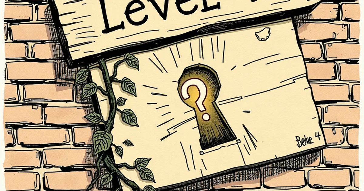
We’ve all felt it: that little pop of dopamine when you unlock a new badge or complete a “level” inside a website or app. Then, somewhere around the fourth or fifth challenge, something goes quiet. The spark fizzles. You stop caring. The question is: why does that happen, and what does it have to do with building a business website that actually holds people’s attention?
It’s tempting to think the answer is just “make harder challenges.” But the real issue isn’t difficulty—it’s how your system handles uncertainty, risk, and reward. The moment a challenge becomes predictable, your user’s brain switches from playful exploration to bored compliance. And boredom kills curiosity faster than any bug ever could.
The level 4 wall: why the middle is the hardest part
Think about the typical progression in a website’s gamified experience. Level 1 is a tutorial: easy win, big feedback. Level 2 shows you the ropes: still simple, but you feel competent. Level 3 introduces a genuine challenge—maybe a form that requires real thought or a decision that matters. Then comes level 4. And level 4 is where most systems break.
Why? Because by level 4, the user has learned the rules. The variable that kept them curious—the uncertainty of what happens next—has collapsed into a known pattern. The brain’s reward system, driven by dopamine, is highly sensitive to novelty and prediction error. When you can accurately predict the outcome, the dopamine response drops. This is a well-documented phenomenon: the reward prediction error hypothesis, which essentially says we learn most when the outcome surprises us. Once you know the pattern, the system becomes a chore, not a game.
For a business website, this is a disaster. You’ve spent time and money building a system meant to guide a user through a journey—maybe onboarding, maybe product discovery, maybe a learning module. And you’ve accidentally trained them to stop paying attention right when they’re most valuable to you (and to themselves).
Variable rewards work—until they don’t (if you do them wrong)
The most famous concept from behavioural psychology that applies here is variable-ratio reinforcement. B.F. Skinner showed that pigeons peck a lever more persistently when the reward comes at unpredictable intervals than when it’s fixed. This principle is why slot machines (which we are not talking about) are so compelling, and also why email notifications and social media likes feel addictive.
But here’s the nuance most website builders miss: variable rewards work beautifully for habitual behaviours—checking, scrolling, tapping. They are terrible for exploratory behaviours—learning, decision-making, risk-taking. When you’re trying to guide someone through a complex decision (like buying your service or navigating a product), a variable reward schedule actually increases anxiety and reduces trust. You want the user to feel safe enough to explore, not stressed enough to chase a random carrot.
The level 4 wall often happens because the system switches from a predictable, safe learning structure (levels 1-3) to an unpredictable reward structure (level 4+) without warning. The user was told “do X, get Y,” and then suddenly Y becomes random. Their brain goes, “This is broken,” not “This is fun.” Curiosity dies.
Loss aversion: the hidden saboteur of challenge systems
Let’s talk about another classic: loss aversion, first formalised by Kahneman and Tversky. People feel the pain of losing something roughly twice as strongly as the pleasure of gaining the same thing. In a challenge system, this manifests as: “If I fail level 4, I lose my streak, I lose my badge, I lose my progress.”
Most websites design level 4 as a “gate”—a moment where you must succeed to proceed. This is a classic loss aversion trap. The user, sensing a potential loss, becomes risk-averse. They stop exploring, stop experimenting, and start trying to not fail. That’s the opposite of curiosity. Curiosity requires a safe environment for failure. If level 4 feels like a high-stakes test, your user will either disengage or cheat the system (click the same safe option repeatedly), which teaches them nothing and kills the experience entirely.
I once worked with a small Australian e-learning platform that had a brilliant onboarding flow. Users completed three modules easily, then hit a fourth module that required a live quiz with a timer. Drop-off at that point was 70%. When we removed the timer and added a “try again without penalty” button, completion jumped to 85%. The challenge was identical—the same questions, the same difficulty. The only difference was removing the perception of loss. The brain could stay curious because failure was safe.
The one concrete example: Duolingo’s streak vs. Khan Academy’s mastery
Consider two well-known systems. Duolingo uses a streak mechanic. If you miss a day, you lose your streak. That’s pure loss aversion, and it works—for a while. But studies and user interviews show that after about a month (roughly level 4 in streak terms), many users report feeling trapped rather than curious. They do the bare minimum to preserve the streak, not to learn. The curiosity about language has been replaced by anxiety about a number.
Khan Academy, on the other hand, uses mastery-based progression. You can’t move forward until you demonstrate understanding, but there’s no penalty for trying. You can retry as many times as you want. Interestingly, Khan Academy’s challenge system has a different kind of drop-off: users often stall at level 4 of a topic because the content gets harder, but they don’t feel loss—they feel boredom from repetition. The fix there wasn’t more rewards; it was offering lateral challenges (related topics) instead of vertical ones. They introduced choice as a variable.
The lesson for your business website? Don’t just make level 4 harder. Make it different. Give the user a fork in the road. Let them choose a path. That reintroduces uncertainty in a safe way—the kind of uncertainty that fuels curiosity.
How to design a challenge system that keeps curiosity alive past level 4
So, what do you actually do? You don’t need to rebuild your entire site. You need to rethink the structure of your challenge system at the point where it currently breaks.
First, introduce safe failure at the critical point. If level 4 is where users drop off, make that level explicitly low-stakes. Remove timers, remove penalties, remove streak-breaking mechanics. Add a “try again” button. Add a hint system. The goal is to keep the user in a state of exploration rather than avoidance.
Second, use variable rewards for discovery, not for completion. Instead of rewarding the user for finishing level 4, reward them for exploring a related area. For example, if your website has a learning module about SEO, after level 3, offer a bonus challenge that’s unrelated but interesting (like “find the hidden Easter egg in the page footer”). The reward is unpredictable but the path is safe. This keeps the dopamine system engaged without triggering loss aversion.
Third, give the user a meaningful choice at the inflection point. Don’t just escalate difficulty. Offer two paths: a harder version of the same challenge, or a lateral challenge that applies the same skill in a different context. This mimics the kind of decision-making that feels like play. Research on autonomy in motivation (Self-Determination Theory) consistently shows that perceived choice is one of the strongest drivers of intrinsic motivation. Your level 4 should be a crossroads, not a wall.
Finally, measure the right thing. Don’t just track completion rates. Track revisits. Track time spent exploring after level 4. Track whether users click on help or hints. Those behaviours are the actual signals of curiosity. If they’re dropping, your system is not challenging them—it’s punishing them.
The forward-looking close: curiosity is a system, not a feature
Here’s the thing: your website’s challenge system isn’t a gimmick. It’s a model of how you want your users to think and behave. If your system kills curiosity at level 4, it’s telling you that somewhere between safety and risk, you’ve misjudged the balance.
The future of good web design isn’t about adding more gamification. It’s about understanding the psychology of uncertainty—when to use it, when to remove it, and how to let your users feel smart without feeling trapped. Your next level 4 doesn’t need to be harder. It needs to be more interesting. Give your users a reason to stay curious, and they’ll do the hard work themselves.