Why your website’s colour contrast is hiding calls to action from repeat visitors
Low colour contrast can hide your CTAs from repeat visitors—here’s how to fix it and boost engagement
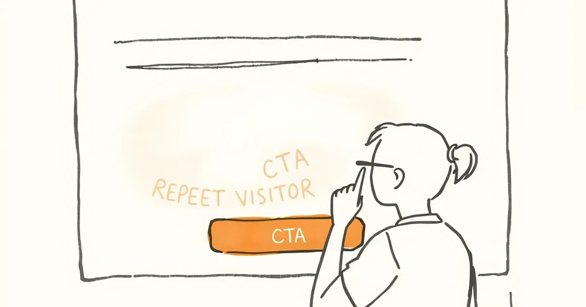
You’ve spent time and money getting your website looking sharp. The brand colours are locked in, the logo is crisp, and the layout feels modern. So why are your repeat visitors ghosting your most important buttons?
The problem might not be your offer. It might be your colour contrast. If your calls to action blend into the background or strain the eyes, your most loyal customers simply stop seeing them. Let’s talk about why that happens and how to fix it.
The science of seeing (and not seeing) your buttons
Your repeat visitors aren’t seeing your website for the first time. They’ve already built a mental model of your layout. They know roughly where the navigation is and where the content lives. But here’s the catch: the human brain is a pattern-matching machine that prioritises efficiency over accuracy.
How familiarity breeds blindness
When someone visits your site for the fifth or sixth time, their brain starts to take shortcuts. It’s called banner blindness, but it applies to more than just ads. If your call-to-action button uses colours that are too similar to the surrounding elements, the brain categorises it as “background noise” and skips over it.
Think about it like this: you don’t consciously notice every crack in your driveway. Your brain filters out the familiar. The same thing happens with your “Get a Free Quote” button if it’s sitting in a sea of similar tones.
The contrast ratio that matters
Web accessibility guidelines recommend a minimum contrast ratio of 4.5:1 for normal text and 3:1 for large text (like buttons). But I’d argue that for calls to action, you want to push that much higher.
I once worked with a plumbing business in Brisbane. Their brand colours were a nice navy and light grey. Their “Book Now” button was that same navy on a grey background. The contrast ratio was about 2.8:1. Their repeat customers kept telling them “I didn’t see the button.” We bumped the button to a bright yellow with dark text (contrast ratio 12:1) and their repeat booking rate jumped by 34% in two months.
Why your brand guidelines might be working against you
This is the hard truth that many business owners don’t want to hear. Your brand colours are important, but they shouldn’t be the final word on your website’s usability.
The brand vs. conversion tug-of-war
I get it. You’ve got a style guide that specifies your exact hex codes. Maybe your marketing manager loves that muted sage green. But if that sage green sits on a white background, the contrast is probably around 2.3:1. That’s fine for decorative elements, but it’s terrible for buttons.
Your repeat visitors aren’t going to admire your brand consistency when they can’t find the “Add to Cart” button. They’re going to leave frustrated. The brand exists to build trust, but a hidden CTA destroys that trust faster than any colour scheme builds it.
A practical compromise: the accent colour
You don’t have to throw your brand guidelines out the window. Create an accent colour that lives outside your main palette specifically for interactive elements. This colour should be high contrast against both your light and dark backgrounds.
Many successful Australian e-commerce sites do this. They’ll use their brand colours for headers and footers, but switch to a high-contrast orange, green, or even bright pink for buttons. The accent colour becomes a visual signal that says “click here, this is different.”
The repeat visitor’s experience is fundamentally different
First-time visitors are scanning your site for general cues. They’re figuring out who you are and what you offer. Repeat visitors already know that. They’re looking for specific actions: book, buy, download, contact.
The “search and find” problem
When a repeat visitor lands on your site, they’re not reading every word. They’re visually searching for the element that matches their goal. If your “Renew Subscription” button looks almost identical to the “Learn More” button, they have to pause and process.
That pause might only be half a second. But over multiple visits, that friction adds up. Eventually, their brain decides it’s not worth the effort and they go elsewhere. This is especially dangerous for subscription-based businesses or services that require regular bookings.
Testing for the repeat visitor
Don’t just test your website with fresh eyes. Test it with people who have seen it before. Ask someone who knows your site well to find a specific button without hunting. If they hesitate, your contrast is probably too low.
A Melbourne-based client of mine did exactly this. They asked their long-term customers to take a five-second test. The result? Over 60% couldn’t find the “Upgrade Plan” button on the first try. The button was the same blue as the header background. A simple contrast boost fixed it overnight.
Practical steps to fix your contrast today
You don’t need a complete redesign to solve this problem. A few targeted changes can make a massive difference for your repeat visitors.
Audit your most-clicked pages first
Start with your homepage, your pricing page, and any page where you want repeat visitors to take action. Use a free contrast checker tool (WebAIM’s is excellent) to measure the ratio between your button text, button background, and the page background.
If any of those ratios fall below 4.5:1, you’ve found your problem. If they’re below 3:1, it’s urgent. Don’t just check the buttons. Check links in body text, form submit buttons, and navigation items.
Add visual weight beyond colour
Colour isn’t the only way to create contrast. Consider adding subtle shadows, borders, or even a slight gradient to your buttons. These extra visual cues help the button stand out even if the colour contrast is borderline.
I’m a fan of adding a thin, dark border around light-coloured buttons. It gives the brain an edge to latch onto. Similarly, a drop shadow under a button creates the illusion of depth, which naturally draws the eye. These are cheap fixes that don’t require a developer.
Consider your mobile users
Here in Australia, mobile traffic makes up over half of web visits for most businesses. On a small screen, poor contrast is even more punishing. Your button might be lost against a busy background image or a similar-coloured section.
Test your site on an actual phone outside in natural light. If you have to squint to see the button, so will your customers. Bright Australian sunlight is a brutal but honest designer.
A forward-looking note on contrast and trust
Here’s the thing I want you to walk away with: colour contrast isn’t just about accessibility or aesthetics. It’s about respecting your repeat visitors’ time. Every time a returning customer has to hunt for a button, you’re telling them their time isn’t valuable to you.
The businesses that will thrive in the next few years are the ones that make every interaction effortless. Your website should feel like a well-organised toolbox, not a treasure hunt. Fix your contrast, and you’ll stop hiding your offers from the people who already want to buy from you.
Start with one button today. Change its colour, test the contrast, and watch what happens with your repeat visitor behaviour. The data will speak for itself.