Why your website’s contact page is pushing users straight to your competitors
Your contact page may be driving users to competitors—discover how to fix it and keep customers engaged
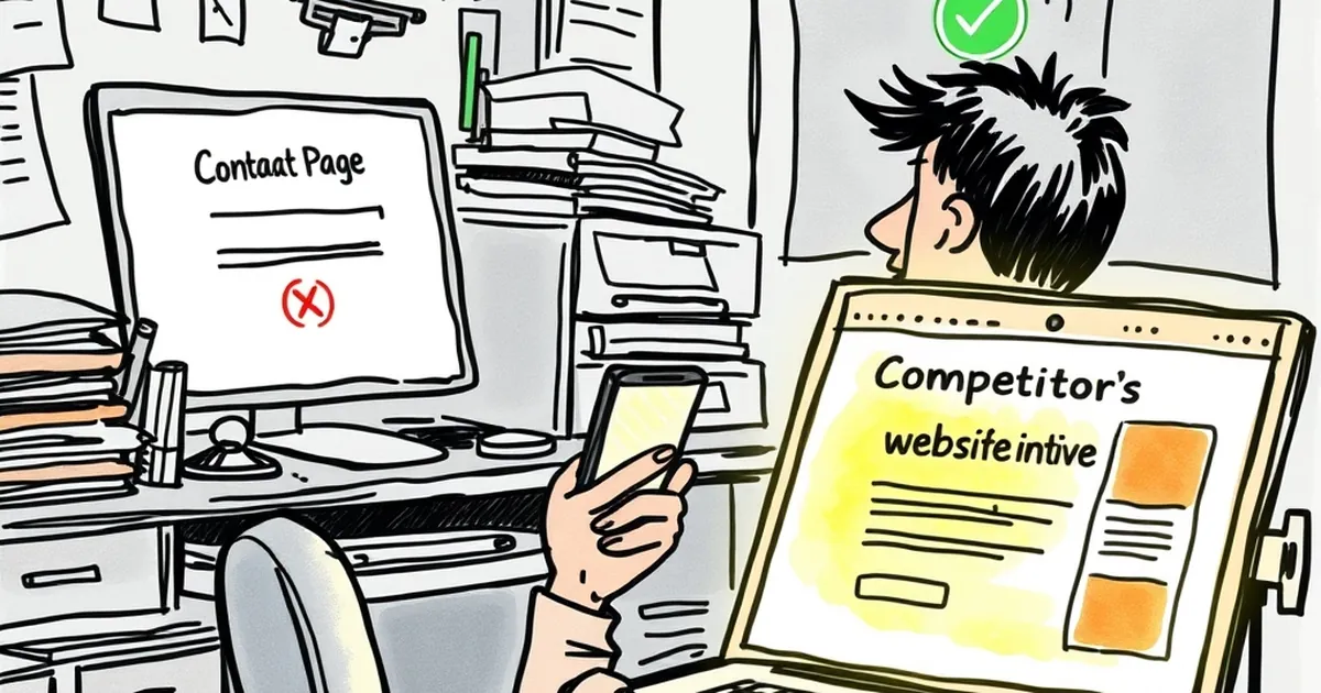
Let’s be honest: when was the last time you actually clicked through to your own contact page? Not just glanced at it, but really tried to use it the way a potential customer would. For most business owners, that page is an afterthought — a boring form slapped onto the template and forgotten. But for your visitors, that page is the final test. If it fails, they don’t stick around to give you feedback; they just click over to your competitor and never come back.
The brutal truth about first contact
Your contact page is often the last click a user makes before deciding whether to trust you with their money. If that page feels like a dead end, you’ve wasted every dollar you spent getting them there. I’ve seen beautiful, award-winning websites that drive traffic like a dream, only to lose the sale because the contact page looked like it was built in 2005 and never updated.
In Australia, where local competition is fierce and word-of-mouth travels fast, a bad contact experience doesn’t just lose you one customer — it loses you their mates, their family, and every person they complain to at the pub. The stakes are higher than most business owners realise.
The form that kills your leads
Let’s start with the most common offender: the contact form. I get it — you want to filter out spam and time-wasters. But there’s a fine line between “qualified lead” and “I give up.”
Too many fields, too little patience
If your form asks for a phone number, a street address, the size of their business, their annual revenue, and a detailed project brief before they’ve even spoken to a human, you’ve already lost them. People are busy. They’re on their phone during their commute or scrolling on the couch after dinner. They don’t want to fill out a tax return to ask a simple question.
I once worked with a tradie in Melbourne who had a nine-field contact form. He was proud of it — thought it weeded out “tire-kickers.” After we trimmed it to name, email, and a short message field, his enquiries tripled in two weeks. The “tire-kickers” turned out to be real customers who just didn’t want to jump through hoops.
The missing confirmation
Here’s a subtle one that drives me nuts: you fill out the form, hit submit, and then… nothing. No confirmation message. No email auto-reply. Just a spinning wheel or a blank page. For the user, that’s like knocking on a door and hearing nothing — you assume no one’s home.
Always, always show a clear confirmation. Even better, send an instant auto-reply that says “We got your message and we’ll be in touch within 24 hours.” That tiny reassurance stops people from refreshing your site and calling your competitor instead.
Contact methods that don’t match your audience
Not every customer wants to fill out a form. Some want to pick up the phone. Others want to send a quick email. And a growing number of Australians — especially under 40 — prefer to message via social media or WhatsApp.
If your contact page only offers one method, you’re turning away everyone who prefers another. Think about your typical customer: are they tradies who call during work hours? Busy parents who email late at night? Young professionals who message after hours on Instagram? Your contact page should reflect how your customers actually want to talk to you.
The phone number trap
Plenty of Aussie businesses still list a phone number but don’t actually answer it during business hours. Worse, they hide it behind a click-to-call button that doesn’t work on desktop. If a potential customer hears a voicemail or gets a busy signal twice, they’re gone. If you’re going to list a phone number, actually pick up the phone — or use a service that forwards calls to your mobile.
Design that screams “don’t talk to me”
Your contact page’s design sends a silent message. If it’s buried in the footer, hard to find, or looks like an afterthought, you’re telling visitors you don’t really want to hear from them. That’s a terrible message to send right when they’re ready to buy.
The invisible contact page
I’ve seen websites where the contact page is hidden under a dropdown menu labelled “More” or “Company.” No one clicks “More” unless they’re desperate. Your contact page should be in your main navigation, preferably next to “About” or “Services.” It’s that important.
Visual clutter and broken links
Another classic: a contact page with a giant hero image, a three-paragraph backstory, and a tiny form tucked in the bottom corner. Or worse, a Google Map embed that doesn’t load properly and slows the whole page down. Keep it clean. Keep it simple. The goal is to make it easy for someone to reach you, not to impress them with your design skills.
A concrete example: the plumber who fixed his contact page
Let me tell you about a plumber in Brisbane I helped a couple of years back. He had a decent website, ranked well for local searches, but his phone wasn’t ringing as much as he expected. When I looked at his contact page, it was a mess: a five-field form, a phone number in a tiny font, and a contact email that bounced back because he’d stopped using that account.
We simplified the form to name, phone, and a short description of the job. We made the phone number big and clickable on mobile. We added a WhatsApp button for after-hours messages. Within a month, his leads went up by 60%. He told me the best part was that people actually thanked him for making it easy to get in touch. That’s the kind of feedback you want.
The practical takeaway
Here’s what I want you to do this week: go to your own website and try to contact yourself. Not as the owner, but as a new customer. Fill out the form. Call the number. Send an email. See what happens. If you hit a roadblock — a slow form, a broken link, a voicemail that never gets returned — fix it today.
Your contact page isn’t the end of the customer journey. It’s the beginning of a relationship. If you make that first step easy and welcoming, you’ll keep more customers right where they belong — with you.