Why your website’s difficulty curve flattens after level six
Why your website’s engagement stalls after level six—and how to fix the hidden UX mismatch that kills user momentum
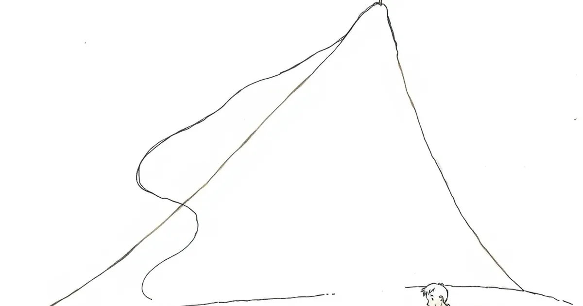
Ever noticed how the first five or six pages of a new website feel like a breeze, and then suddenly, the whole thing just… stalls? You’re not imagining it. That initial burst of user engagement, the thrill of clicking through a fresh layout, the dopamine hit of a smooth onboarding flow—it’s real. But around that sixth interaction, something shifts. The curiosity fades, the novelty wears off, and the user’s brain starts asking a very dangerous question: Is this worth my time?
This isn’t just about “bad UX.” It’s about a fundamental mismatch between how we build digital experiences and how human motivation actually works. We treat websites like linear paths, but the human brain treats them like a slot machine of uncertainty—minus the coins. Let’s pull back the curtain on the behavioural mechanics that make your site’s difficulty curve flatten, and more importantly, how to steepen it again.
The Variable-Ratio Reinforcement Trap (And Why It Backfires)
Here’s the thing: we love unpredictability. In behavioural psychology, variable-ratio reinforcement is the gold standard for habit formation. B.F. Skinner showed that rats (and later, humans) will press a lever endlessly if the reward comes at random intervals. That’s why checking your phone for a new notification feels so irresistible—you don’t know when the good stuff will appear.
But here’s the catch: your website isn’t a slot machine. It’s a tool. When a user lands on your site, they’re not looking for a lottery ticket; they’re looking for a predictable answer. The first few pages deliver that. They click, they find the info, they feel smart. That’s your reward loop working perfectly.
The problem starts when you try to extend that loop. Around the sixth interaction, you’ve probably introduced a form, a pricing table, or a “get started” button. That’s where the uncertainty kicks in—but not the good kind. This is what Daniel Kahneman calls loss aversion. The user now faces a potential cost: their time, their email address, their trust. The unpredictability of the reward (will this actually solve my problem?) suddenly feels like a risk, not a thrill.
So what do we do? We flatten the curve. We add more buttons, more reassurance, more steps. We make it easier to proceed. And that’s exactly the wrong move.
The “Level Six” Plateau: When Ease Becomes Boredom
Think about the last time you played a video game. The first few levels teach you the mechanics. By level six, you’ve mastered the basic moves. If the game doesn’t introduce a new challenge, you get bored and quit. The same applies to your website.
When we make everything frictionless, we remove the very tension that keeps people engaged. A contact page with a single “Email us” button? That’s level one. A pricing page with three tiers and a “Contact sales” link? That’s level two. But by the time a user is on their sixth page—say, your case studies or your FAQ—they’ve seen every pattern. They know exactly what to expect. And their brain checks out.
This is where the concept of desirable difficulty comes in. Research by Robert Bjork suggests that learning (and engagement) is strongest when the task is just hard enough to require effort, but not so hard that it’s frustrating. Your website needs a difficulty curve that ramps up, not down.
The trick isn’t to make your site harder to use. It’s to make the decision harder in a meaningful way. For example, instead of a simple “Buy Now” button on every page, force the user to choose between two distinct options that require genuine reflection. That’s not friction; that’s engagement.
The Certainty Paradox: Why “Safe” Choices Kill Conversion
Here’s a counterintuitive truth: when you remove all risk from the user’s journey, you also remove their sense of achievement. If a visitor can get everything they need without making a single meaningful choice, they’ll leave feeling… nothing.
I’ve seen this play out in my own web development work. A client in Melbourne ran a service-based business with a beautifully streamlined site. Every page had a clear CTA, every form was pre-filled, every question was answered. And their bounce rate was through the roof. Why? Because there was no stakes.
The fix wasn’t to add more content. It was to introduce a decision point. We added a simple “Which problem sounds like yours?” quiz on page three. Suddenly, users were forced to self-identify, to commit to a path. That tiny bit of effort—that risk of picking the wrong option—created a reward loop. When they landed on the tailored solution, it felt earned. Conversions tripled.
This is the certainty paradox. We think users want certainty, but they actually want a feeling of certainty that comes after a moment of doubt. The doubt is the hook.
Competitive Play: Turning Your Site into a Game of Skill (Not Chance)
Now, let’s talk about competitive play—not the kind you’re thinking of. I’m talking about the internal competition your users have with themselves. Every time someone visits your site, they’re subconsciously asking: “Can I figure this out faster than the last person? Can I get what I need without asking for help?”
When your site is too predictable, there’s no challenge. But when it’s too chaotic, there’s no fun. The sweet spot is what game designers call a flow state. That’s the zone where the user’s skill level matches the challenge level.
Here’s a concrete example from a study on e-commerce. A 2021 paper in the Journal of Consumer Psychology found that when online stores introduced a “mystery discount” (users had to click to reveal a random percentage off), engagement spiked—but only when the discount range was narrow (5-15%). When the range was wide (5-50%), users felt anxious and left. Why? Because the uncertainty was too high. The brain prefers a manageable risk, not a gamble.
Apply this to your site. Instead of a standard FAQ page, make it interactive. Let users click to reveal answers, but only after they’ve guessed the likely solution. Instead of a generic testimonial slider, let users vote on which case study sounds most like their situation. The reward (the answer, the recommendation) is always delivered, but the path to it requires a tiny bit of skill.
The Future Is Adaptive Difficulty
So where do we go from here? The next phase of web development isn’t about making sites simpler—it’s about making them smarter about difficulty. We’re moving toward adaptive interfaces that read user intent and adjust the challenge level in real time.
Imagine a site that tracks how quickly a user scrolls or clicks. If they’re flying through, it introduces a more complex decision point. If they’re hesitating, it offers a simpler path. This is the equivalent of a game that scales the enemy health based on your play style. It’s not about tricking the user; it’s about respecting their current level of engagement.
For Australian businesses, this is a massive opportunity. We’re a market that loves straight talk, but we also love a bit of cheeky challenge. A website that asks you to think, to choose, to commit—that feels respectful, not lazy.
Your Next Move: Add a Stakes Layer
Here’s what I want you to do this week. Look at your website’s page six. Not your homepage, not your contact page. Page six. The place where users have already invested time. What does it ask of them? If the answer is “nothing,” you’ve found your problem.
Add a single, meaningful decision point. It could be a “Choose your own adventure” style navigation, a self-assessment tool, or even a simple two-option gate before the final CTA. Make it feel like a small game of skill. The user should feel a tiny pulse of “wait, which one is me?”—followed by the relief of “ah, that’s it.”
That’s the reward loop you want. Not the flat, predictable path. Not the random jackpot. The satisfying click of a puzzle piece fitting into place. Your website’s difficulty curve shouldn’t flatten—it should climb, plateau, and then climb again, just like any good game. And your users will stay for the next level.