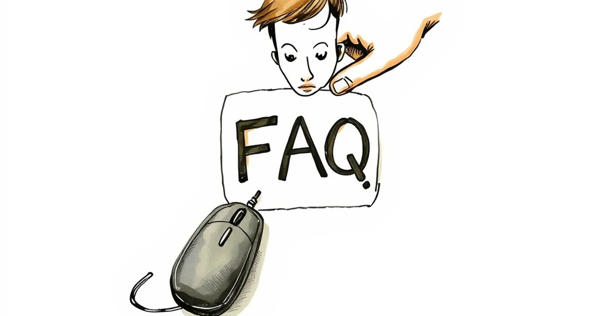
Why your website’s FAQ page is making customers hesitate
Your FAQ page might be undermining customer trust—here’s how to fix it and turn hesitation into confidence
You’ve spent weeks perfecting your website, polishing your service pages, and tuning your calls to action. But there’s one page that might be quietly sabotaging all that hard work: your FAQ page. Instead of reassuring potential clients, it could be planting seeds of doubt that make them click away.
I see it all the time with Australian business owners. They think a long list of questions shows they’re thorough. In reality, a clunky or defensive FAQ page screams, “We’re expecting problems.” Let’s look at how this happens and what you can do to turn it into a tool that builds trust.
The “What If” Trap Your FAQ Is Setting
A standard FAQ page often reads like a list of worst-case scenarios. Every question you include is a worry you’ve put into your customer’s head. When you lead with a question like, “What if the product breaks?” you’re telling the reader, “It might break.”
Your brain works on a principle called priming. If I show you a list of potential faults, you’ll start looking for faults. Your FAQ page should solve problems, not create new ones.
The difference between reassurance and red flags
Think about the wording. A question like, “Do you offer refunds?” feels neutral. But to a first-time visitor, it can feel like a warning. They might not have even considered asking for a refund until you brought it up.
A better approach is to frame your answers around confidence. Instead of a question about refunds, you could have a section titled, “Our 30-day satisfaction guarantee.” You’re still giving the same information, but you’re leading with a promise, not a potential failure.
Why Your FAQ Sounds Defensive (Even When You Don’t Mean It)
Australian customers are pretty direct, but they also value fairness and transparency. A defensive FAQ page feels like you’re bracing for an argument. You might have phrases like, “We reserve the right to…” or “Please note that we cannot be held responsible for…”
These phrases might be legally necessary. But if they’re the first thing a potential client reads, they set a negative tone. You’re essentially saying, “I don’t trust you, so here are the rules.”
A quick anecdote from a Melbourne café website
A friend of mine runs a small café in Fitzroy. Their old FAQ page had a question: “Can I bring my own cake for a birthday party?” The answer was a firm “No, due to food safety regulations.” It was honest, but it sounded harsh.
We changed the question to: “Celebrating a birthday with us?” The answer became: “We’d love to help you celebrate! We have a selection of cakes from local bakeries. Please let us know 48 hours in advance so we can prepare.” The rule was the same, but the tone shifted from “don’t” to “we can help.” Their booking inquiries went up noticeably.
The Information Overload Problem
Another common mistake is treating your FAQ page like a manual. You list every single question you’ve ever been asked since you started your business. The result is a wall of text that nobody reads.
When a page has too much information, people’s eyes glaze over. They scan for the one thing they need, and if they can’t find it quickly, they leave. Worse, they might assume your service is too complicated to bother with.
How to structure for the impatient reader
Break your FAQ into clear categories. Use H3 headings like “Shipping & Delivery,” “Returns & Exchanges,” or “Service Guarantees.” This lets someone jump straight to their concern.
Keep each answer short. Three sentences max. If you need more detail, link to a dedicated policy page. The FAQ is for quick answers, not legal deep dives. For example, instead of explaining your entire refund policy in the FAQ, say: “We offer a full refund within 14 days. See our full policy here.”
The Hidden Opportunity: Turning FAQs Into Sales Tools
Your FAQ page doesn’t have to be a defensive afterthought. It can be one of your most persuasive pages. Think of it as a chance to answer the objections that stop people from buying.
Every question is an opportunity to reinforce your value. If someone asks, “How long does delivery take?” you can answer, “Most orders arrive within 3-5 business days. We use express post to get your gear to you faster.” You’re not just giving a fact; you’re selling the speed and reliability of your service.
Preemptively solving the real hesitation
The best FAQ pages address the question the customer is too shy to ask. For example, a common hesitation for small businesses buying web development services is, “Will I be locked into a long contract?”
Don’t wait for them to ask. Put that question on your FAQ page, even if nobody has asked it yet. Answer it with confidence: “No lock-in contracts. You own your website, and you can cancel anytime. We’re that confident you’ll love the work.” That one line can remove the biggest barrier to a sale.
The Practical Takeaway: Audit Your FAQ Page This Week
You don’t need a complete redesign to fix a hesitant-making FAQ page. Here’s a simple exercise: print out your current FAQ page and read it out loud. Does it sound like you’re defending your business, or are you inviting someone in?
If you find any question that starts with a negative assumption, rewrite it. Flip the script. Turn “What if something goes wrong?” into “Here’s how we make sure everything goes right.” Your customers will feel the difference, and they’ll be far more likely to take that next step.
Your website’s job is to build trust, not to list potential problems. Treat your FAQ page like a conversation with a friend, not a contract with a stranger. That small shift in mindset might be exactly what your conversion rate needs.