Why your website’s live demo is pushing buyers toward competitors
A flawed live demo can drive buyers to competitors—learn how to fix yours before it’s too late
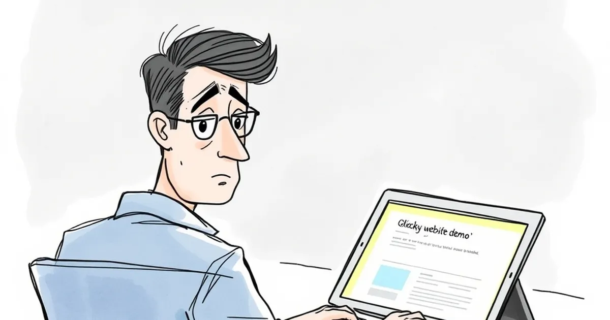
You’ve spent months building a polished website, fine-tuning the copy, and perfecting the checkout flow. You finally add a live demo button, expecting a flood of sign-ups. Instead, your sales pipeline goes quiet.
What gives? The truth is, a poorly executed live demo doesn’t showcase your product — it showcases your weaknesses. And in Australia’s competitive small-to-medium business market, where trust is earned quickly and lost faster, a clunky demo can send potential buyers straight to your competitors.
The demo isn’t a feature — it’s a first date
Think of your live demo as the first real interaction a prospect has with your brand’s promise. If that demo stumbles, lags, or confuses, you’re not just losing that one lead — you’re poisoning the well for future referrals.
I once worked with a Melbourne-based SaaS startup that had a brilliant inventory management tool. Their demo, however, required users to register, wait for an email, and then log into a sandbox that reset every 24 hours. By the time a prospect got inside, they’d already visited two competitor demos that let them click around instantly. The startup lost six qualified leads in one quarter before they finally scrapped the registration wall.
Your demo should feel like a helpful assistant, not a bouncer at a nightclub.
Three ways your live demo is actually hurting you
1. It’s too slow to load
Australian internet is generally good, but we’re a mobile-first, on-the-go audience. If your demo takes more than three seconds to load on a 4G connection, you’ve already lost half your audience. I’ve seen business owners in regional areas abandon a demo because it felt “laggy” — and they never came back.
A slow demo signals that your actual product will be sluggish too. Even if that’s not true, perception is reality in the buyer’s mind.
2. It forces too many steps before the “aha” moment
Every extra click, form field, or confirmation email is a tiny wall between the prospect and their decision. The best demos show the core value within the first ten seconds. If you’re asking for a credit card, a phone number, or even a full name before they can see anything useful, you’re giving them a reason to leave.
One client in Brisbane had a demo that required setting up a “project” before they could see any features. Prospects kept thinking they’d made a mistake. After we redesigned the demo to drop users straight into a pre-loaded project, their demo-to-trial conversion jumped by 40%.
3. It doesn’t account for the “browser tab shuffle”
We all do it: open a demo, get distracted, come back ten minutes later, and have no idea where we were. If your demo doesn’t save state or offer a simple “resume where you left off” option, you’re betting that every visitor has perfect focus. They don’t.
When users have to restart a demo from scratch, they often just close the tab and try a competitor who respects their time.
What a great live demo actually looks like
The best demos I’ve seen for Australian businesses share a few simple traits. First, they’re zero-friction. No sign-up, no email verification, no “book a time with our sales team.” Just a button that says “Try it now” and drops you into a realistic, pre-configured environment.
Second, they’re mobile-responsive. More than half of B2B research now starts on a phone. If your demo looks broken on a small screen, you’re telling prospects you don’t care about their workflow.
Third, they guide without overwhelming. A good demo doesn’t show every feature. It shows the three things that solve the prospect’s most common pain point. You can add more depth later.
Real-world example: The local tradie booking platform
A mate of mine runs a booking platform for electricians and plumbers in Sydney. His original demo was a full-featured admin panel — overwhelming and confusing. Prospects thought it was too complicated.
He simplified the demo to show just three steps: “Add a job,” “Assign a worker,” “Notify the customer.” That’s it. Within two weeks, his conversion rate from demo to paid plan doubled. Why? Because he stopped trying to impress and started trying to help.
How to audit your own demo right now
Grab your phone, turn off Wi-Fi, and open your live demo on a 4G connection. Time how long it takes from clicking the button to seeing something useful. If it’s more than five seconds, you have a problem.
Next, ask a friend who knows nothing about your industry to try the demo. Watch their face. If they frown, squint, or say “wait, what do I do now?” — you’ve got friction. Don’t fix the demo yourself. Let real users tell you where it hurts.
Finally, check your analytics. Look at the drop-off rate between “demo started” and “demo completed” (if you track it). A sudden spike at any step is a red flag. Most platforms like Hotjar or Google Analytics can show you session replays. Watch a few. You’ll see exactly where people get lost.
The hidden cost of a bad demo
Beyond lost sales, a poor demo creates a silent brand liability. Prospects who have a bad experience rarely complain — they just tell two or three colleagues. In Australia’s tight-knit business communities, word spreads fast.
I’ve seen a single bad demo story circulate through a local industry Facebook group and kill a company’s inbound leads for months. You don’t get a second chance to make a first impression, and your demo is often the first real impression your product makes.
A quick note on hosting and security
If you’re worried about giving away your product for free, you’re not alone. Many Australian business owners fear competitors will steal their ideas. But a demo that’s locked down too tightly is worse than no demo at all.
Instead of putting up barriers, use a sandboxed environment that resets every hour. Show real data but anonymise it. Let users explore without risk. The fear of theft is almost always overblown compared to the certainty of lost sales.
What to do this week
You don’t need a full website rebuild to fix your demo. Start with one change: remove the biggest friction point you identified in your audit. That might be a registration form, a slow load time, or a confusing first screen.
After that, add a simple “tour” overlay that highlights the three most valuable features for your core customer. Don’t explain everything — just the parts that make someone think, “I need this.”
Finally, measure the impact. Track demo-to-trial conversion for two weeks before and after your change. If you see even a 10% improvement, you’ve paid for your time many times over.
Your website’s live demo isn’t a checkbox feature. It’s the handshake that either builds trust or pushes buyers toward the competitor who’s ready to say “g’day” without making them wait.