Why your website’s navigation is driving visitors away
Confusing site navigation is costing you visitors. Learn why a clear menu keeps Australian users engaged and on your site
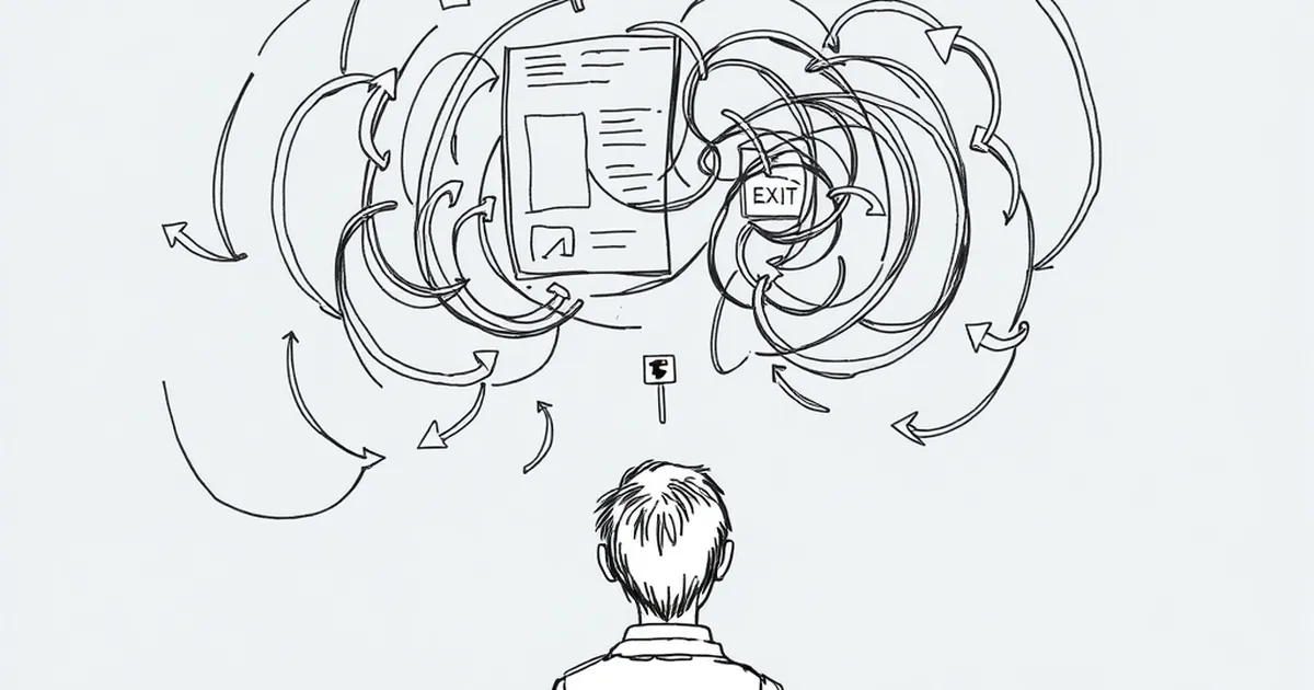
You’ve spent time and money getting your website looking sharp. Your copy is polished, your products are solid, and you’re getting traffic. So why are people leaving after just a few seconds?
The culprit is often hiding in plain sight: your navigation. If visitors can’t find what they’re looking for within three clicks, they’ll bounce. And in Australia, where internet users are famously impatient, a confusing menu is basically a digital “go away” sign.
The three-click rule is real (and your menu is breaking it)
The three-click rule isn’t a hard science, but it’s a solid benchmark. If someone has to hunt through multiple layers of dropdowns just to find your “Contact Us” page, they’re gone. I’ve seen this happen with a client in Melbourne who ran a specialty coffee roastery. Their menu had seven top-level items, each with four sub-items. Customers couldn’t find the “Subscription” page without clicking through “Shop” → “Products” → “Coffee” → “Monthly Box.” That’s four clicks for something they wanted to buy.
The fix was brutal but effective: we cut the main menu to five items. Subscriptions got its own spot. Their bounce rate dropped by 22% in two weeks.
How to audit your own navigation
Open your site on your phone right now. Pretend you’re a new customer looking for your pricing, your about page, and your contact details. Count the clicks. If any of those take more than three taps, you’ve got a problem.
Your labels are speaking a language your customers don’t understand
I see this all the time: businesses use internal jargon in their navigation. “Our Expertise,” “Solutions,” “Capabilities” — these mean nothing to someone who just wants to know if you can fix their leaking roof. In Australia, we call a spade a spade. Your navigation should do the same.
A trades business in Brisbane had a menu item called “Our Methodology.” It turned out to be their process page. Nobody clicked it. We renamed it “How We Work” and added a subtitle: “Step-by-step from quote to completion.” Clicks tripled.
Use plain Australian English
Think about how your customers actually talk. Do they say “Contact” or “Get in Touch”? Do they say “Shop” or “Browse Products”? If you run a local bakery in Sydney, “Order Online” is clearer than “E-Commerce Portal.” Keep it simple, keep it local.
Mobile users are suffering (and they’re probably most of your traffic)
More than 60% of web traffic in Australia comes from mobile devices. Yet so many business websites still use desktop-style navigation on small screens. That means tiny dropdowns you can’t tap accurately, or a hamburger menu that hides everything behind one microscopic icon.
I visited an accountant’s site in Perth on my phone recently. Their menu had 12 items, all stacked vertically, each requiring a precise tap to open a sub-menu. I gave up and called them instead. That’s a lost opportunity for their online booking system.
The mobile-first navigation checklist
- Use a simple hamburger menu (it’s standard, people know it)
- Keep top-level items to five or fewer
- Make sure tap targets are at least 48 pixels wide (Apple and Google both recommend this)
- Test with one thumb — if you can’t reach every item, neither can your customer
Your search bar is an afterthought (it shouldn’t be)
For larger sites — say you run an online store with 200 products — a search bar is your navigation safety net. But most business sites hide it, or they make it too small to find. Worse, some search functions return zero results for common terms.
A hardware store in Adelaide had a search bar that only matched exact product names. Someone searching for “drill bits” got nothing because the title was “12mm HSS Twist Drill Bit Set.” We added synonyms and partial matching. Their search usage jumped 40%, and conversion from search users was 3x higher than from browsing.
Make search work for your audience
Put the search bar in a prominent spot, usually the top right. Make it visible, not hidden behind an icon. And test it with real customer language — ask a friend to search for something using their own words, not your product names.
Too many choices lead to paralysis (the jam experiment is real)
There’s a famous study where shoppers were offered 24 varieties of jam versus 6. The 24-jam display attracted more attention, but the 6-jam display sold 10 times more jam. Your navigation works the same way.
Every extra menu item is a decision your visitor has to make. Too many options and they freeze. They don’t choose anything. They just leave.
Apply the 5±2 rule
Your main navigation should have no fewer than three and no more than seven items. That’s it. If you have more, you need to consolidate or move some items to the footer. For example, “Blog” and “News” can be one item. “About Us” and “Our Team” can merge.
Your footer is a dumping ground (it should be a lifeline)
The footer is the second most-visited area on any website, right after the header. But most businesses treat it like a legal disclaimer zone. They cram in privacy policies, cookie notices, and social media icons, but forget the stuff people actually need.
I worked with a financial planner in Melbourne whose footer had “Terms & Conditions” and “Privacy Policy” taking up half the space. The “Book a Consultation” link was buried at the very bottom, tiny and grey. We swapped the layout: consultation link became the biggest element, followed by phone number and email. Their contact form submissions went up by 35%.
What to put in your footer
- Your phone number (clickable on mobile)
- Your email address
- A direct link to your most important action (book, buy, call)
- Physical address (especially for local businesses)
- Social links (but keep them secondary)
A practical takeaway for your next move
Don’t try to fix everything at once. Pick one thing: your mobile navigation, or your menu labels, or your search function. Change it, track the impact for two weeks, then move to the next. Your website is a living tool, not a printed brochure. Test it, tweak it, and watch your bounce rate fall.
And here’s a forward-looking thought: voice search is growing fast in Australia. People are asking Siri or Google Assistant for “plumber near me” or “best coffee subscription.” Your navigation needs to mirror how people speak, not just how they type. Start simplifying now, and you’ll be ready for the voice-first future.