Why your website’s navigation menu hurts repeat visitors
Discover why cluttered navigation drives repeat visitors away—and how a streamlined menu keeps them coming back
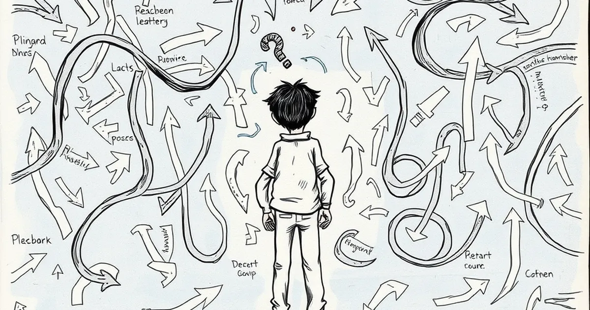
You’ve spent good money on a website that looks sharp, loads fast, and sells your services. Yet repeat visitors — the ones you’d think would be easiest to convert — keep bouncing off after a few clicks. The culprit is almost always hiding in plain sight: your navigation menu.
Think about it. A first-time visitor might forgive a clunky menu because they’re exploring. But a returning customer? They’re coming back for a specific reason — to book a job, find a phone number, or check an order status. If your menu makes them hunt for it, they’ll leave frustrated and less inclined to return.
The “Where did that go?” problem
One of the quickest ways to lose a repeat visitor is to change your menu structure between their visits. Maybe you redesigned your site six months ago and moved the “Contact” page under a dropdown called “Get In Touch.” To you, that’s a clever rebrand. To your customer, it’s a dead end.
I saw this firsthand with a tradie client in Brisbane. He had a simple four-item menu: Home, Services, Gallery, Contact. He added a new service, so he restructured the menu into “Residential,” “Commercial,” and “Contact” — all nested under a hamburger icon. Within a month, his repeat visitor traffic dropped by nearly 25 percent. His regulars couldn’t find the gallery link they used to show clients on site. They gave up.
Consistency breeds trust
Your menu is a mental map your visitors build over time. Every time you rearrange it, you’re asking them to learn a new route to the same destination. For a small business in Australia — whether you’re a plumber in Sydney or a boutique agency in Melbourne — that friction is lethal.
Keep your primary navigation stable. If you must add new pages, append them to the end of the menu or create a secondary footer menu. Don’t shuffle existing items around just because your internal team got bored of the layout.
Too many choices kill repeat visits
There’s a reason the classic “About Us, Services, Blog, Contact” structure works. It’s predictable. When a returning customer lands on your site, they’re subconsciously scanning for familiar landmarks. If they see a dropdown menu with twelve options, their brain immediately goes into overload.
I’ve audited websites for cafes in Perth that had menu items like “Our Story,” “Meet the Team,” “Sustainability Promise,” “Locations,” “Catering Menu,” “Private Events,” and “Gift Cards” — all crammed into the top nav. That’s seven options competing for a click. The owner told me regular customers kept calling to ask if they still did catering. The catering link was there — it was just buried under visual noise.
The “three-click rule” still matters
For repeat visitors, every extra click feels like a personal insult. They know what they want, and they want it fast. If your navigation forces them to hover, click, then scroll, then click again, you’ve already lost their goodwill.
Aim for no more than five or six top-level menu items. Use dropdowns sparingly, and only for logical groupings — like “Services” with sub-items for “Plumbing,” “Electrical,” and “HVAC.” Avoid dropdowns for vanity pages like “Awards” or “Testimonials.” Those can live on your homepage or in the footer.
Mobile menu traps that punish returning users
Here in Australia, mobile traffic accounts for well over half of all web visits. That means your mobile navigation is arguably more important than your desktop menu. Yet I still see businesses hiding their entire site behind a hamburger icon with no labels, no search bar, and no hint of what’s inside.
A repeat visitor on their phone — someone who’s trying to quickly rebook a service — will tap that hamburger icon, see a wall of text, and immediately back out. They’ll call a competitor instead.
Use a sticky search bar
One practical fix is to add a persistent search bar at the top of your mobile menu. If a returning customer remembers your “Gift Vouchers” page but can’t recall where you put it, a search lets them bypass your entire navigation. It’s a safety net for when your menu fails them.
Also, avoid “mega menus” on mobile. Those massive grids of links that look impressive on desktop turn into endless scrolling nightmares on a phone. If you have a large site, use a simple accordion-style menu with clear headings and bold text for the top-level items.
The hidden cost of “clever” navigation
Every year, a new trend sweeps through web design — vertical menus, hidden menus, circular menus, slider menus. I get it, you want your site to look modern. But for repeat visitors, novelty is the enemy of usability.
I worked with a law firm in Adelaide that switched to a side-mounted vertical navigation bar. It looked slick on their brand deck. But their repeat clients — mostly older business owners — kept clicking the top of the page out of habit. The side menu was invisible to them. Within two weeks, the firm reverted to a traditional top nav after losing three consultation bookings.
Stick to conventions
Your navigation should feel invisible. When it works well, nobody notices it. When it breaks, everyone does. The most successful small business websites in Australia use standard patterns: logo top-left, menu top-right, contact button prominent.
Don’t reinvent the wheel. Your customers have been trained by decades of web browsing. Use that training to your advantage. If you want to be creative, do it in your hero section or your blog layout — not in the one element people rely on to get around.
A practical takeaway for your next redesign
Here’s what I want you to do right now: open your website analytics and look at the “Navigation Summary” or “Page Flow” report. Identify the top three pages your returning visitors land on. Then check whether those pages are accessible within one click from your homepage menu.
If a returning customer has to click more than once to reach your booking page, your pricing page, or your contact details, fix that immediately. Move those items to your primary navigation. No dropdowns, no sub-menus, no clever rebranding. Just a direct link.
Your website isn’t a museum exhibit — it’s a tool your customers use to get things done. Treat your navigation like a well-worn path in a national park: clear, direct, and unchanged season after season. Your repeat visitors will thank you by coming back.