Why your website’s pop-up is punishing first-time buyers
Learn why aggressive pop-ups scare off first-time buyers and how to welcome new visitors without losing their trust
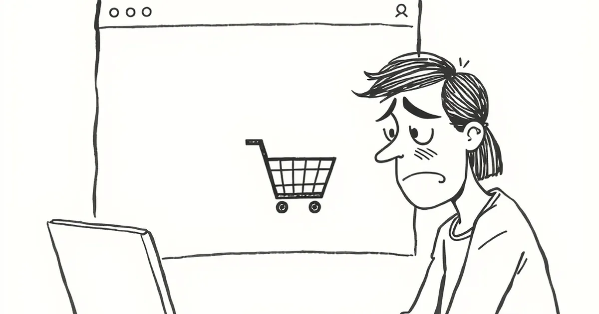
You’ve spent good money on ads, social posts, and maybe even a Google campaign to get someone to your site for the first time. They click through, curious about your product or service, and then—bam—a full-screen pop-up slams down asking for their email before they’ve even scrolled. That first-time buyer didn’t come here to sign up for a newsletter; they came to see if you’re worth trusting. So why are we punishing them the moment they arrive?
I see this mistake all the time with Australian small businesses, from Byron Bay boutiques to Melbourne tradies. We’ve been told pop-ups are essential for lead generation, but we’ve forgotten the human on the other side. Let’s break down exactly why that aggressive pop-up is costing you sales, and how to fix it without losing the lead capture.
The psychology of a first impression online
When someone lands on your website for the first time, they’re in what psychologists call an “orientation phase.” They’re scanning, assessing, and asking one silent question: Can I trust this business? Your pop-up, especially if it appears within the first five seconds, answers that question with: “I want something from you before you’ve even seen what I offer.”
Think about walking into a physical store. If a salesperson rushed up to you before you’d touched a single product, demanding your phone number, you’d walk straight back out. Your website’s pop-up is that salesperson. For a first-time buyer, that interruption feels pushy, not helpful.
The trust deficit
Australian consumers are particularly savvy about online privacy. After the Optus and Medibank data breaches, we’re all more cautious about handing over personal details. A pop-up that asks for an email address before providing any value signals that your priority is their data, not their problem.
I worked with a Brisbane-based skincare brand last year. They had a 40% bounce rate on their homepage, and their pop-up was appearing after just two seconds. We delayed it to 30 seconds and made the offer specific—a free sample guide, not a generic newsletter. Bounce rate dropped to 22%, and conversions actually increased because the people who did see the pop-up were already engaged.
Why timing matters more than the offer
The offer inside your pop-up might be genuinely good. Maybe it’s a 10% discount or a free ebook. But if you’re showing it to someone who hasn’t even read your headline yet, the offer is invisible. They’re not rejecting your discount; they’re rejecting the interruption.
The exit-intent alternative
Here’s where you can have your cake and eat it too. Exit-intent pop-ups—those that only appear when someone’s cursor moves towards the browser’s close button—are far less intrusive. The visitor has already had time to evaluate your site. If they’re leaving, a well-timed offer might genuinely help.
A Sydney-based furniture store I consult for switched from an instant pop-up to an exit-intent one. Their email capture rate actually rose by 35%. Why? Because the people who saw it were already interested in leaving, meaning the pop-up felt like a helpful last chance rather than an ambush.
The damage to mobile user experience
This is where things get ugly for Australian businesses. Over 60% of web traffic in Australia comes from mobile devices. On a phone screen, a pop-up can cover the entire viewport. The visitor can’t see your product images, your about page, or your shipping information. They only see your demand.
The Google penalty factor
Google has been penalising intrusive interstitials since 2017. If your pop-up makes content less accessible on mobile, you could be hurting your search rankings. For a local business in Sydney or Melbourne, that means fewer organic visitors and a harder time competing with bigger players.
I’ve seen a Gold Coast café’s website drop from page one to page three on Google after they installed a full-screen mobile pop-up. They removed it, and within two months, their rankings partially recovered. Your pop-up isn’t just annoying customers; it’s actively working against your SEO efforts.
How to fix your pop-up without killing your leads
I’m not saying you should abandon pop-ups entirely. They’re a proven tool when used correctly. But you need to respect the first-time buyer’s journey. Here’s a practical framework I use with my clients.
Segment your audience by behaviour
Don’t show the same pop-up to a first-time visitor and a returning customer. Use a cookie or session variable to track whether someone has visited before. For new visitors, delay the pop-up by at least 20 seconds or, better yet, use a scroll-triggered pop-up after they’ve read 50% of the page.
Make the offer relevant to their intent
If they landed on your product page, offer a sizing guide or a product demo. If they’re on your blog, offer a related downloadable resource. A generic “Subscribe to our newsletter” is lazy. The best pop-ups I’ve seen for Australian businesses offer something specific: “Get our free Sydney wedding planning checklist” or “Download the Melbourne tradie’s guide to storm season.”
Give them an easy out
Your pop-up should have a clear, obvious close button. Not a tiny “x” in the corner that’s hard to tap on mobile. Make it large and visible. And never use dark patterns like a close button that actually opens the sign-up form. That destroys trust instantly.
The future of first-time buyer engagement
Pop-ups aren’t going away, but their role is evolving. More Australian businesses are moving towards “welcome mats” that slide in from the bottom of the screen, or inline forms embedded naturally within the content. These feel less like an interruption and more like a natural part of the browsing experience.
I’m also seeing a rise in “no-email” engagement tools like product quizzes or interactive calculators that collect data without the immediate ask. A Melbourne-based financial planner I know uses a retirement calculator on their homepage. Visitors use it freely, and only at the end are they invited to email the results to themselves. That feels like a service, not a sales pitch.
A practical note for your next redesign
Here’s what I’d love you to take away from this: before you add any pop-up to your website, ask yourself one question. Would I feel respected if I saw this as a first-time buyer? If the answer is no, redesign it. Your pop-up should feel like a handshake, not a hold-up. When you treat first-time buyers with patience, they’re far more likely to become repeat customers—and that’s worth more than any email address you’d capture in the first five seconds.