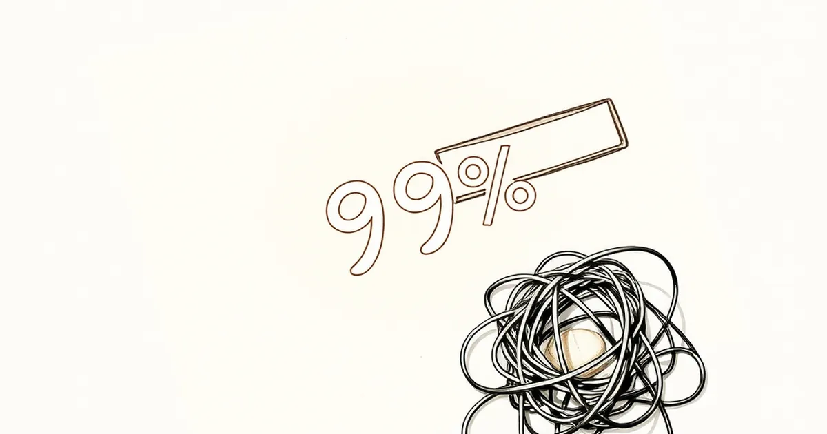
Why your website’s progress bar is lying to your customers
Discover why most website progress bars are designed to manipulate your patience, not measure real time
Why your website’s progress bar is lying to your customers
You’ve seen it a hundred times: that thin, blue line creeping across the screen while you wait for a checkout to finalise or a file to upload. It feels honest, almost scientific — a promise that you’re 47% of the way there. But here’s the uncomfortable truth: most progress bars are designed less to inform and more to keep you from clicking away. They’re playing a subtle game with your brain, and once you understand how, you’ll never look at a loading screen the same way again.
The psychology of the “almost there”
Let’s start with a concept that behavioural economist Daniel Kahneman popularised: the peak-end rule. We don’t remember experiences as a sum of their parts; we remember the most intense moment and the final moment. A progress bar that stalls at 90% for ten seconds creates a terrible “end” memory. Yet many website owners, desperate to reduce bounce rates, intentionally design bars that rush to 80% and then crawl. Why? Because of a cognitive bias called the goal-gradient effect.
Researchers at the University of Chicago found that people work harder the closer they perceive themselves to be to a goal. A coffee shop loyalty card with two stamps already filled in (and eight empty) gets completed faster than a card with no stamps, even if both require ten purchases. The progress bar exploits this: by showing you a quick sprint to the 70% mark, your brain releases a tiny squirt of dopamine. You’re “almost there,” so you stay. But the bar is lying — it’s not measuring real progress; it’s measuring your willingness to wait.
Variable-ratio reinforcement in disguise
This is where the overlap with behavioural psychology gets really interesting. The most addictive digital experiences — think refreshing social media feeds or checking email notifications — use a principle called variable-ratio reinforcement. B.F. Skinner showed that if a reward comes unpredictably, we keep pulling the lever. A progress bar that jumps erratically (2%, 15%, then stuck at 37%, then a sudden leap to 89%) mimics this exact pattern.
Your website might not be a slot machine, but when a customer is waiting for a quote generator or a booking confirmation, that uncertain progress bar keeps them hooked. They don’t know when the reward (the result) will come, so they watch. The problem? If the uncertainty feels unfair — if the bar clearly isn’t tracking real work — trust erodes fast. Australian consumers, in particular, value a fair go. A bar that visibly lies (e.g. “Your order is processing” for thirty seconds when it’s already complete) triggers loss aversion: the fear that leaving now will waste the time already invested. It works, but it breeds resentment.
The case of the “smooth” vs. “honest” bar
Let’s look at a concrete example. In 2016, a team at Microsoft Research ran a study on progress indicators during file transfers. Participants saw one of three types: a smooth linear bar, a bar that paused at 95% for a long time, or a bar that gave real-time updates with occasional “stuttering.” The counterintuitive result? The stuttering bar was rated more trustworthy, even though it took the same total time. People preferred knowing the truth — “we’re actually waiting on the database” — over a fake smooth ride that clearly ended in a lie.
Now apply that to a business website. Say you run a custom printing shop in Melbourne. A customer uploads a design, and your progress bar shows 30% for five seconds, then leaps to 100% instantly. That customer knows something’s off. Maybe the file didn’t upload properly, or the system crashed. They refresh. They email you. You’ve created more work and lost trust. An honest bar that says “Uploading file… 40%… waiting for server response… 60%…” might feel slower, but it builds credibility.
Why we hate the “infinite spinner”
There’s a simpler cousin to the lying progress bar: the spinner. That endlessly rotating circle is the digital equivalent of being put on hold forever. Research from Google’s UX team in 2018 showed that users perceive a spinner as taking 15% longer than a progress bar, even when the wait is identical. Why? Because a bar gives the brain a prediction. It reduces uncertainty. Under uncertainty, our amygdala (the threat-detection centre) lights up. We start scanning for reasons to leave.
This is crucial for Australian businesses. Our market is small enough that word-of-mouth travels fast. If your checkout process or appointment booking system uses a deceptive bar, customers won’t just bounce — they’ll tell their mates. “That site’s a bit dodgy.” You’ve triggered a reputational risk that no amount of SEO can fix.
Risk-taking and competitive design
There’s a fascinating tension in web design between risk and reward. Every business owner wants to reduce bounce rate. A faster-looking bar reduces the perceived risk of waiting. But here’s the catch: the risk isn’t in the wait time; it’s in the unmet expectation. When you promise 47% progress and deliver 47% progress, you earn a small deposit of trust. When you promise 90% and deliver a five-second stall, you spend that deposit.
Think of it like a competitive game. In high-stakes decision-making, players who bluff too often get called out. Your website is playing a repeated game with each customer. The first visit, they might accept the lie. The second visit, they’re suspicious. By the third, they’ve learned the pattern and they’ll leave the moment the bar hits 80%. You’ve trained them to distrust your interface. That’s not good UX; it’s a losing strategy.
The practical payoff
So what’s the better path? It’s not about making bars slower — it’s about making them accurate. Even if the truth is ugly. If your payment gateway takes eight seconds, show a bar that spends seven seconds at 10% and then jumps to 100%. Tell the user what’s happening: “Contacting bank… waiting for approval…” This is called transparent feedback. It respects the user’s intelligence.
For Australian businesses, this is especially powerful. We have a cultural bias toward directness. “How ya going?” isn’t small talk; it’s an invitation for an honest answer. A progress bar that says “This might take a moment — grabbing your file from the server” feels like a mate giving you a heads-up, not a marketer trying to trick you.
A forward-looking close
Here’s where I want to leave you: the next time you audit your website, don’t just look at the speed. Look at the story your progress bar tells. Is it a story of competence and honesty, or one of manipulation and cover-up? The best websites of the next decade won’t be the ones that feel fastest — they’ll be the ones that feel fairest. As AI and real-time data become standard, customers will have more tools than ever to detect when a system is lying. The bar that tells the truth, even when it’s slow, will be the one that keeps people clicking.
Start small. Pick one page — your checkout, your booking form, your quote generator — and replace that lying bar with something real. Add a line of text that explains the delay. Watch what happens to your completion rates. I think you’ll be surprised how much a little honesty can speed things up.