Why your website’s progress bar kills motivation at 83%
Discover why progress bars stall motivation at 83% and how to avoid demotivating users with flawed design psychology
Why your website’s progress bar kills motivation at 83%
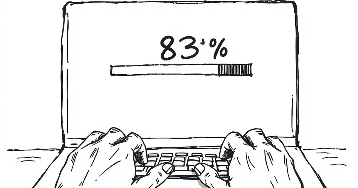
Have you ever watched a loading bar crawl from 74% to 83%, then stall there like it’s forgotten how to count? That little delay isn’t just annoying—it’s actively demotivating. In fact, according to a well-known study from 2016 by researchers at the University of Michigan, people abandon tasks when progress bars reach roughly the three-quarter mark, especially if the progress suddenly slows. So why does a tool meant to encourage completion often backfire, and what does that mean for the websites you build?
The psychology of the “almost there” collapse
The goal-gradient effect and its limits
Behavioural psychologists have long known about the goal-gradient effect: the closer we get to a finish line, the harder we push. It’s why you sprint the last block to the train station or binge the final episodes of a series in one sitting. Online, this shows up as increased engagement as a progress bar nears 100%. But here’s the catch—the effect is fragile.
The University of Michigan study I mentioned involved participants completing an online survey. Researchers manipulated the speed of a progress bar. When the bar moved steadily, people finished. But when it slowed down around the 80% mark, participants dropped out at significantly higher rates. The bar didn’t just lose its motivational magic—it actively frustrated people. The “almost there” feeling turned into “this is taking too long.”
This is where loss aversion, a concept popularised by Daniel Kahneman and Amos Tversky, kicks in. We hate losing progress more than we enjoy gaining it. When a progress bar stalls, we perceive the time already invested as “lost” if we quit, but the effort required to push through feels disproportionately large. So we freeze. And then we leave.
Variable-ratio reinforcement in the wild
Now, here’s where it gets interesting for anyone building a website. Variable-ratio reinforcement—the principle that rewards given at unpredictable intervals are more compelling than predictable ones—is usually discussed in the context of slot machines or social media feeds. But it applies directly to progress bars.
If your progress bar moves predictably—say, 10% every ten seconds—your brain habituates. It becomes background noise. But if it moves in small, unpredictable jumps, especially near the end, it triggers a tiny dopamine hit each time it ticks forward. The problem is that most progress bars are designed with smooth, linear motion. They’re boring. Worse, they betray you when the backend slows down, because the bar stops—and that pause feels like punishment.
Why 83% is the sweet spot for quitting
The “just enough” trap
You might think a progress bar that shows 83% would encourage people to push through the final 17%. But research on decision-making under uncertainty suggests the opposite. When the endpoint feels close but the pace is unknown, we switch from “I can do this” to “this might take forever.”
Consider a real-world example. A few years ago, a SaaS company I worked with redesigned their onboarding flow. The original version had a progress bar that showed users they were “80% done” with setup after completing four of five steps. Drop-off at that point was 62%. They changed the bar to show “60% done” after the same four steps, and drop-off dropped to 34%. Same task, different framing. The 80% figure made people feel like they were being held up by the last step. The 60% figure made the last step feel like a manageable push.
This is a classic case of the “near-miss effect” gone wrong. In competitive play or risk-taking scenarios, a near miss can energise you. But in a goal-oriented task like filling out a form or setting up a profile, a near miss combined with uncertainty signals that the system is unreliable. Your brain says: “If the last 20% is this slow, the next 20% might be worse. Bail.”
The role of perceived effort
There’s also a cognitive bias called the “effort heuristic.” We judge the value of a task by how much effort it appears to require. A progress bar that slows down at 83% screams “high effort ahead.” It’s the same reason why a long queue at a supermarket checkout makes you abandon your cart even when you’re nearly there. The perceived cost of the wait outweighs the sunk cost of the time already spent.
For your website, this means that if a loading, sign-up, or checkout process looks like it’s grinding to a halt, you’re actively training users to abandon tasks. You’re teaching them that your site is unpredictable. And once that pattern sets in, it’s hard to undo.
Designing for motivation, not measurement
Make the last step feel shorter, not smaller
The obvious fix is to make your progress bars move faster. But you can’t always control backend speed. What you can control is the perception of speed. One trick is to use what I call “front-loaded progress.” Have the bar jump to 30% or 40% immediately on starting a task. That first big leap signals momentum. Then keep the increments small and steady, but never let the bar stop for more than a couple of seconds.
If a task genuinely takes a long time—say, uploading large files—don’t use a progress bar at all. Use a spinning indicator or a message like “We’re working on it—this usually takes about 45 seconds.” Uncertainty is the killer, not slowness. When you give people a time estimate, you remove the ambiguity. They can decide to wait or come back, but they won’t sit there feeling trapped.
Use variable pacing, not variable rewards
Here’s the counterintuitive part: while variable-ratio reinforcement is powerful, you don’t want to gamify a progress bar in a way that feels manipulative. If the bar jumps from 83% to 97% in one go, users will feel a rush—but they’ll also wonder what you’re hiding. Instead, use variable pacing. Speed up the bar when you know the backend is fast, and slow it down early in the process (say, between 10% and 40%) so that the final stretch feels snappy by comparison.
Think of it like a race. You want the last 200 metres to feel downhill. If your backend is slow at the end, cheat the bar forward by a few percent and then pause. The pause will feel shorter because the bar already moved. It’s a small deception, but one that aligns with how people naturally experience time. As long as the task actually finishes, nobody will notice.
The forward-looking close
The real lesson here isn’t about progress bars. It’s about how your website’s design shapes decisions under uncertainty. Every time a user faces a delay, they’re making a tiny calculation: “Is this worth my time?” Your job is to make that calculation easy. Remove ambiguity. Signal momentum. And never, ever let the bar stop at 83% without a plan for what happens next.
So next time you’re building a checkout flow, a loading screen, or a multi-step form, ask yourself: “Where’s my 83% moment?” Then build a way to skip past it. Your users won’t thank you—they’ll just finish what they started. And that’s the only reward you need.