Why your website’s progress bar stalls motivation at 63%
Discover why a stalled 63% progress bar triggers user anxiety and how to fix this psychological barrier in your website design
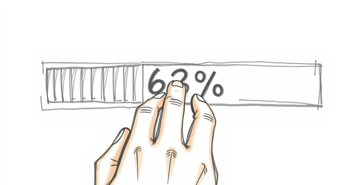
You know that tiny, gut-level drop of disappointment when a progress bar on a website hangs at 63% for what feels like an eternity? It’s a universal experience. You’re halfway through an online checkout, a form, or a data migration, and that little blue line just… stops. Your brain doesn’t just think "this is slow." It thinks "something is wrong," and that 63% feels a lot closer to failure than to success.
Why does that specific percentage — not 50%, not 75% — feel like a psychological trap door? The answer isn’t in the code. It’s in how our brains handle goals, uncertainty, and the threat of wasted effort. And for any Australian business owner trying to keep a customer on their site, understanding that 63% wall is the difference between a conversion and a bounce.
The psychology of "almost there" and the dip
Let’s start with a well-known concept from behavioural economics: the goal-gradient effect. This is the idea that we work harder the closer we get to a goal. Think about a loyalty card. If you have a coffee card that needs ten stamps, you’re more likely to buy that next coffee when you’re at stamp eight than you were at stamp three. The perceived "distance to reward" shrinks, and motivation spikes.
But here’s the problem: the goal-gradient effect doesn’t kick in immediately. It actually has a lazy start. Early progress feels irrelevant. "I’ve only done 10% of this form, who cares?" Motivation is flat. Then, somewhere around the halfway mark, the brain starts to engage. "Okay, I’ve invested something. I don't want to lose that."
The 63% point sits in a dangerous sweet spot. You’ve invested enough that loss aversion (Kahneman & Tversky’s famous theory that losses hurt roughly twice as much as gains feel good) is fully active. You don’t want to abandon the task because you’ve already put in real effort. But you’re not close enough to the finish line to feel that final dopamine surge of completion. You’re in what psychologists call the "dip" — the zone of maximum perceived risk with minimum perceived reward.
When the progress bar stalls at 63%, your brain isn’t processing "loading." It’s processing "threat." The uncertainty of how long you’ll be stuck here triggers your amygdala. You start looking for the exit, not because you don’t want the product, but because your brain wants to resolve the uncertainty. Abandoning the task, even if it means losing the effort, can feel less painful than waiting in the unknown.
Variable-ratio reinforcement and the broken promise of the bar
This is where things get really interesting for a web developer. A progress bar is a promise. It’s a visual contract that says, "I will show you predictable, linear progress towards a known end." The user trusts that contract.
But life, and especially network latency, doesn’t work linearly. Real progress on a server often happens in bursts: 0-40% quickly, then a long pause while a database query runs, then a jump to 90%, then another pause for image compression.
If you code your progress bar to reflect actual server progress, you are building a user experience that mimics a bad slot machine. You’re delivering a variable-ratio reinforcement schedule — the same pattern that makes checking your phone addictive. Sometimes the bar moves fast, sometimes it stops dead. The user never knows when the next "reward" (the bar moving) will come.
Here’s the catch: variable-ratio reinforcement works brilliantly for repetitive, low-stakes actions (like refreshing Twitter). It is toxic for a single, high-stakes goal (like paying for a flight to Melbourne). When the reward schedule becomes unpredictable during a transaction, the brain switches from "goal-seeking mode" to "threat-assessment mode." The uncertainty doesn’t create excitement; it creates anxiety.
A real-world example: A 2014 study by researchers at the University of Houston looked at how people perceived waiting time for video buffering. They found that when the progress indicator was inaccurate (stalling at a certain percentage), users estimated the wait as being 30% longer than it actually was. Their subjective experience of time stretched. The stalling bar didn't just feel bad; it made the actual wait feel longer, which is a terrible outcome for a business trying to keep a customer patient.
The "just one more click" loop: Designing for the finish, not the fight
So, what does a good website do? It doesn’t fight human nature. It exploits it — in the best way possible.
The smartest web designers don't use progress bars to show progress. They use them to show safety. They manipulate the perception of time and risk to keep the user in the goal-gradient zone.
Think about the "multi-step checkout" that breaks a 10-field form into 4 pages, each with its own progress bar. By the time you hit page 3 (which feels like 75% complete), you are psychologically committed. You’ve already "paid" the effort cost of starting. The risk of losing that investment by clicking away is now higher than the risk of continuing. The designer has used commitment and consistency (another Cialdini principle) to lock you in.
But the real magic trick is hiding the uncertainty. A great progress bar lies, and it lies for your own good. It uses a "hockey stick" curve: it moves quickly to 80% or 90% in the first few seconds, then slows down dramatically for the final 10-20%. Why? Because by the time you hit 90%, your brain is already planning the reward. You’ve mentally checked out of the waiting process and into the "I’m about to get something" process. The goal-gradient effect is at its absolute peak. You will wait much longer at 90% than you will at 50%, because the perceived cost of quitting at 90% (losing almost all your progress) is enormous.
This is the exact opposite of the 63% stall. The 63% stall happens when the bar is too honest about the backend reality. The 90% stall happens when the bar is psychologically optimised to keep you engaged.
A concrete example: The Australian Energy Provider sign-up
Imagine you’re switching energy providers on a comparison site like iSelect or Compare the Market. You’ve found a plan. You click "Sign Up."
- Bad UX (the 63% stall): The site shows a single, long progress bar. It jumps to 20% as you enter your address. Then it hangs at 63% while it queries a legacy database to verify your meter number. You wait. You start to doubt the deal. You open a new tab to check a competitor. You never finish.
- Good UX (the hockey stick): The same process is broken into 3 clear steps: "Your Details" (Step 1 of 3), "Your Plan" (Step 2 of 3), "Confirm & Submit" (Step 3 of 3). The progress bar moves instantly to 33% when you start. It jumps to 66% when you finish your details. That 66% feels safe. You’re committed. The backend database query happens behind Step 2, while you’re busy choosing a payment method. The progress bar never stalls because the hard work is hidden while you are cognitively occupied. The user feels like they’re flying through.
The forward-looking close: Build for the brain, not the server
The practical takeaway for any Australian business owner is this: stop treating your progress bar as a technical dashboard. It is a psychological tool. It is a promise of safety in an uncertain world.
Your server might need 3 seconds to process a payment. But a user’s brain can process a lifetime of doubt in 600 milliseconds. Your job is to bridge that gap.
Don’t show the user the messy backend reality of database joins and API calls. Show them a clean, predictable, and accelerating path to the finish line. Use micro-commitments (Step 1 of 4, Step 2 of 4) to build momentum. If you must have a pause, do it early, not at 63%. And if you can’t avoid a stall? Fill the dead air with something useful. Show a loading animation with a tip. "Did you know you can bundle your internet and energy?" That uses the downtime to reinforce the value proposition, not to trigger a panic.
The best websites don’t just load fast. They feel fast. They make the user feel smart for sticking around. They turn the anxiety of uncertainty into the calm of a predictable journey.
Go check your own site’s checkout flow. Find the 63% stall. Kill it. Your customers’ brains — and your conversion rate — will thank you.