Why your website’s progress bars are tricking your brain to stay
Discover how progress bars exploit your brain’s need for completion to keep users engaged on your website
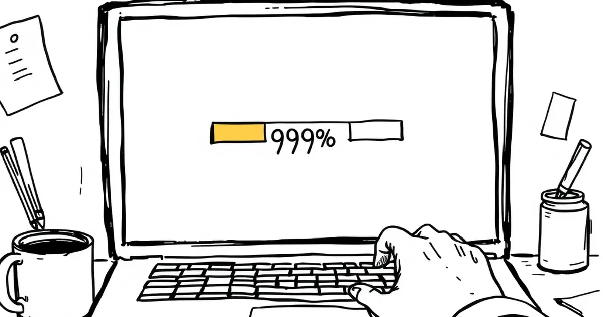
Ever noticed how you’ll happily sit through a 45-second loading screen if the progress bar inches from 92% to 94%, but you’ll abandon a page that takes three seconds with no feedback at all? That’s not patience. That’s your brain being gently hijacked by a pattern we’ve all been conditioned to respond to — the same way we lean forward when something feels almost finished. Your website’s progress bars aren’t just functional widgets; they’re tiny behavioural engines designed to keep you in the seat. And if you’re building websites for Australian businesses, understanding why they work is the difference between a bounce and a conversion.
The dopamine drip: variable-ratio reinforcement on your homepage
Here’s the thing about progress bars: they exploit one of the most powerful psychological mechanisms ever studied — variable-ratio reinforcement. This is the principle that made B.F. Skinner’s pigeons peck at levers thousands of times, and it’s the same reason you keep refreshing your feed even when you know nothing’s new. The reward (the bar moving) comes at unpredictable intervals, and your brain’s reward system releases a little squirt of dopamine each time it happens.
On a website, this plays out in micro-interactions. Think about a multi-step checkout form. When a user fills in their email, the progress bar jumps from 20% to 35%. Then a small delay. Then they enter their address, and it creeps to 55%. The unpredictability of when the next jump happens — especially if you’ve designed the form to batch steps unevenly — keeps them engaged. They’re not just filling out a form; they’re playing a very low-stakes game where the prize is completion.
For a business website, this matters because abandonment rates spike during friction points. The Australian e-commerce landscape, particularly in sectors like retail or professional services, sees drop-offs of 60-80% at checkout. A well-timed progress bar that uses variable pacing (not just evenly spaced 25% increments) can reduce that. The brain interprets the slowing near the end as “almost there,” triggering a commitment response. You’re not tricking them into staying; you’re aligning your interface with how their brain already expects rewards to work.
Loss aversion and the “endowment effect” of partial progress
Daniel Kahneman and Amos Tversky’s work on loss aversion tells us that people feel the pain of losing something roughly twice as strongly as the pleasure of gaining it. Progress bars weaponise this beautifully. Once a user has invested even a small amount of time or effort — say, watching a progress bar reach 30% during a file upload — they psychologically “own” that progress. Abandoning the task now feels like a loss.
This is the endowment effect in action. You’ve probably seen it on Australian real estate websites: a property listing page takes a moment to load high-res images, and the progress bar shows “43% loaded.” The user has already committed a few seconds. Walking away means losing that sunk time. The brain, irrational as ever, decides to wait another five seconds to “protect” that investment.
For website developers, this is a goldmine. Consider a SaaS onboarding flow. If you show a progress bar during a data import that moves slowly at first (10% in ten seconds) and then speeds up (jumping to 60% in two seconds), you’re exploiting loss aversion twice. The initial slow pace makes the user feel they’ve already paid a cost. The sudden acceleration feels like a reward. The alternative — no feedback at all — leaves the user with no sense of ownership, so they leave.
One concrete example: a study from the Nielsen Norman Group found that users perceive a process as 20% faster when a progress bar is present, even when the actual wait time is identical. That’s a 20% reduction in perceived friction, just by showing them a visual token of their own sunk effort. For an Australian business with a high-value service (say, a mortgage broker’s inquiry form), that 20% could mean the difference between a lead and a lost opportunity.
The uncertainty gambit: how progress bars reduce decision paralysis
We don’t like uncertainty. In fact, research by the University of Chicago found that people prefer a guaranteed negative outcome over an uncertain one — we’d rather know we’ll wait five minutes than be told “we’ll get back to you soon.” Progress bars reduce uncertainty by giving users a prediction of when something will end. But here’s the twist: they don’t have to be accurate.
A progress bar that moves smoothly but pauses at 99% for ten seconds is infuriating, yes. But a bar that moves in a slightly unpredictable way — slowing near the end, speeding up, then pausing — actually increases engagement. Why? Because it mimics natural, non-linear processes. Your brain is wired to expect that the final stretch of any task is the hardest. When the bar reflects that (slowing at 80-90%), it feels honest. And honesty builds trust.
For Australian businesses, this is critical. We’re a market that values directness. If your website’s booking system shows a progress bar that zips to 50% and then crawls, the user’s brain says, “This feels real. They’re not pretending it’s instant.” That perceived transparency reduces the urge to bounce. In fact, a 2019 study on waiting time perception found that users who saw a progress bar with a realistic (non-linear) pace reported 30% lower frustration levels than those who saw a linear bar that finished faster but felt fake.
The competitive edge: turning waiting into a game
This is where the overlap with competitive play gets interesting. Progress bars are essentially a solo game against time. But you can layer in subtle competitive elements. Think about a progress bar that shows “You’re ahead of 80% of users” during a signup flow. That’s not a progress bar anymore — it’s a leaderboard. It taps into social comparison and the desire to beat the average.
For a business website, this works wonders in high-friction contexts. Take a quote calculator for a tradie service in Sydney. The user enters their job details, and the progress bar moves. If you add a small note like “Most users complete this in 90 seconds — you’re on track,” you’ve turned a boring form into a timed challenge. The user now wants to beat that average. They’re not just filling out fields; they’re playing.
The research backs this up. A study from the Journal of Consumer Research found that showing users their progress relative to others increased completion rates by 23%. The mechanism is simple: uncertainty about your own performance is resolved by comparison. And the progress bar becomes the scoreboard.
Practical moves: designing progress bars that don’t feel like tricks
So how do you use this without crossing into manipulative territory? First, ditch the fake 99% stall. That’s a trust killer, and Australian users smell it from a mile away. Instead, use “optimistic” pacing: start fast, slow realistically, and finish with a small burst. This mirrors how your brain expects effort to feel — easy at first, hard in the middle, rewarding at the end.
Second, add a micro-reward at completion. A subtle animation, a colour shift, or a sound cue (if appropriate) reinforces the dopamine loop. The user’s brain says, “I finished, and I got a little treat.” For a business, that treat could be a confirmation message with a personal touch: “Thanks, Jess. Your quote is ready — we’ll email it in 30 seconds.”
Third, use variable-ratio reinforcement in multi-step processes. Don’t space your progress evenly. Make step 1 worth 10%, step 2 worth 25%, step 3 worth 15%, and step 4 worth 50%. The unpredictability keeps the brain engaged. Just ensure the final step isn’t too heavy — you want the big jump to feel earned, not punishing.
Finally, consider the “endowment” effect deliberately. If a user has partially completed a form and navigates away, save their progress and show them a progress bar when they return. That 60% they saw before is now a loss they can reclaim. You’re not tricking them; you’re respecting their sunk effort.
Your website’s progress bars are already doing something to your users’ brains. The question is whether you’re designing that something intentionally. Australian businesses that treat their interfaces as behavioural tools — not just functional ones — will see lower bounce rates, higher completion rates, and a trust edge that feels earned. Because it is. The trick isn’t to deceive. It’s to align your design with the way people actually decide to stay.