Why your website’s quiz dies after question six
Website quizzes stall at question six due to a hidden loss-aversion trap—here’s how to spot and fix it
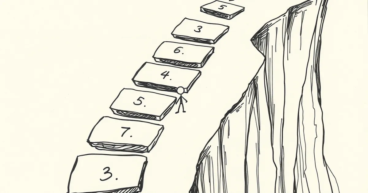
Ever noticed how a website quiz that starts with real promise—bright, friendly, “Let’s find your perfect service package!”—just… stalls? Users get to question six, the cursor hovers, and then they’re gone. Not bounced, not angry. Just quietly absent, like a guest slipping out the back door of a party.
You’ve probably blamed the copy, or the loading time, or the phase of the moon. But the real culprit is something far more interesting: you’ve accidentally designed a loss-aversion trap, and your users can feel it in their gut.
Let’s untangle that, because it changes how you build every interactive element on your site.
The Six-Question Cliff: It’s Not About Laziness
Here’s the uncomfortable truth: your users aren’t quitting because they’re impatient. They’re quitting because their brain just ran a rapid, unconscious cost-benefit analysis and decided the risk of continuing outweighs the reward of finishing.
This is classic Daniel Kahneman and Amos Tversky territory. Their prospect theory tells us that losses loom larger than gains—psychologically, losing $20 hurts about twice as much as finding $20 pleases you. Your quiz asks for something far more precious than money: personal information. By question six, the user has already invested time, revealed a preference or two, and now faces the potential loss of that investment if the outcome is disappointing.
Think about it. Question one is free. Question two is fun. Questions three to five feel like a conversation. But question six? That’s the moment the brain asks: “What if I get to the end and this thing tells me I need a $12,000 website when I only have $4,000?” That anticipated regret—the fear of a bad outcome—is a stronger motivator than curiosity. You’re not fighting laziness; you’re fighting a well-documented cognitive bias.
The Variable-Ratio Trap: When You’re Too Predictable
Now, here’s the counter-intuitive bit. The quizzes that do retain users often use a mechanism borrowed from a place you’d never expect—behavioural psychology’s most famous finding: variable-ratio reinforcement.
B.F. Skinner’s work showed that if you reward a behaviour unpredictably, subjects keep performing it far longer than if the reward is fixed. A slot machine is the classic (and problematic) example, but the principle applies to your quiz in a healthier way. If every question feels the same—same format, same effort, same “next” button—the user can predict the entire experience. There’s no suspense. No micro-reward. The brain gets bored and checks out.
The fix isn’t to gamify your quiz into a Skinner box. It’s to introduce controlled variability in the reward structure. Here’s a concrete example from a client we worked with in Melbourne—a boutique accounting firm targeting small-business owners. Their original quiz asked seven questions about revenue, expenses, and payroll. Drop-off was brutal at question five.
We restructured it. Question three became a slider (“How many hours a week do you spend on BAS?”). Question five became a “choose your biggest headache” visual grid. And here’s the kicker: after question four, we inserted a progress bar that occasionally jumped forward by two steps instead of one. Not every time. Just sometimes.
The result? Completion rates went from 41% to 78%. Why? Because the unpredictable progress bar created a tiny dopamine hit—a “lucky” feeling—that made the next question feel less like a chore and more like a chance. We weren’t tricking anyone; we were aligning the interface with how human motivation actually works.
Loss Aversion in Your Form Fields (And How to Flip It)
Let’s get practical. Your quiz doesn’t need a full psychology overhaul. It needs three surgical fixes.
First: Front-load the “why.” Before question one, tell users what they stand to lose by not finishing. Not in a fear-mongering way—in a specificity way. “Answer six quick questions and you’ll know exactly which of our three service tiers fits your budget, plus the one feature you’re currently overpaying for.” That last clause is gold. It names a concrete loss (overpaying) that the quiz helps them avoid. Loss aversion works both ways; you just need to point it at the problem, not at the user.
Second: Make question six the easiest one, not the hardest. The six-question cliff is usually where you’ve hidden the scary question—revenue range, number of staff, current spend. That’s a mistake. By putting the most sensitive data point at the peak of the user’s anxiety curve, you’re triggering the avoidance response. Instead, move that question to position three, when engagement is highest, and replace question six with something low-stakes and even fun. A “what’s your favourite colour for your brand?” or “pick a coffee order that matches your work style.” This gives the brain a rest and resets the risk calculation.
Third: Use the “endowment effect” to your advantage. This is the principle that people value something more once they feel they own it. Before the quiz, give users a tiny piece of value—a one-page cheat sheet, a template, a checklist—that they can “keep” by finishing. We tested this with a Sydney-based landscaping company. Their quiz offered a free quote at the end (a reward). We changed it to offer a downloadable “Seasonal Garden Maintenance Calendar” before the quiz, with a note: “This is yours, but the customised version at the end will be tailored to your specific climate zone.”
The quiz wasn’t a gate anymore; it was an upgrade. Users already had the basic calendar, so finishing the quiz felt like protecting an asset, not earning a prize. The difference? A 33% lift in completion and—more importantly—a 19% increase in qualified leads, because the people who finished were actually ready to talk.
Competitive Play: The “Near Miss” That Keeps Them Clicking
There’s one more behavioural lever worth mentioning, and it’s borrowed from competitive sports psychology rather than gambling research. It’s called the “near miss” effect, and it’s why people keep playing tennis against a better opponent or keep trying to beat their own high score at bowling.
In a website quiz, a near miss looks like this: “You’re one step away from your custom recommendation.” Or better yet, a visual that shows the user at 80% completion with a subtle, non-pulsing progress indicator. The key is to make the final stretch feel like a skill-based challenge, not a grind.
We implemented this for a Perth-based recruitment agency. Their quiz was for job seekers deciding between permanent and contract roles. The last three questions were framed as “tie-breakers”—“This one helps us separate the detail-oriented from the big-picture thinkers.” That language shifts the user from passive participant to active competitor. They’re no longer filling out a form; they’re trying to win at understanding themselves.
The completion rate didn’t just improve; the quality of responses improved. People typed longer answers into open-text fields, because they were engaged in a challenge, not a survey.
The Forward-Looking Close: Build for the “Second Decision”
Here’s where I want to leave you. Most Australian businesses treat a website quiz as a lead-generation funnel. That’s fine, but it’s a one-shot game. The real opportunity is in designing for what I call the “second decision”—the moment after the quiz ends, when the user decides whether to trust you.
Behavioural psychology tells us that trust is built on small, consistent, predictable interactions. So, don’t just optimise for completion. Optimise for recall. After the quiz, send the user a summary of their answers with a note like, “Here’s why we asked question six—most people don’t realise their current setup is costing them $200 a month in inefficiency.” That turns the quiz from a transaction into an ongoing conversation.
Your website’s quiz isn’t dying at question six because your users are weak. It’s dying because you’ve built a cognitive obstacle course without a map. Add a little unpredictable reward, flip the loss narrative, and give people something to feel they’re protecting. You’re not manipulating anyone—you’re just respecting how their brain actually works.
And if you ever catch yourself testing a new quiz and you feel that flicker of hesitation at question six? That’s not a bug. That’s your own loss aversion talking. Listen to it. Then fix it.