Why your website’s signup wall is costing you first-time visitors
Discover why aggressive signup walls drive first-time visitors away and how to balance lead generation with user experience
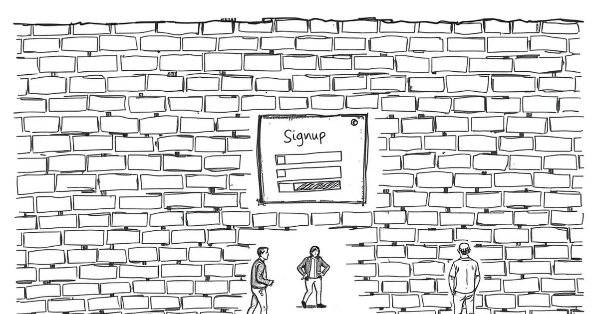
I’ll admit it: I’ve abandoned more websites in the last month than I’ve actually read. The culprit? That well-meaning, but infuriating, pop-up that appears before I can even scroll — the signup wall.
If you’ve ever landed on a business blog, only to be hit with a full-screen modal demanding your email before you can read a single sentence, you know the feeling. It’s the digital equivalent of walking into a store and having the assistant block the door, asking for your contact details before you’ve touched a single product.
The irony is brutal: you’re trying to build your email list, but you’re actively training first-time visitors to hit the back button. Let’s unpack why your signup wall is the single fastest way to lose a potential customer in Australia’s competitive online market.
The psychology of the “back button”
We’ve all been conditioned by the web to expect instant gratification. When someone clicks through from a Google search or a Facebook ad, they’ve already invested a tiny sliver of trust in your brand. They’re thinking, “This might answer my question.”
A signup wall shatters that fragile trust immediately. It screams: “I don’t care what you need right now — I want your data first.”
Why it feels like a bait-and-switch
Think about it. You’ve promised value in your meta description or your social post. The user clicks, expecting content. Instead, they’re asked to perform a transaction — giving up their email — before they’ve received anything in return. In Australia, where consumers are increasingly savvy about data privacy (thanks, OAIC guidelines and high-profile data breaches), this feels particularly slimy.
The result is almost always the same: the user closes the tab. You’ve lost them forever. They won’t remember your brand fondly. They’ll remember the annoyance.
The hidden cost of a single signup
Let’s talk numbers for a second. I’m not a spreadsheet wizard, but I’ve seen enough analytics dashboards to know the pattern.
If your website gets 10,000 first-time visitors a month, and your signup wall converts at a stellar 5% (which is generous for a cold audience), you’re capturing 500 emails. That sounds okay on paper. But what about the other 9,500 people?
The 95% you never see again
Here’s the kicker: most of those 9,500 people will never return. You’ve burned the bridge. They had a need, you blocked it, and they moved on to a competitor who didn’t.
But if you had just shown them the content, even 10% of that 9,500 might have stuck around, read two more articles, and eventually subscribed on their own terms. That’s 950 potential subscribers — nearly double your forced capture rate — plus the goodwill and brand trust you didn’t destroy.
When (if ever) is a signup wall acceptable?
I’m not going to tell you to never use a signup wall. There are specific contexts where they work. But you need to be honest about your audience’s intent.
High-intent, niche content only
A signup wall can work if you’re offering something incredibly specific and high-value that the user can’t easily find elsewhere. Think: a detailed industry report for professional services, or a specialised calculator for tradies estimating job costs.
But even then, you’re better off using a soft gate. Let them see the first paragraph or two, then gently ask for an email to continue. It’s less jarring and feels more like a fair trade.
The “free trial” trap
Software-as-a-service businesses are the worst offenders here. You land on their blog, read a useful article, and then bam — a pop-up to start a free trial. You’re not ready for a trial. You’re just trying to learn.
If you’re a SaaS company targeting Australian small businesses, remember: they’re busy. They’re not going to interrupt their day to sign up for a demo because you blocked their blog post.
A better approach: the “content-first” philosophy
I’ve seen this work beautifully for a Melbourne-based consultancy I work with. They removed their signup wall entirely and replaced it with a simple, non-intrusive inline CTA at the bottom of each article.
The results were telling
Within three months, their overall traffic jumped 40% (because people weren’t bouncing immediately). Their email signups actually increased by 15%, because visitors who finished an article were already primed to trust them. They were signing up because they wanted to, not because they were forced to.
The lesson is simple: give value first. Earn the right to ask for something in return.
Practical ways to capture emails without the wall
You still need to grow your list. I get it. But there are smarter, more respectful ways to do it in the Australian market.
Use “lead magnets” that actually help
Instead of a generic “Subscribe to our newsletter” pop-up, offer something specific. A checklist, a template, a short video guide. Place it at the end of relevant articles or as a non-blocking slide-in after the user has scrolled 50% of the page.
The “exit-intent” pop-up (done right)
Exit-intent pop-ups are less offensive because they only appear when someone is about to leave. But keep it simple. No aggressive countdown timers or fake urgency. Just a genuine offer: “Before you go, grab our free guide.”
Leverage your footer and sidebar
This is the most underrated strategy. A simple, clean email signup form in your sidebar or footer works wonders. It’s there for the people who want to subscribe. It doesn’t interrupt anyone.
A concrete example from the trenches
I once consulted for a small Australian e-commerce brand selling eco-friendly homewares. They had a signup wall on their blog that asked for an email before showing any articles about sustainable living.
Their bounce rate was over 85%.
I convinced them to remove the wall and instead add a “Join the Green Community” form at the bottom of each post. Within a month, their bounce rate dropped to 55%, and their email list grew by 30% — organically.
The owner told me, “I can’t believe I was actively pushing people away for years.”
A forward-looking note on trust and respect
The Australian web audience is becoming more discerning by the day. They’ve been burned by spam, data leaks, and aggressive marketing. They value authenticity and respect for their time.
Your website’s job isn’t to collect emails. Its job is to build trust. If you focus on that first, the emails will come naturally.
So, before you add that next signup wall, ask yourself: “Is this helping my first-time visitor, or am I just helping my own metrics?” The honest answer might surprise you — and change the way you build your site for good.