Why your website's trust signals are scaring away ready buyers
Discover why common trust signals may be driving buyers away and how to fix your site's hidden conversion killers
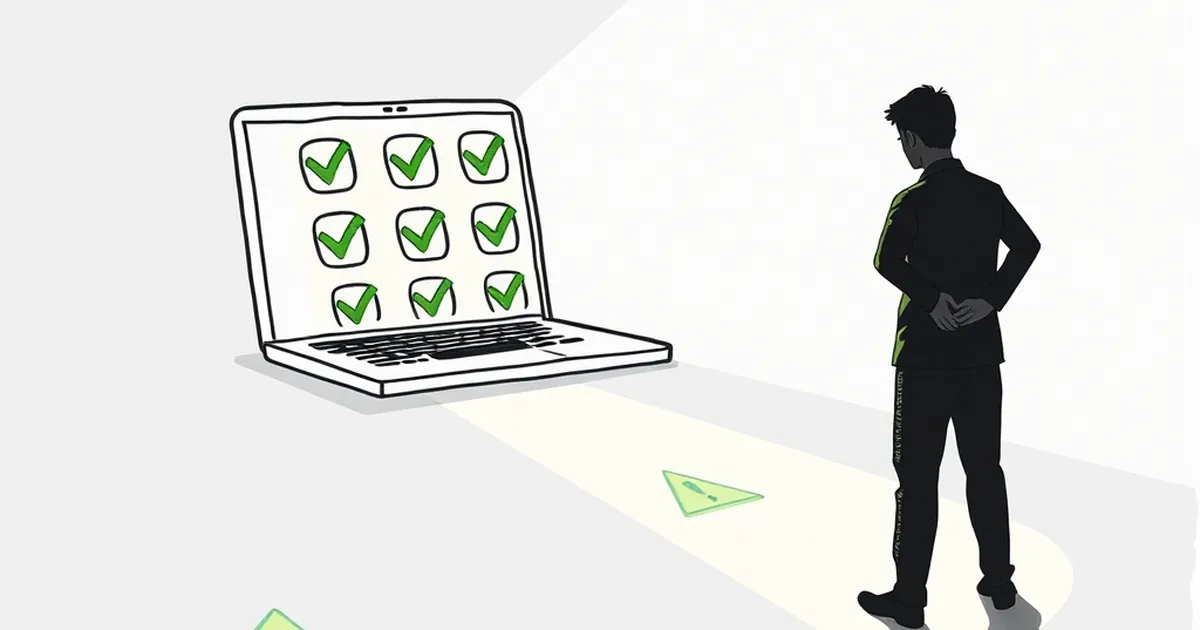
You’ve spent good money on a clean, modern website. Your copy is sharp, your calls-to-action are prominent, and your traffic is steady. But your conversion rate is stuck in the mud.
The culprit is probably hiding in plain sight: your trust signals. Those little badges, testimonials, and security stamps you thought were reassuring buyers are actually making them hesitate — or worse, click away. Let’s dig into why that’s happening and how to fix it before another ready buyer vanishes.
The trust signal paradox: when safety feels like a warning
It sounds backwards, but the very elements we add to build confidence can trigger suspicion. The problem isn’t that you have trust signals; it’s that many of them look dated, generic, or outright desperate.
Think about the last time you visited a site and saw a row of logos that read “As seen on TV” or “Trusted by thousands.” Did you feel reassured, or did your internal bullshit detector ping? For most Australians, those badges scream “I’m trying too hard.”
The “old news” factor
A concrete example: I recently worked with a boutique furniture retailer in Melbourne. Their homepage had a testimonial from 2017. It was glowing, five stars, and completely irrelevant. The buyer reading it in 2025 wondered, “If they’re so good, why are they still showing a review from eight years ago?” That single dated quote was doing more harm than good.
Your audience in Australia is savvy. They’ve been burned by dodgy drop-shippers and overhyped service providers. When they see stale or obviously generic trust signals, their brain flags the entire business as potentially unreliable. It’s not fair, but it’s human psychology.
The three trust signal offenders scaring buyers away
Not all trust signals are created equal. Here are the three most common culprits that send ready buyers running for the exit.
1. The generic testimonial carousel
You know the one: five identical paragraphs about “amazing service” and “fast delivery” that rotate automatically. Nobody reads them. Worse, the auto-rotation makes the site feel like a template. Australian buyers want specifics. They want to hear about a real person’s experience with your product or service, not a sanitised blur.
The fix: Ditch the carousel. Pick your single best, most specific testimonial and feature it prominently. Better yet, use a video testimonial from a real customer with a real name and a real accent. That authenticity cuts through the noise.
2. The security badge graveyard
I see this all the time on Australian e-commerce sites: a footer cluttered with five different SSL seals, a “100% secure checkout” banner, and a “Verified by Visa” logo that hasn’t been relevant since 2012. To a buyer, that visual noise screams “I’m trying to convince you I’m legit, which means I might not be.”
The fix: Use one trusted security badge. In Australia, that’s often the Norton Secured seal or a simple SSL padlock icon in the footer. If you accept Afterpay or Zip, show those logos instead — they’re actual payment methods buyers recognise and trust.
3. The “award-winning” badge with no context
“Award-winning web design” or “Best local business 2020” sounds great until you realise the award was from a self-nominating industry body and the date is four years old. Your buyer doesn’t know that context. They just see “2020” and think “outdated.”
The fix: If you’re going to claim an award, link to the actual award page. Show the year, the organisation, and what the award was for. Otherwise, remove it. Empty bragging is worse than no bragging.
Why Australian buyers are particularly sensitive
There’s a cultural layer to this, too. Australians are famously sceptical of overt salesmanship. We value directness, mateship, and a bit of self-deprecation. Over-the-top trust signals feel American or corporate, and that disconnect can kill a sale.
I remember a client in Sydney who ran a premium dog food brand. Their site had a huge pop-up that said “Join 50,000 happy dogs!” The problem? They’d only been in business for six months. The number was clearly fabricated. Their bounce rate was through the roof. When we replaced that with “We’ve fed 500 dogs this month — here’s three of their owners talking about it,” conversions climbed by 30%.
Your audience can smell a lie from a click away. Trust signals that feel inflated or generic actively erode the trust you’re trying to build.
How to rebuild trust without the scare tactics
So, what do you do instead? You strip it back and get real.
Focus on social proof that’s verifiable
Instead of a wall of anonymous testimonials, use case studies with real names, business names, and outcomes. If you’re a tradie in Brisbane, show a before-and-after photo of a job you did, with the client’s permission. If you’re a consultant, share a short paragraph from a client who saw a specific result. Verifiable social proof is bulletproof.
Make your contact details impossible to miss
One of the strongest trust signals for Australian businesses is a simple phone number and physical address. If you’re a local business, put your suburb in the header. “Based in Surry Hills” is more reassuring than any security badge. Buyers want to know you’re a real person they could call if something goes wrong.
Use real-time signals where possible
Live chat (even a simple chatbot that answers basic questions) signals you’re present and available. So does a “last updated” date on your blog or About page. Freshness is a trust signal that’s hard to fake. If your site looks like it was built in 2018 and never touched, your buyer assumes you’ve closed up shop.
A practical takeaway for your next site audit
Here’s what I want you to do this week: Open your website on your phone. Scroll through the homepage, the product pages, and the checkout. Pretend you’re a customer who’s never heard of you. Ask yourself one question about every trust signal you see: “Does this make me feel more confident, or does it make me wonder why they’re trying so hard?”
If you can’t answer that with a confident “yes,” remove it. Replace it with something real: a customer’s name, a recent date, a specific number, or a direct way to contact you. The goal isn’t to look trustworthy — it’s to be trustworthy on the page.
That shift from performative trust to genuine transparency is what turns a scroller into a buyer. And in a market as discerning as Australia’s, it’s the only move that works long-term.