XP bar fills at task 3—flow state needs 11
The gap between a reward at task three and flow at task eleven reveals where well-meaning web design quietly goes wrong
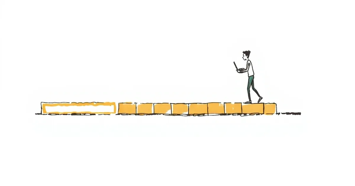
Every product team I've sat with has, at some point, argued about the same thing: when should the first reward land? The argument usually settles on something like three actions in. Short enough that nobody bounces, long enough that it feels earned. But there's a quieter problem sitting underneath that decision, and it's the one worth pulling apart here. The XP bar fills at task three. The flow state — the thing you were actually trying to manufacture — needs eleven.
That gap between "rewarded" and "absorbed" is where a lot of well-meaning web design quietly goes wrong. And it's not really a design problem. It's a behavioural one, with a decent amount of research behind it that most build briefs never touch.
The three-task reward is a variable-ratio hangover
Let's be honest about where the "reward early" instinct comes from. It's a descendant of variable-ratio reinforcement — the schedule where a reward arrives after an unpredictable number of actions. B.F. Skinner's work on this in the 1950s showed it produces the most persistent responding of any reinforcement schedule. Unpredictable rewards keep behaviour going longer than predictable ones.
That finding got absorbed into product design and, somewhere along the way, got flattened into "give them a win fast and keep the wins slightly unpredictable." Which is fine as far as it goes. The trouble is that variable-ratio reinforcement is a compliance mechanism, not an engagement one. It keeps someone pulling a lever. It doesn't make them care about the lever.
For a business website — a booking flow, a quoting tool, a member portal, a learning platform — compliance isn't the goal. You want someone to reach the state where the work stops feeling like work, because that's when they finish the thing, come back, and tell someone else about it. That state has a different shape entirely.
Flow needs a runway, not a trigger
Mihaly Csikszentmihalyi's flow research is often reduced to "challenge matched to skill," which is true but incomplete. The other conditions matter for web design specifically: clear goals at every step, immediate feedback, and — critically — a sense of control. Flow doesn't switch on. It accumulates as a person's model of the system gets accurate enough that they stop consciously negotiating with it.
That's the eleven-task problem in a sentence. The first three tasks are spent building a mental model: where am I, what does this button do, what happens if I get it wrong. Those tasks feel like effort because they are effort. The reward at task three doesn't create absorption. At best it buys you the patience to keep going until the model clicks.
There's a useful piece of evidence here from the flow literature on feedback timing. Immediate, unambiguous feedback supports flow. Delayed or noisy feedback interrupts it — and every interruption resets the clock a little. A confetti animation at task three is feedback, technically. But if it's feedback about the wrong thing — "you did it!" rather than "here's what changed as a result" — it's noise dressed as reward.
A concrete example worth stealing
Consider a Sydney-based accounting software onboarding I looked at a while back. The team had A/B tested their welcome sequence and found the three-step version won on completion of the first session. Clear result. What they hadn't measured was week-four retention, which was flat to slightly worse. Users finished the short sequence, felt done, and left — because the sequence had taught them the product was a checklist, not a workspace.
They rebuilt it around a single real task: import a bank feed, categorise five transactions, reconcile one account. No XP, no progress bar, no celebration. Just a visible before-and-after on their own data. Session-one completion dropped by about a fifth. Week-four retention went up meaningfully, and support tickets about "how does this actually work" fell. The reward hadn't been removed — it had been moved to where it meant something.
Loss aversion is doing more work than you think
Kahneman and Tversky's loss aversion — losses loom roughly twice as large as equivalent gains — shows up in web flows in ways that rarely get named. A progress bar that starts at 40% complete because of a "quick" first step is a loss-aversion play: people dislike watching a bar go backwards or stall. It works. It also teaches users that progress is something the interface performs for them, not something they earn.
The more interesting application is in decision points under uncertainty. Every form field with an unclear consequence is a small risk. Will this cost me? Will someone call me? Am I committing? The behavioural research on risk perception is fairly consistent: people overweight small probabilities of bad outcomes, especially when the outcome is ambiguous. So they stall, or they abandon, or they pick the safe default.
Design that reduces ambiguity at those points does more for flow than any reward schedule. Showing the price before the form. Naming who will contact them and when. Letting them preview the output before submitting. None of this is a reward loop. All of it shortens the runway to absorption.
Competitive play, and why leaderboards usually miss
Leaderboards are the most-bolted-on "engagement" feature in Australian product design, and they almost always fail for the same reason: they reward the outcome, not the play. In competitive play research, the satisfying loop isn't winning — it's the tight feedback cycle of a well-matched contest. You know immediately whether the last move was good, and you know what to try next.
A leaderboard gives you feedback on a timescale of days. That's not a feedback loop, it's a scoreboard. If you want competitive energy in a business tool — and sometimes you genuinely do, in sales dashboards, training platforms, community features — the useful version is the one that gives immediate, local feedback on the last action. Did that quote go out faster than your average? Did that listing get more views than the last one? Small, fast, personal.
What to build instead of a faster reward
If you're briefing a build this quarter, the practical shift is this: stop asking "where's the first reward?" and start asking "what does the eleventh task look like, and is it reachable without a guide?"
Three things tend to fall out of that question.
Design the eleventh task first. Whatever the absorbed state is — a reconciled month, a published listing, a completed quote — build that experience before you build the onboarding. Then work backwards to the shortest honest path to it.
Make feedback about consequence, not praise. Replace "Nice work!" with "Your listing is live and visible to 340 searchers in your suburb." Consequence feedback builds the mental model. Praise builds dependence on praise.
Measure the right week. Session-one completion is a compliance metric. Week-four return, task completion without support contact, and referral are the ones that tell you whether absorption happened. Track them separately and don't let a good week-one number excuse a flat week four.
The forward-looking bit: as more business software leans on AI-assisted flows, the temptation to reward faster will get stronger, because AI makes the first three tasks trivially easy. That's exactly when the eleven-task runway matters most. Easy tasks don't build models. They build the illusion of one — and the people who bounce at task twelve will never tell you why, because from their side, they already finished.