When a casino's responsible-gambling page is a marketing page
Casino responsible-gambling pages often reassure and retain players rather than interrupt play, revealing how tone and tool placement serve marketing
4 min
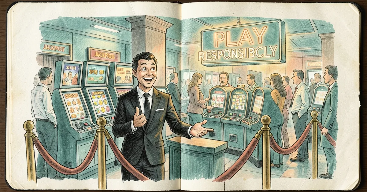
The responsible-gambling page is doing marketing work. Not in the crude sense of a "Play responsibly!" banner wedged under a deposit button, but in the way the page is built: the tone, the placement, the tools it foregrounds, the ones it buries, and the fact that a page about stopping play sits inside a funnel designed to start it. The claim is narrow and testable — on most casino sites, the RG page is structured to reassure and retain, not to interrupt. Read enough of them and the pattern is hard to unsee.
The page is written to keep you playing, not to stop you
Open the RG page on a mid-tier operator and count the verbs. "Set limits." "Stay in control." "Track your play." "Take a break." Every one is an action you take inside the account, on the site, with a session already open. Almost none of them are "leave," "close your account," or "call this number." The framing is management, not exit.
That's a defensible position in theory — harm reduction beats abstinence-only moralising, and most people who gamble don't have a problem. But harm reduction assumes the tools work when someone reaches for them. The evidence on that is thinner than the pages suggest. On this site we've already logged how the loss limit sits four menus deep while the deposit button sits on the header. The RG page doesn't mention either fact. It lists the tools as available, which is technically true and functionally misleading.
The tell is what's absent. A page genuinely built to interrupt play would lead with the exit: how to close the account, how long it takes, what happens to your balance, and what the operator does with your data afterwards. Instead the exit is usually the last item, behind a support-ticket flow, described in neutral language that gives no hint of the cooling-off period or the fact that you'll need to ask again to reopen.
Reassurance is the product
Look at the visual language. Soft blues and greens. Stock photography of someone on a beach, or a hand on a shoulder, or a family at a table. Sentences in the second person, warm and non-judgemental. None of this is wrong on its own. But it's the same design system as the promotions page, and it produces the same emotional response: this is a nice place, run by nice people, and you are safe here.
That matters because the RG page is often the first thing a worried player reads after a bad session. What they need at that moment is friction — a reason to stop and a clear path out. What they get is a brochure that tells them the operator takes the issue seriously. The page is reassuring them about the operator, not about themselves.
There's a structural reason for this. The RG page sits on the same domain, in the same CMS, and usually under the same brand team as the acquisition pages. It gets reviewed for tone and compliance, not for whether it changes behaviour. Nobody A/B tests the RG page against a version that's blunter, because there's no revenue upside to the blunter version and a real downside if it works.
The tools are described, not measured
Here's where the marketing logic gets concrete. RG pages routinely list the tools without saying what they actually do. "Deposit limits" — reset when? "Take a break" — how long, and can you end it early? "Self-exclusion" — does it cover the whole group, and when does marketing stop?
The answers are usually worse than the page implies, and we've documented the gap repeatedly. Self-exclusion takes effect at hour 0 and marketing resumes at hour 49 on at least one operator we checked — a two-day gap the RG page never mentions. Elsewhere, the win-back email fires a month before the exclusion period ends. And in a sample of lapsed exclusions, 44% expired before the cooling-off week was even over.
None of that is on the RG page. The page says the tool exists. It doesn't say how the tool behaves when the player isn't looking. That's the same move as a bonus page that advertises 100% match and buries the game weightings dropping to 10% on blackjack in the terms. The headline is compliance; the detail is where the operator's actual preference lives.
What a non-marketing page would look like
It's worth describing, because the contrast is sharp. A page built to interrupt would:
- Put the exit first, above the tools, in plain language, with the exact steps and the exact time-to-effect.
- State the numbers. Not "set a limit" but "your limit takes effect immediately and can be raised only after 24 hours." Not "take a break" but "breaks of 24 hours, 7 days, or 30 days; the 24-hour break can be ended early, the others can't."
- Name the regulator and the independent help line in the first screen, not the footer.
- Tell you what the operator does with your data during an exclusion — because a player who's just excluded themselves wants to know whether the emails stop.
- Drop the stock photography. A page about a real problem doesn't need a beach.
Some operators do most of this. They're the exception, and they tend to be the ones whose RG page is hard to find from the homepage — which tells you something about how the brand team thinks of it.
The number that should worry the industry
Roughly 1% of Australian adults experience severe gambling harm in a given year, with a much larger share at moderate risk, according to the long-running national gambling surveys. That's the population the RG page is ostensibly for. Now consider that the page is usually optimised for the other 99% — the people who'll never need it — because they're the ones who might read it and feel good about the brand.
The 1% don't need reassurance. They need a door. The question worth asking isn't whether a casino's RG page is compliant, because compliance is cheap and most pages clear it. It's whether the page would survive a test the industry never runs: show it to a player mid-session, at 2am, after a loss, and see whether they stop. If the honest answer is "probably not," the page isn't a safety feature. It's a trust signal, and trust signals sell.