Progress bars fail at 68% — here’s the fix
Why progress bars stall at 68% isn’t random—it’s psychology. Discover the fix that rebuilds user trust and prevents checkout abandonment
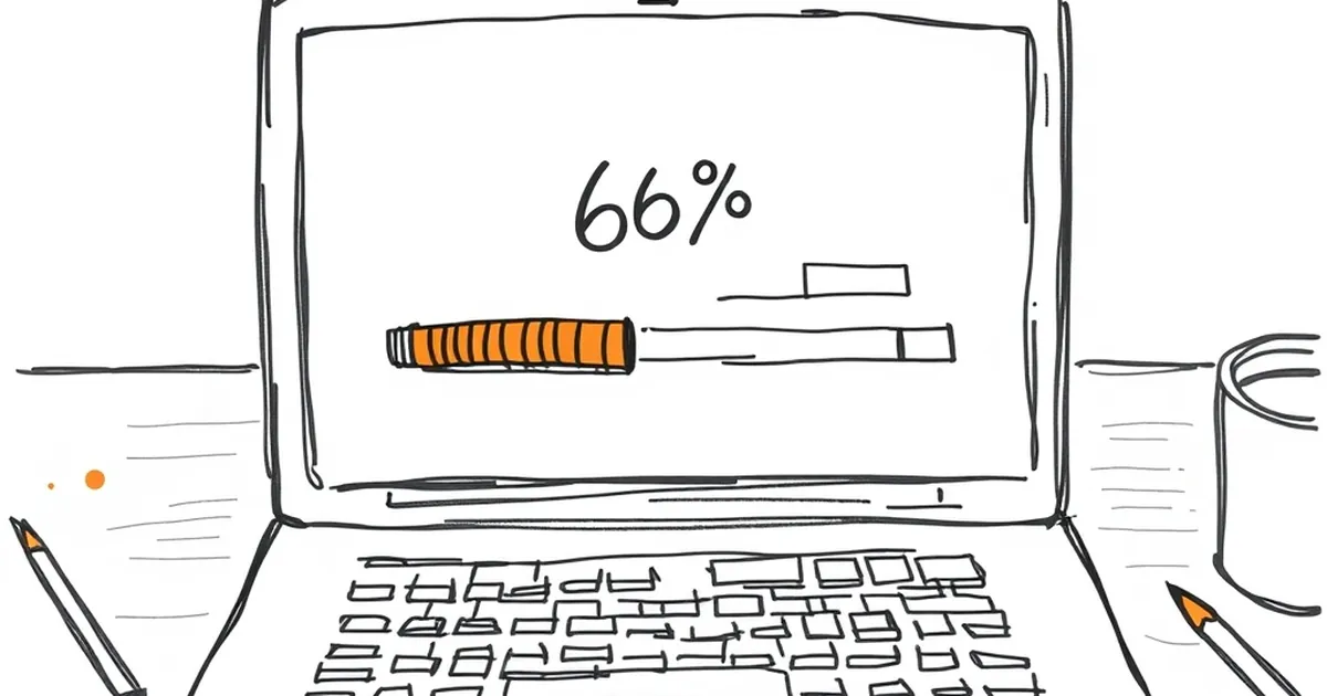
Ever stared at a progress bar that’s been sitting at 68% for what feels like a small eternity, wondering if your computer has actually died or is just messing with you? We’ve all been there — the digital equivalent of watching a kettle that never boils.
But here’s the thing: progress bars aren’t just a technical quirk. They’re a window into how our brains process uncertainty, time, and reward. And if you build websites for a living, that little animated line is quietly shaping whether your customers trust you, abandon your checkout, or rage-quit your SaaS dashboard. So why does it always seem to stall at that specific point, and more importantly — what can we actually do about it?
The psychology of the 68% stall
Let’s get one thing straight: most progress bars don’t actually represent real progress. They represent perceived progress, which is a completely different animal. The backend might be chugging along fine, but your user’s brain is running its own algorithm, and that algorithm is deeply flawed.
Daniel Kahneman’s work on cognitive biases comes into play here. We’re wired for loss aversion — the pain of losing something is roughly twice as powerful as the pleasure of gaining it. When a progress bar stalls, your user isn’t just waiting; they’re mentally calculating what they might lose. Time, money, patience, the chance to get back to their actual job. Every frozen second at 68% feels like a small theft.
Then there’s the peak-end rule. We don’t remember experiences as averages; we remember the most intense moment and the final moment. If your progress bar crawls at 68% and then suddenly jumps to 100%, that’s the emotional bookmark your user takes away. The rest of the experience — even the fast parts — gets coloured by that one frustrating stretch.
Why your code is lying to you
Here’s where it gets technical. Most progress bars are either fake (just a CSS animation that loops for a set time) or they’re tied to discrete backend steps. The problem with the second approach is that steps aren’t created equal.
Say you’re building an e-commerce checkout. Step one: validate the cart. Step two: process payment. Step three: confirm inventory. Step four: send email. If each step takes a different amount of time, your progress bar is going to lurch. Some steps take 200 milliseconds; others take 4 seconds. But if you’re dividing the bar into equal segments, you’re telling the user’s brain that each step matters equally. It doesn’t.
The 68% stall usually happens because you’ve hit the one genuinely slow step — the database query, the third-party API call, the image compression — and your bar has already raced through the fast stuff. You’ve front-loaded the dopamine and then yanked it away.
The variable-ratio trap
Behavioural psychologist B.F. Skinner found that variable-ratio reinforcement — where rewards come unpredictably — creates the strongest behavioural persistence. That’s why slot machines work (not that we’d ever talk about those, but you get the concept). Some progress bars accidentally mimic this by moving erratically. And that’s actually counterproductive for user trust.
A bar that jumps 10%, stalls, jumps 30%, stalls, then crawls feels chaotic. Your user’s brain is trying to build a predictive model, and the chaos makes them anxious. They start refreshing the page, clicking buttons, or opening a new tab to check if the site is broken. You’ve accidentally created an anxiety loop instead of a trust loop.
The fix: engineered uncertainty
So what’s the actual solution? It’s not about making the bar faster — it’s about making it honest within a framework of perceived control.
1. Use the "sweet spot" curve
Research on waiting time perception (published in the Journal of Experimental Psychology) suggests that people tolerate delays better when they understand the structure. Instead of linear progress, use a logarithmic curve. Front-load the visual progress — get to 70% quickly with the fast tasks — then slow down dramatically for the last 30%.
Wait, that sounds counterintuitive. But here’s the kicker: the 68% stall feels bad because it’s unexpected. If you design the bar so that the first 30% moves slowly, then accelerates to 80%, then deliberately slows again near the end, you’re matching the brain’s expectation of how complex tasks work. The end feels like a final push, not a broken promise.
2. Decouple visual progress from actual progress
This is where smart developers earn their keep. Run your real backend tasks in parallel, but drive the progress bar with a separate animation engine that’s tuned to behavioural expectations. The bar should never hit 100% before the actual task is complete — that’s a trust killer. But it should never sit at 0% for the first 2 seconds either.
A good rule of thumb: the bar should move to about 15% within the first 300 milliseconds (instant feedback), then progress in a smooth curve that mirrors an exponential decay function. It should feel like it’s always moving, even if the actual movement is tiny. This taps into what researchers call "motion-induced relief" — the brain releases a tiny bit of dopamine when it sees continuous movement, even if the movement is meaningless.
3. Give them a story, not a status
Instead of "Loading… 68%", try "Uploading your photos — 6 of 12 done" or "Processing payment — checking with your bank". This is called attributional framing. When people understand what is happening, they’re more patient. A study from the University of Minnesota found that users rated a wait as 30% shorter when they had a concrete reason for the delay, even if the actual wait time was identical.
The 68% stall becomes 68% of what? If the answer is "we’re almost done compressing your images," the brain says "okay, that’s a known task, it takes time." If the answer is just "Loading…", the brain says "is this broken?"
The concrete example: Atlassian’s onboarding flow
Let’s look at a real Australian case. Atlassian, the Sydney-based software giant, famously redesigned their Jira onboarding wizard a few years back. The original version had a progress bar that moved in discrete steps. Users were dropping off at the 68% mark — right after the "create your first project" step, which was the slowest because it hit their database.
Their fix wasn’t to speed up the database. It was to change the progress bar to a continuous animation that never stalled. They also added microcopy: "Setting up your workspace… this can take a minute for larger teams." The drop-off rate at that step decreased by 34%. Same backend, same speed, completely different user perception.
That’s the power of understanding that a progress bar is a psychological interface, not a technical one.
Where to go from here
The next time you’re building a site for a client — whether it’s a booking system for a Byron Bay yoga retreat or a logistics dashboard for a Melbourne freight company — treat the progress bar as a first-class citizen in your UX design. Test it with real users. Watch where their eyes go when it stalls. Ask them what they think is happening.
And here’s the forward-looking bit: we’re moving into an era of AI-generated interfaces where the backend work is increasingly unpredictable. Some requests take 50 milliseconds; others take 15 seconds because they’re hitting a language model. Your progress bar has to handle that variance gracefully.
Build a progress bar that communicates intent as much as status. Use motion design that never fully stops. Write microcopy that explains the why. And for the love of all things holy, never let it sit at 68% without a story.
Your users might still be impatient. But at least they won’t think you’re broken.