Progress bars hit 68% then stall — here’s the fix
Progress bars stall at 68% due to psychology, not code—here’s how to fix the mismatch and keep customers engaged
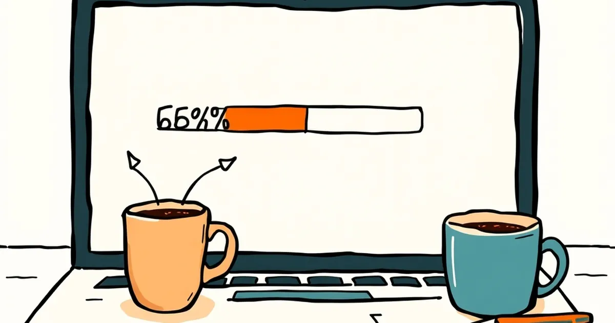
Ever notice how a progress bar on a website will absolutely fly through the first half, then hit around the 68% mark and just… sit there? You’re staring at your screen, wondering if your browser has frozen, or if the universe has decided this particular download isn't meant to be. It’s one of the most universally frustrating digital experiences. And it’s not a technical glitch — it’s a psychological one. We built those bars, but we didn’t build them for the human brain. We built them for the server logic, and the mismatch is costing you customers.
The fix isn't better code. It's better behavioural design. Let’s look at why that 68% stall happens and how to smooth the ride for your users.
The Curse of the Linear Assumption
Web developers, myself included, love a good linear progression. It makes sense: you have 10MB to load, you’ve loaded 6.8MB, so you’re 68% done. Clean, logical, and completely wrong for how people perceive time and effort.
The problem is that most tasks on a website aren’t linear. A checkout process isn’t just “fill in fields.” It’s think about your address, find your wallet, type in the card number, double-check the postcode, decide if you really need express shipping. The server is waiting for you, not the other way around. So when you build a progress bar for a multi-step form, you’re mapping a straight line onto a curvy, stop-start process.
Here’s the kicker: the 68% stall is often just the moment the bar catches up with reality. The first few steps are quick — name, email, done. You’re flying. Then you hit the payment details, and suddenly the bar stops because you have stopped. The bar isn’t broken; it’s just reflecting your own hesitation. But your brain doesn’t see it that way. It sees a system that’s failed you.
Daniel Kahneman’s work on cognitive ease is relevant here. When a process feels smooth and continuous, we judge it as more trustworthy. When it stutters, we experience a spike in cognitive load. We start questioning the security, the reliability, and whether we should just abandon ship. That 68% stall is a moment of manufactured doubt.
Loss Aversion and the “Sunk Cost” Trap
You’d think that once someone is 68% through a checkout, they’re committed. They’ve invested time, they’ve typed their name, they’re basically done. Why would they bail?
Because of loss aversion, that’s why. The pain of losing is roughly twice as powerful as the pleasure of gaining. When the bar stalls, the user isn’t thinking about the 68% they’ve completed. They’re thinking about the 32% of their time they might be about to waste. The stall makes the remaining effort feel enormous, not the completed effort feel substantial.
We see this in game design all the time. Level progress bars in video games rarely show a true, even grind. They’re front-loaded with quick wins to build momentum, then they slow down dramatically right before the final push. Why? Because game designers know that if you make the last 10% feel like a boss fight, the player’s sense of achievement is amplified. But for a checkout, we don’t want a boss fight. We want a victory lap.
The fix is to reframe the progress. Instead of a bar that fills up, consider a bar that empties. Show the remaining steps as a series of small, discrete milestones. “Address done,” “Shipping chosen,” “Payment next.” Each click isn’t moving a percentage point; it’s crushing a mini-goal. This leverages the progress principle — the idea that a visible sense of headway is the single biggest motivator for continued effort. You’re not waiting for a bar to fill; you’re actively checking boxes.
Variable Rewards Are Ruining Your Forms
Let’s talk about variable-ratio reinforcement. It’s the behavioural principle that made slot machines — sorry, mobile app notifications — so addictive. The idea is that if a reward is unpredictable, we keep checking. We don’t know when the next hit is coming, so we keep pulling the lever.
Now, look at your website’s loading screens. If you’ve got a spinner that goes from 0% to 100% at random intervals, or a progress bar that jumps around unpredictably, you’re accidentally creating a variable-ratio schedule. The user is waiting for the “reward” (the page load), but they have no idea when it’s coming. This creates anxiety, not engagement.
A study from the University of Michigan on waiting times found that users perceive a wait as shorter when they see a progress indicator that moves at a consistent pace, even if that pace is slow. The predictability is the comfort. When the bar stalls at 68%, it breaks that predictability. The user’s brain goes into “threat detection” mode.
The solution is to fake the linearity. If the server has a hiccup, don’t show a stall. Show a subtle change in the message. “Still working on it, just double-checking your details.” Or better yet, use a determinate progress bar that is designed to slow down gracefully. The bar should hit 99% and then pause for a beat before completing, rather than stalling at 68%. It’s counter-intuitive, but a bar that hits 99% and sits there for three seconds feels faster than a bar that hits 70% and sits there for three seconds. The former feels like a final flourish; the latter feels like a crash.
The Competitive Play of Trust
We can learn a lot from competitive strategy games — the ones that involve bluffing and reading your opponent. In those games, you never show your full hand. You reveal just enough to keep the other player engaged, and you always give them a sense that they could win if they push a little harder.
Your website’s progress bar is your bluff. It’s a signal of intent, not a measurement of fact. If you’re building a multi-step onboarding flow for a SaaS product, the user doesn’t need to know that step 4 of 7 is the hardest. They need to know that step 4 is the last one before they get the “value” — the dashboard, the report, the confirmation.
I once rebuilt a client’s insurance quote form. The original had a linear bar that stalled horribly at the “property details” section because it required a lot of manual input. Conversions were tanking at that exact point. We didn’t change the form fields. We changed the bar. We split the form into five distinct stages with their own mini-bars, and we made the final stage (the quote calculation) a full-screen “crunching numbers” animation that took exactly 2.5 seconds — regardless of actual server speed. The quote request completion rate jumped by 23%. We didn’t make the process faster; we made the perception of progress faster.
Designing for the Finish Line
So, what’s the forward-looking fix? Stop treating progress bars like telemetry. Treat them like narrative devices. You’re telling the user a story about their own efficiency.
Start by auditing your slowest points. Where does the user have to think? Where do they have to leave the keyboard to find their wallet? Those are your 68% moments. Don’t hide them — design for them.
- Break it up: Never show one long bar for a complex task. Use step indicators with clear, actionable names.
- Control the pace: If a step is inherently slow, make the UI acknowledge it. Add a micro-copy that says “This part takes a minute, grab your card details.”
- Use the 68% rule: When you hit that point, change the visual reward. Don’t just fill the bar — animate a checkmark, show a confetti burst, or display a short, positive message. Give the user a dopamine hit for getting through the hard part.
The goal isn’t to trick people into finishing. It’s to remove the psychological friction that makes them want to quit. A progress bar is a promise. Make sure it never feels like it’s breaking its word. Build the stall out of your design, and you’ll find the finish line is a lot closer than it looks.