XP bar fills at level 9—players quit the tutorial at 4
Game design reveals why users abandon websites early and how the features you build last rarely reach the people who need them most
You've spent three months building a website. The homepage looks sharp, the copy is tight, the contact form works. And the analytics say most visitors leave before they've scrolled past the first screen. Meanwhile, the one feature you're proudest of—the thing that took the longest to build—sits at the bottom of the page, waiting for users who never arrive. So what's actually going on between the moment someone lands and the moment they decide to stay?
The gap between where you build and where people quit
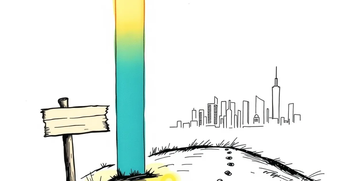
There's a pattern in game design that should make anyone who builds websites sit up a bit straighter. Designers map out a player's journey, place the reward at the end, and then watch in confusion as a huge chunk of players bail long before they reach it. The tutorial gets skipped. The first boss goes unbeaten. The XP bar fills at level 9, but most people quit at level 4.
The lesson isn't that players are lazy. It's that the reward you designed for isn't the reward they were chasing. They came for something else, found it—or didn't—and left.
Websites have the same shape. You build a conversion funnel with a clear end point: book a demo, request a quote, sign up. You assume the visitor is walking that path with you. But the visitor is running their own calculation, moment by moment, and most of the time it doesn't match the story you told yourself when you designed the page.
What behavioural research actually tells us about the first ten seconds
Herbert Simon, the economist and cognitive scientist, coined the term "satisficing" back in the 1950s. The idea: humans don't optimise, they look for the first option that's good enough, then stop searching. It's a survival strategy for a brain that can't process everything. In a world of infinite tabs, satisficing is the default.
Daniel Kahneman later built on this with the distinction between fast, intuitive thinking and slow, deliberate reasoning. Most web browsing happens in the fast lane. A visitor doesn't read your headline and weigh its merits. They scan, feel something, and either keep going or leave. The decision takes a couple of seconds, and it's made before conscious thought catches up.
This is why "we'll explain it in the second paragraph" rarely works. By the second paragraph, most of your audience has already satisfised somewhere else.
There's a well-known usability study from the Nielsen Norman Group that found users typically read only around 20 to 28 percent of the words on a page during an average visit. The number drops further if the content is dense. That's not a reading problem. It's a filtering problem. The visitor is running a quick internal query—"is this for me?"—and most pages fail to answer it fast enough.
Variable rewards and the loop that keeps people scrolling
B.F. Skinner's work on variable-ratio reinforcement is one of the most cited findings in behavioural psychology, and it's usually dragged out to explain why people keep pulling levers on machines. But the principle is broader: unpredictable rewards create stronger, more persistent behaviour than predictable ones.
Applied to a website, this isn't about tricking anyone. It's about understanding that a page which delivers a small, interesting payoff every few seconds holds attention far better than one that front-loads everything and then tapers off. Scrolling is a behaviour. If each scroll reveals something worth the effort—a useful stat, a surprising claim, a clean piece of design—the visitor keeps scrolling. If the next screen looks like the last one, they stop.
This is why good long-form pages often feel like they're pulling you down. Not because of some dark pattern, but because the writer understood that attention is earned in increments, not in one big hit at the top.
A concrete example: Basecamp, the project management tool, has long used a homepage that reads more like a letter than a sales page. It's conversational, it explains a problem, and it rewards you for reading the next line. The payoff isn't a promise of a free trial in bold red text—it's the feeling that someone is talking to you like a person. The page has been through many redesigns, but the underlying principle hasn't changed: give the reader a reason to keep going, one sentence at a time.
Loss aversion and the cost of a confusing first screen
Kahneman and Amos Tversky's work on loss aversion tells us that people feel losses roughly twice as strongly as equivalent gains. On a website, this shows up in subtle ways. A visitor who can't immediately tell what you do experiences a small loss—of time, of certainty, of the feeling that they're in the right place. That loss registers more sharply than the potential gain of sticking around to figure it out.
So they leave.
The fix isn't a bigger headline or a louder call to action. It's reducing the sense that the visitor is risking something by staying. Clear language. Obvious next steps. No jargon that makes them feel stupid for not knowing. The goal is to make the decision to stay feel like the safe, low-stakes choice.
Australian businesses often get this wrong in a specific way: they write for the industry, not the customer. A tradie's website that talks about "comprehensive solutions" and "end-to-end service delivery" is writing for a peer, not for the homeowner who just wants to know if you'll show up on time and not overcharge. The homeowner feels the loss of clarity immediately and goes back to the search results.
Designing for the level-4 quitter, not the level-9 finisher
If most of your visitors leave early, the most valuable work isn't polishing the end of the journey. It's making the first few steps worth taking. That means:
- Answering "what is this?" in the first screen, not the third
- Giving a reason to scroll—a question, a stat, a promise that pays off
- Removing anything that makes the visitor feel like they're risking their time
- Treating every scroll as a small decision the visitor is making, not a given
This is a shift in how you think about website development. It's less about the funnel and more about the moment. Less about the conversion and more about the first ten seconds. The businesses that get this right aren't necessarily the ones with the biggest budgets. They're the ones who understood that their visitor is running a fast, emotional calculation, and designed for that reality instead of the tidy story they told themselves in the planning meeting.
The next time you look at your analytics and see that drop-off, don't ask why people aren't reaching the end. Ask what you're giving them at step four. That's where the real work is.